Used by GitHub
Primer React
by GitHub · primer.style
Colors
BasePrimaryTextBorderSoft
Typeface
Aa-apple-systemRadius
3612
 Screenshot 1 of 2
What it is
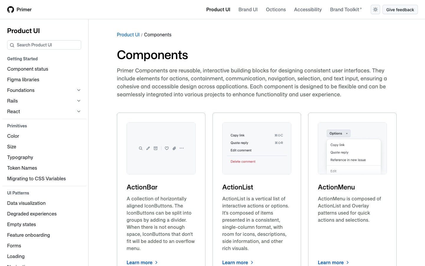
The components behind GitHub's own product pages, from issues to settings: clean, information-dense and built for developers.
Design SystemsA design system is more than a component set: it comes with tokens for color, type and spacing, theming, and rules for how parts fit together.
Good for
- Products that need one consistent look
- Theming and dark mode
- Teams sharing one set of components
Alternatives to Primer React
Other Design Systems kits.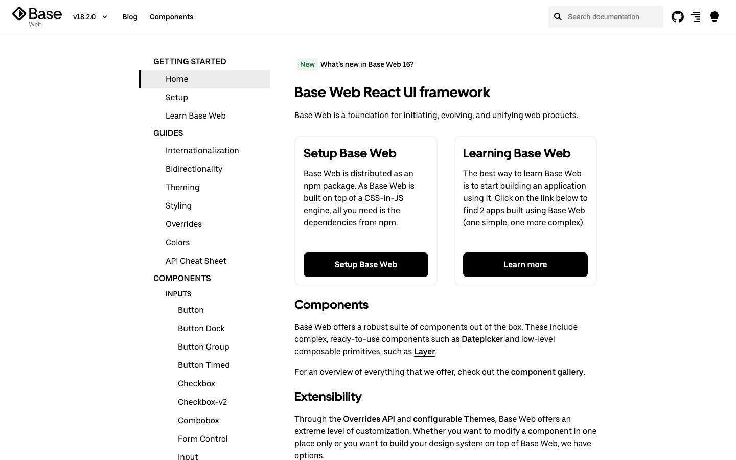
Base WebFree
Uber's React design system: black and white, high contrast and plain shapes, the look of Uber's own web tools.
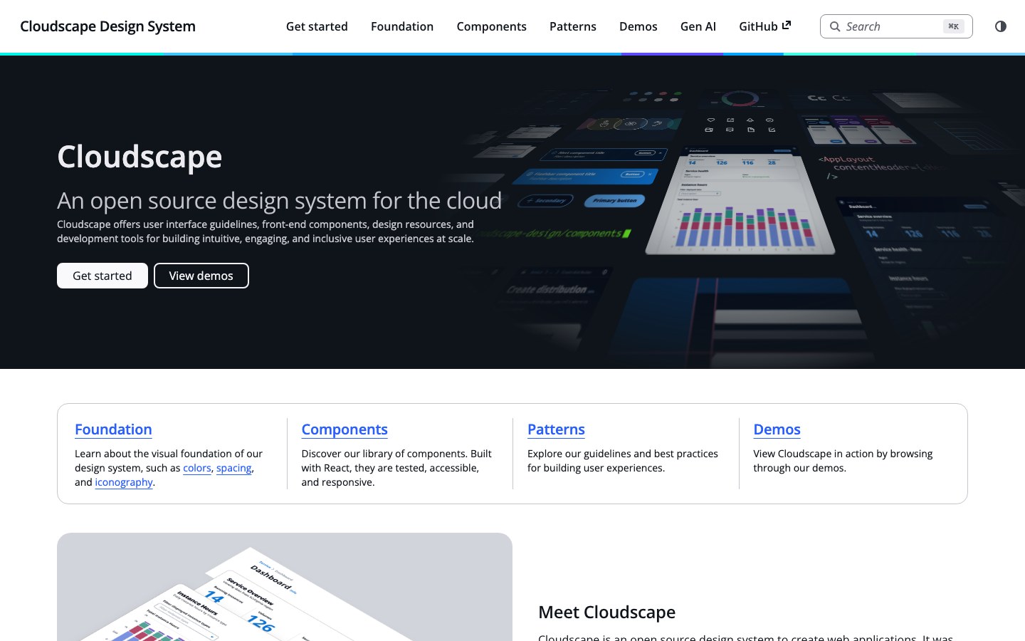
CloudscapeFree
The design system behind the AWS console: data tables, forms and dashboards built for long working sessions.
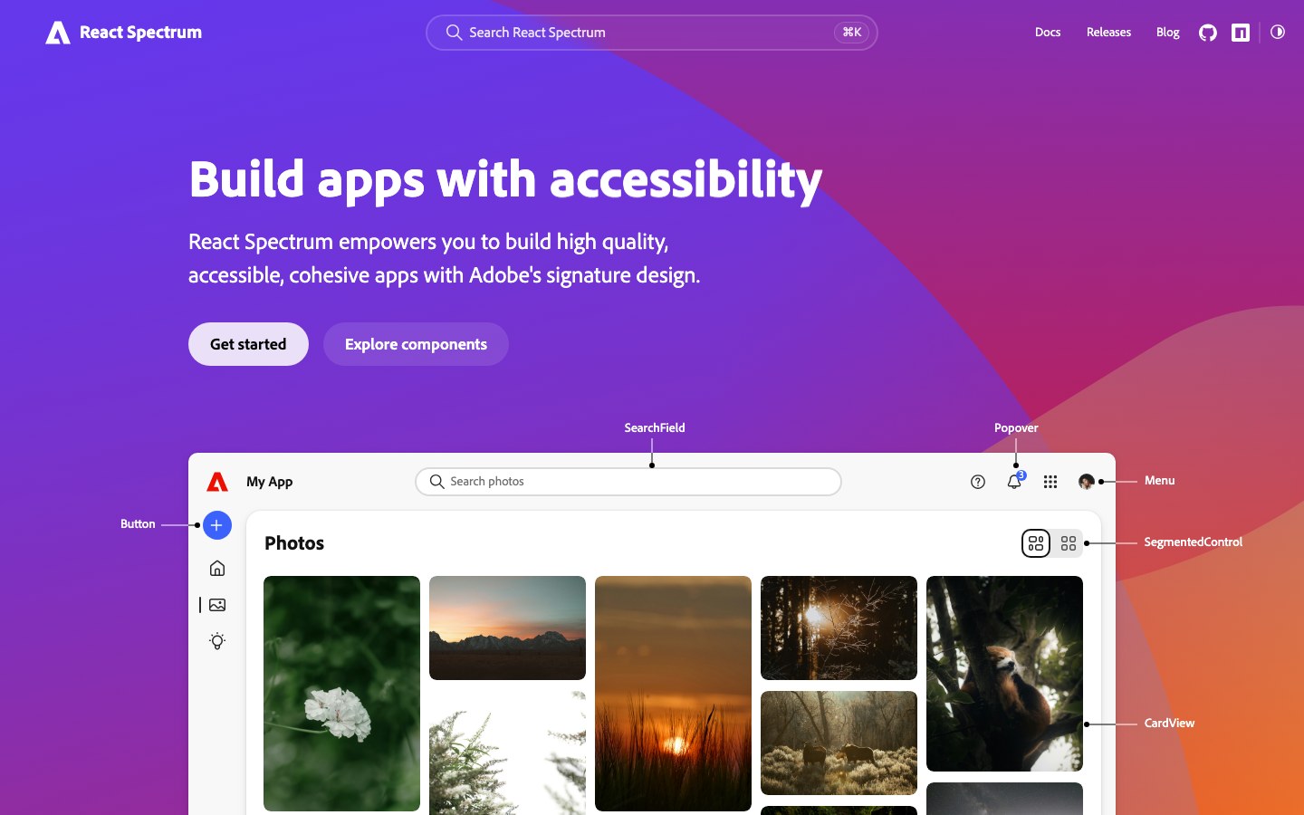
Spectrum 2Free
Adobe's new Spectrum 2, the look of today's Photoshop and Acrobat on the web: big rounded corners, bold type and a bright blue accent.