All sites
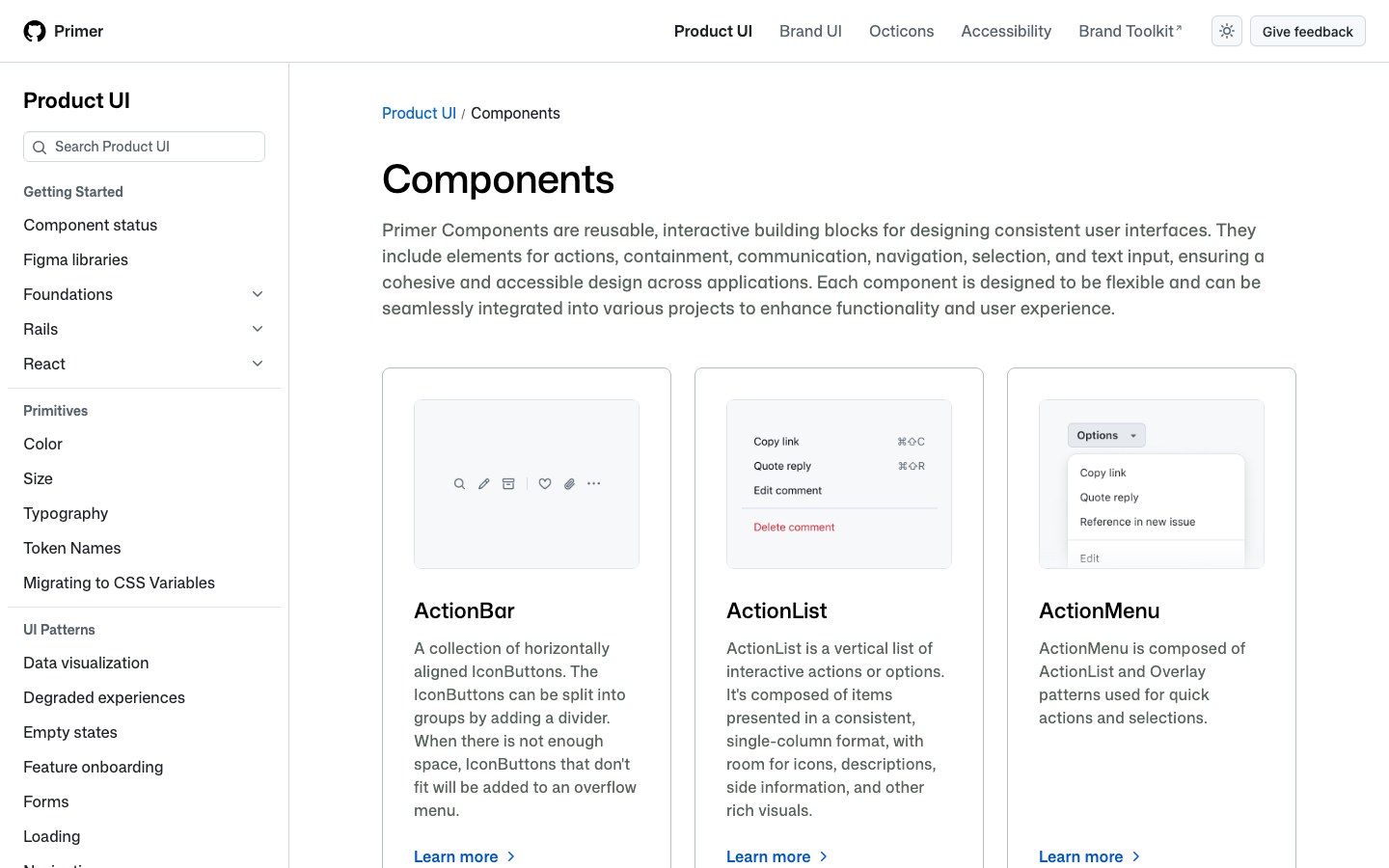
The components behind GitHub's own product pages, from issues to settings: clean, information-dense and built for developers.
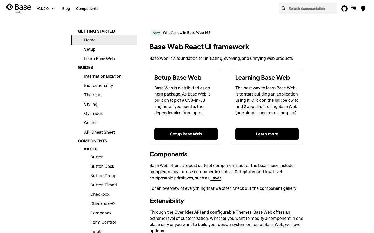
Uber's React design system: black and white, high contrast and plain shapes, the look of Uber's own web tools.
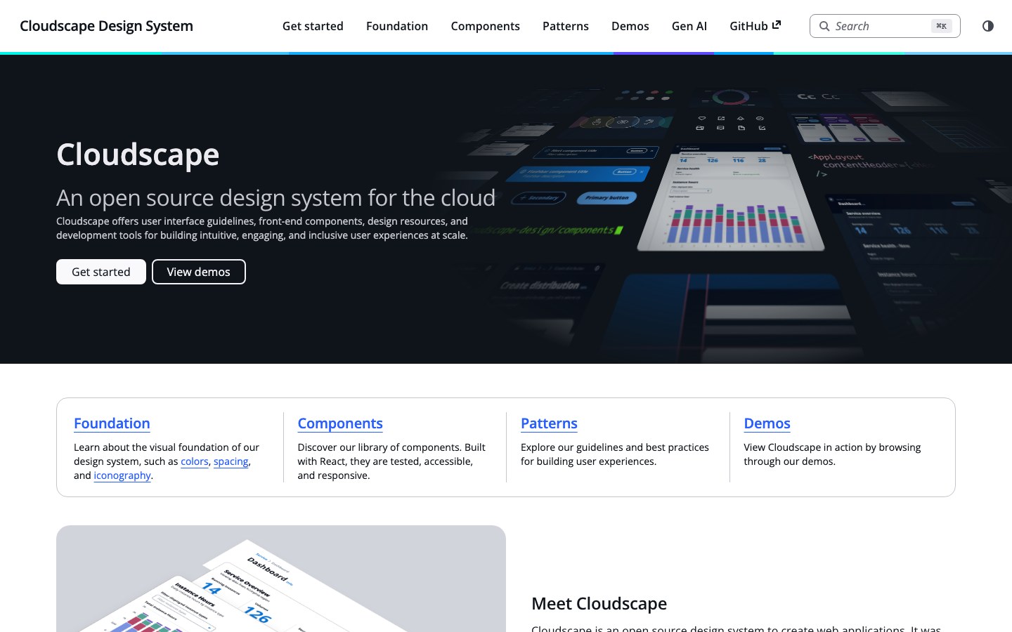
The design system behind the AWS console: data tables, forms and dashboards built for long working sessions.
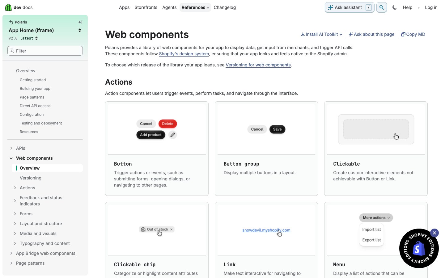
Shopify's admin design system, rebuilt in 2025 as web components: black pill buttons, gray canvas and calm white cards.
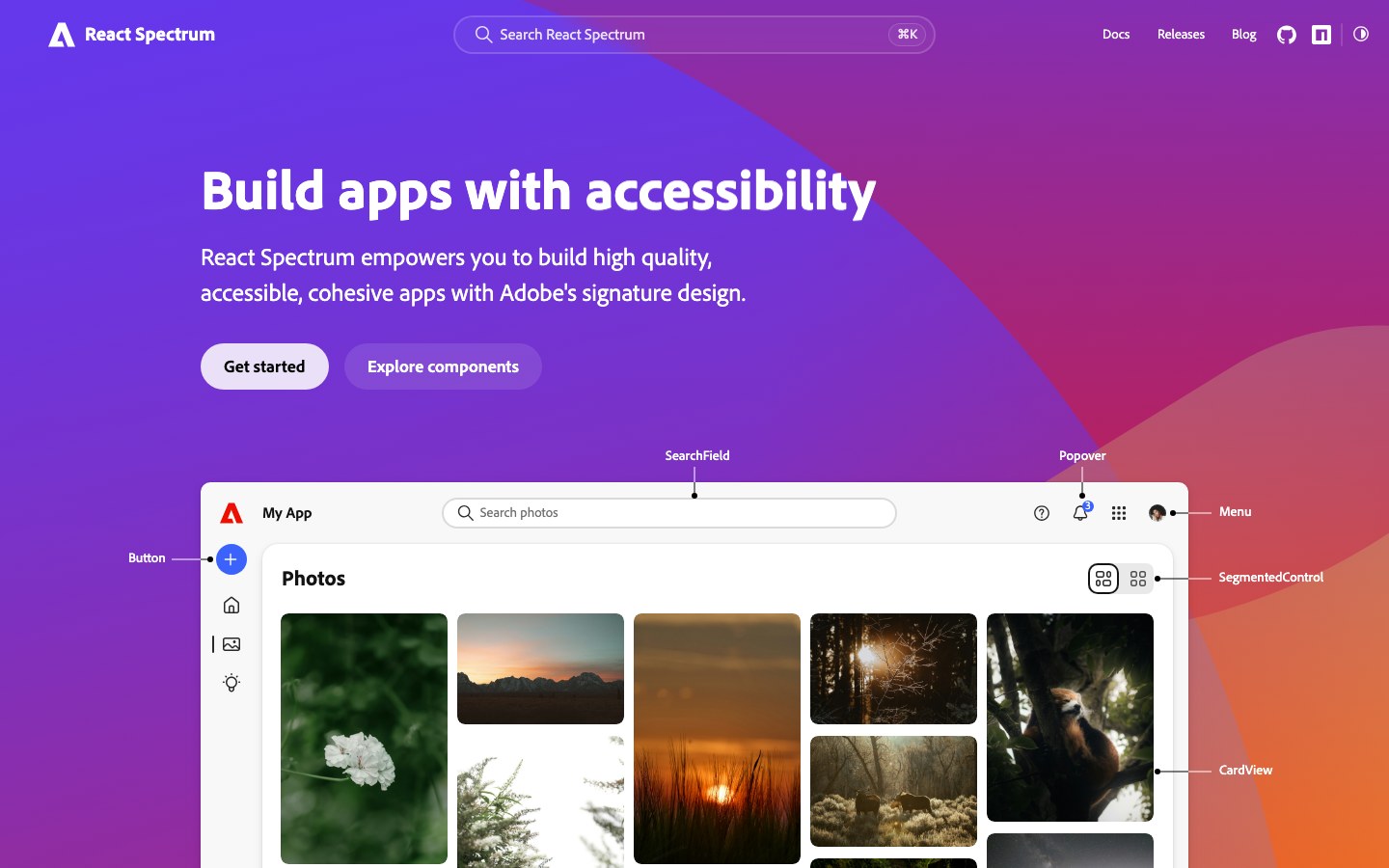
Adobe's new Spectrum 2, the look of today's Photoshop and Acrobat on the web: big rounded corners, bold type and a bright blue accent.
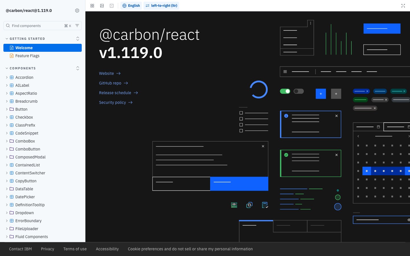
IBM's design system for its cloud and data products: square corners, IBM Plex type and a strict grid.
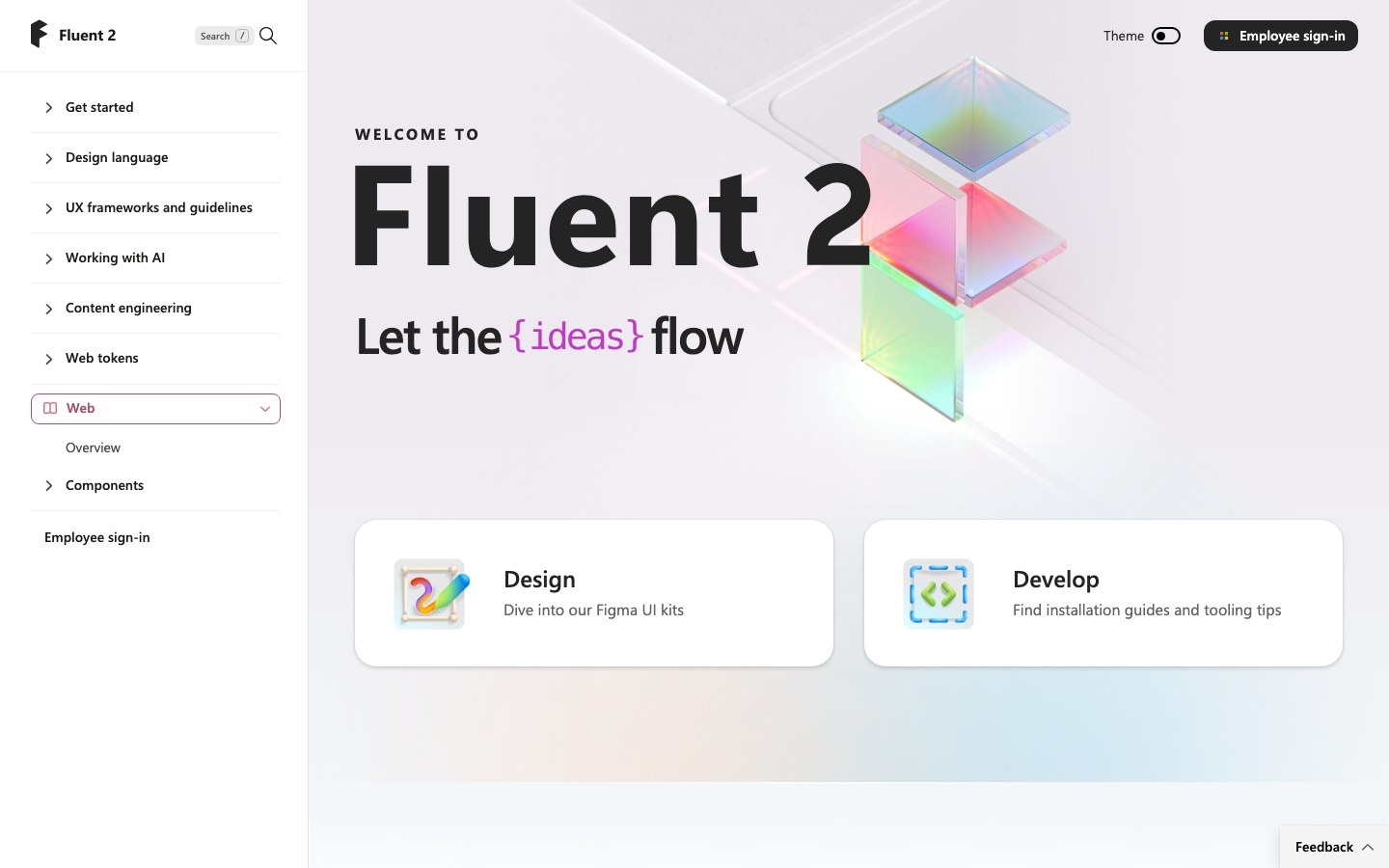
Microsoft's Fluent 2 for React, the system behind Teams and Office on the web: calm blue, small corners and dense, tidy layouts.
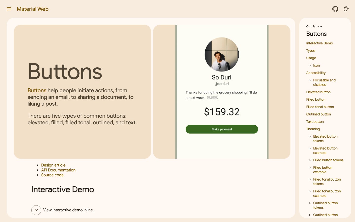
Google's Material 3 components as web components: rounded buttons, soft purple tones and works in any framework.
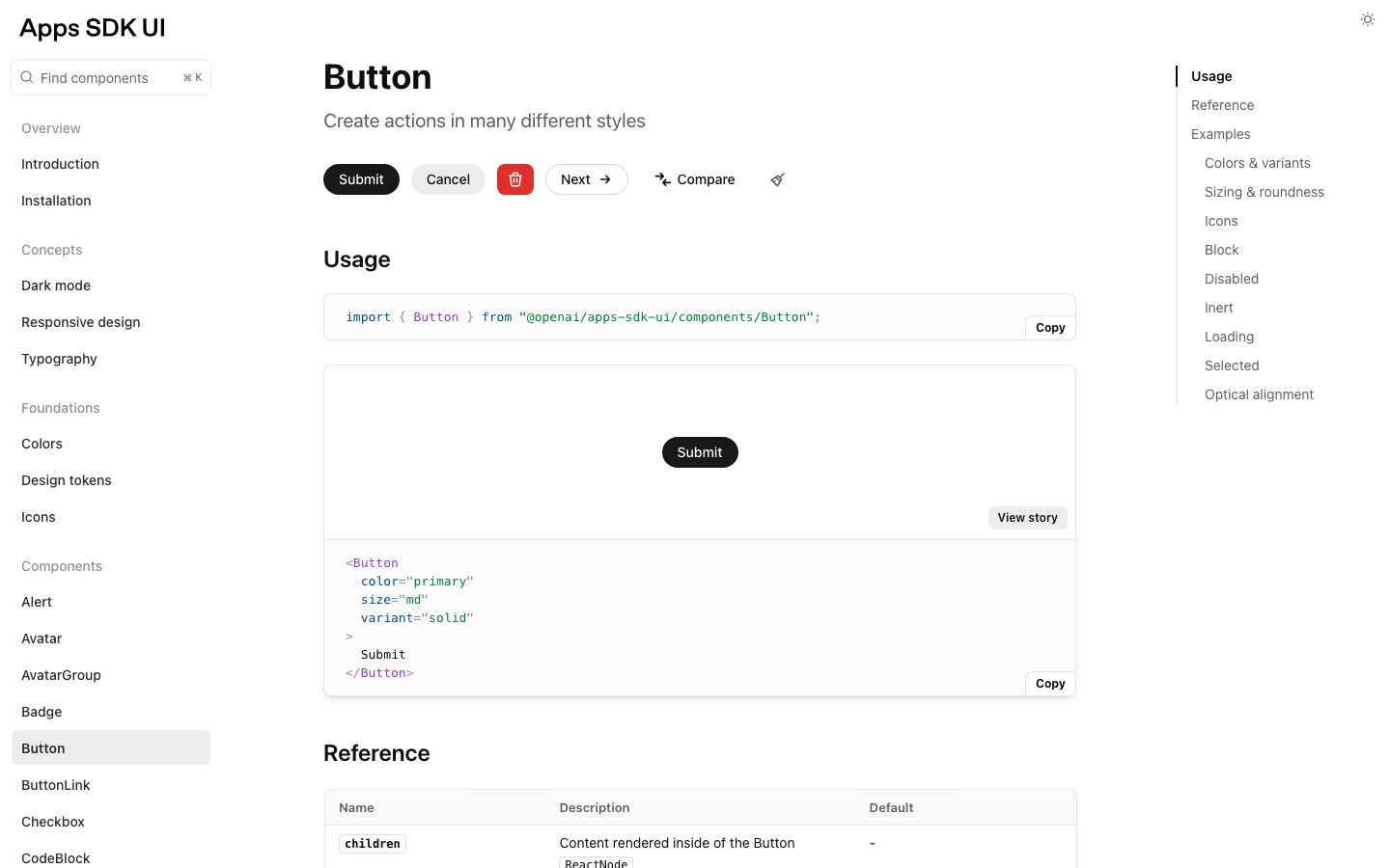
OpenAI's design system for apps inside ChatGPT: black pill buttons, lots of white space, Tailwind 4 tokens and Radix-based components.
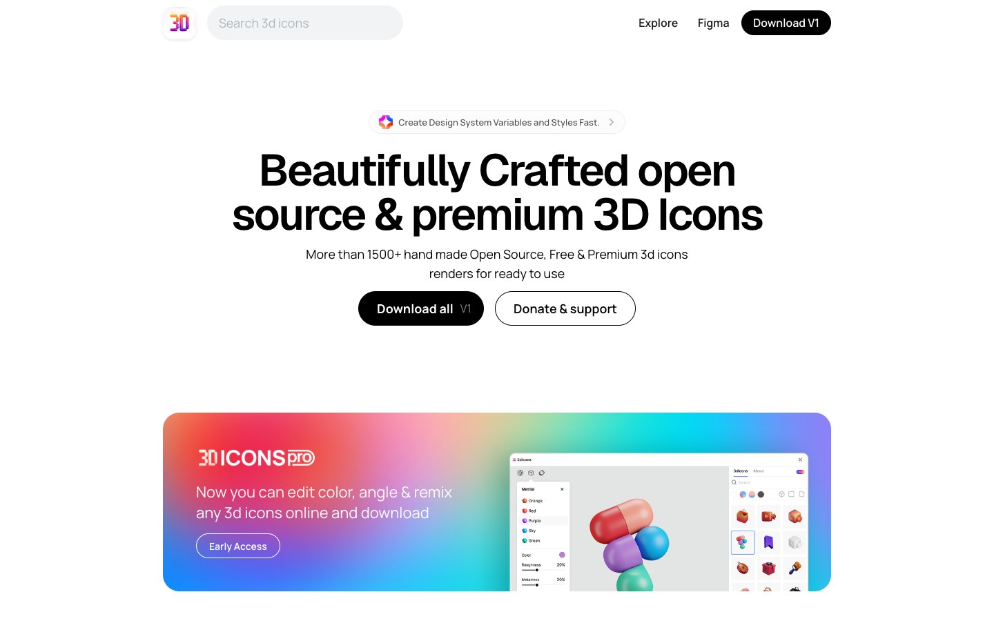
1,500+ hand-made 3D icon renders, CC0 for commercial use, with Blender source files.
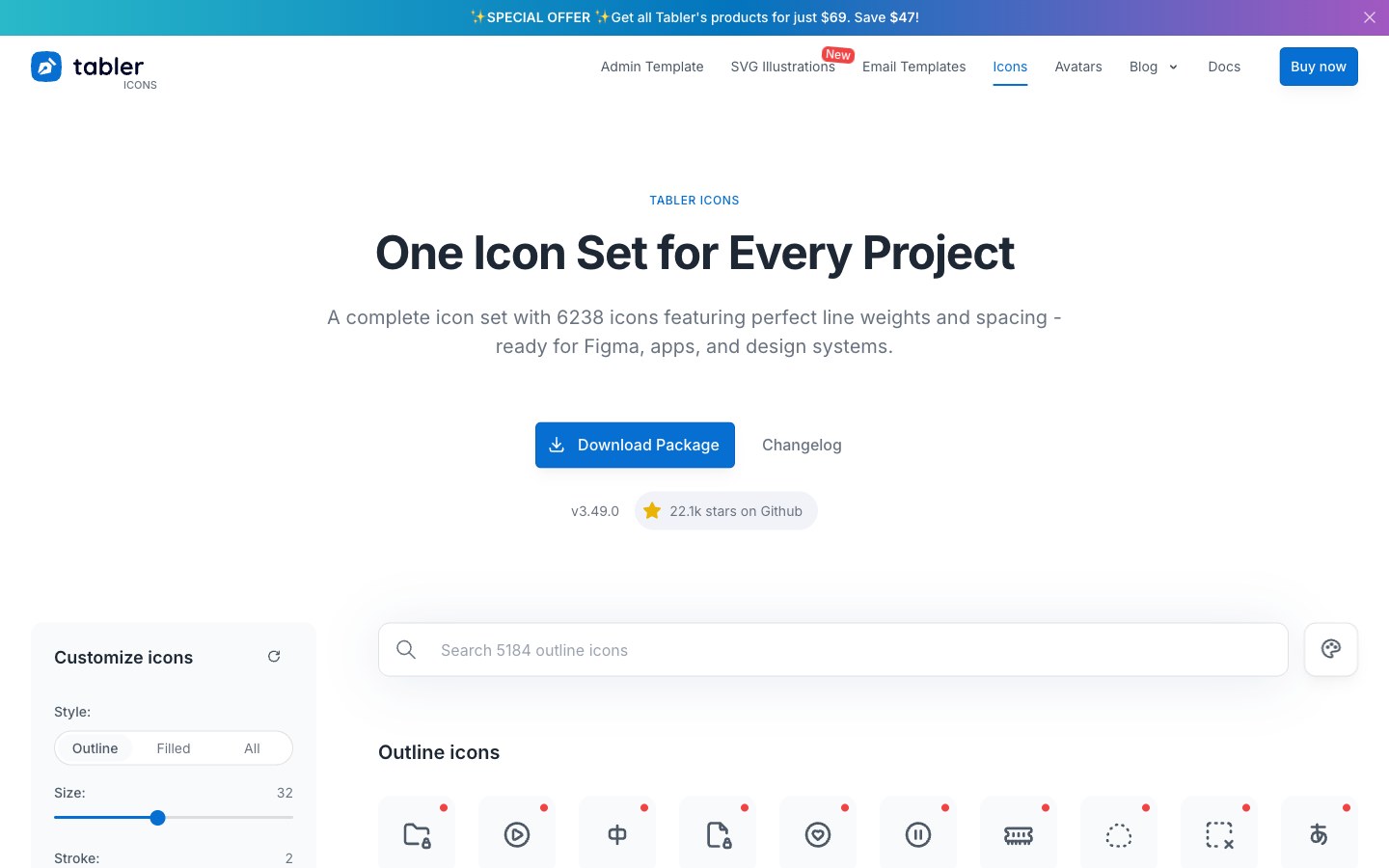
6,200+ free line icons on a 24 grid with a 2px stroke — one of the largest MIT icon sets.
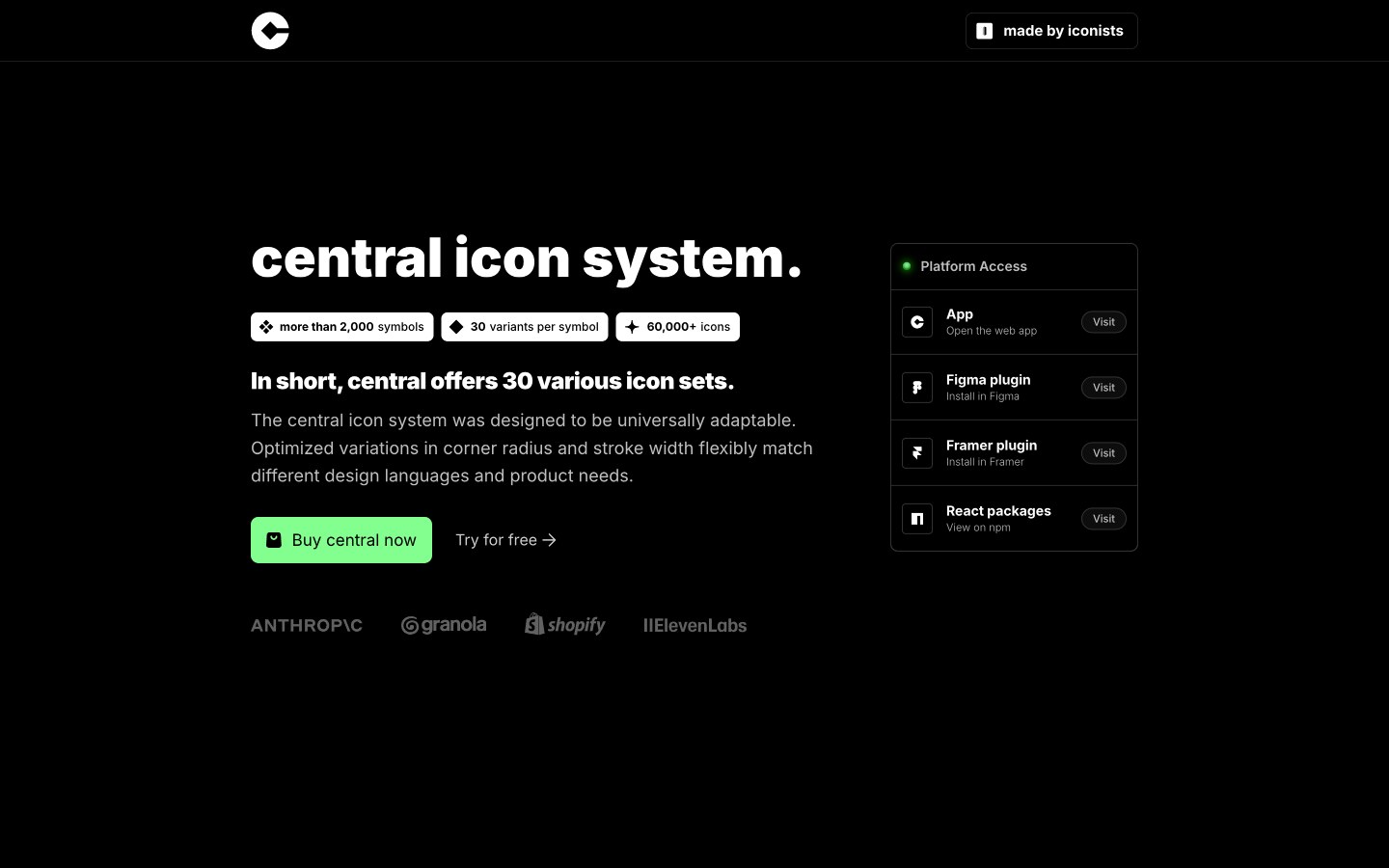
A premium icon system of 2,000+ symbols with 30 combinations of corner, stroke and fill.
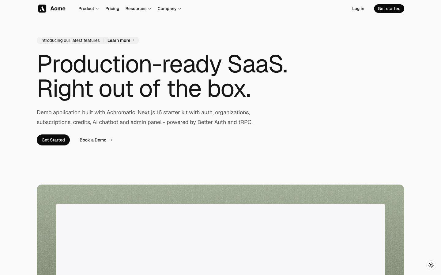
A paid SaaS starter with multi-tenancy, organizations, billing and dashboards, polished like a finished product.
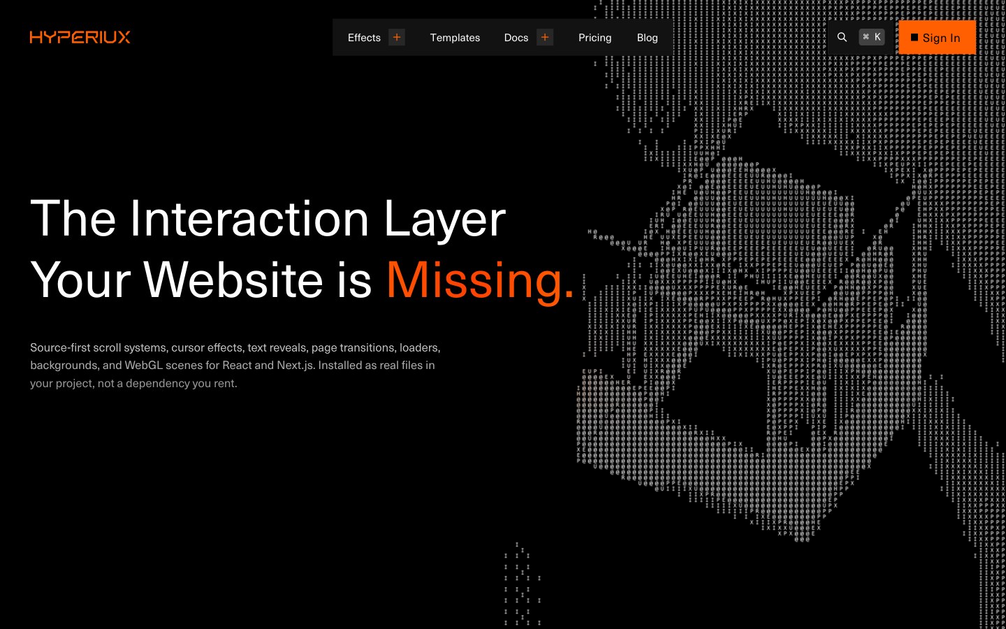
Agency-grade interaction effects — scroll systems, cursor effects, text reveals, page transitions and loaders.
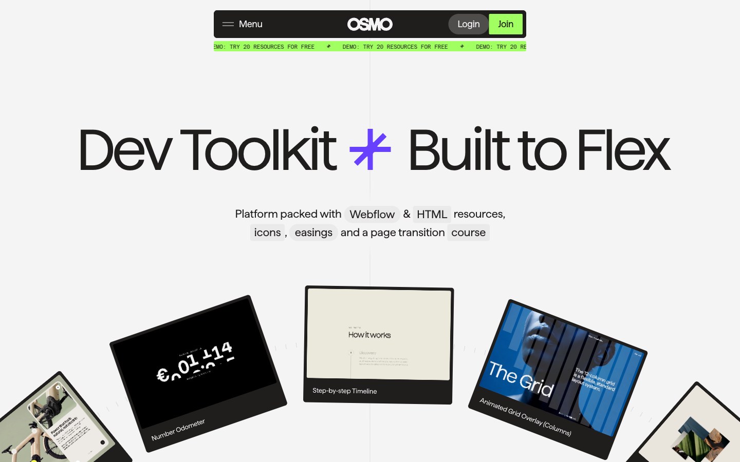
A members' library from award-winning motion designers — page transitions, scroll effects and easings in plain HTML, CSS and GSAP.
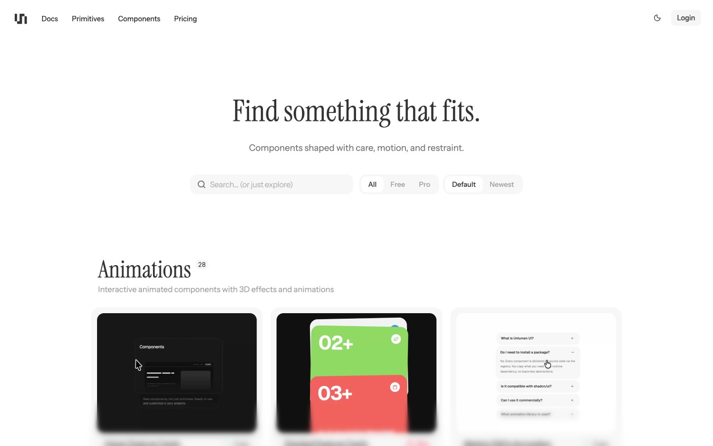
Hand-polished shadcn motion primitives and components with measured, unshowy animation.
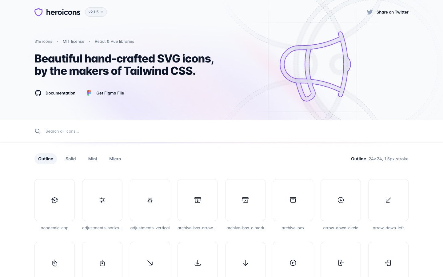
Tailwind Labs' icon set — about 300 icons in outline, solid, mini and micro styles.
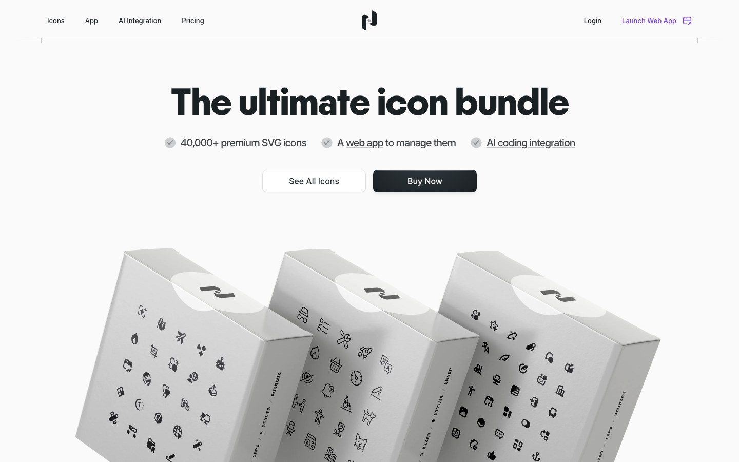
40,000+ premium icons with a desktop app to manage them, all in one consistent, polished style.
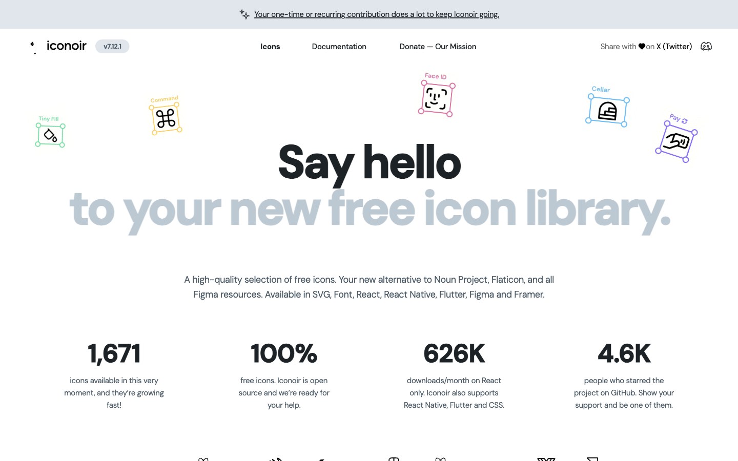
1,600+ minimal line icons with thin strokes and a geometric feel, completely free.
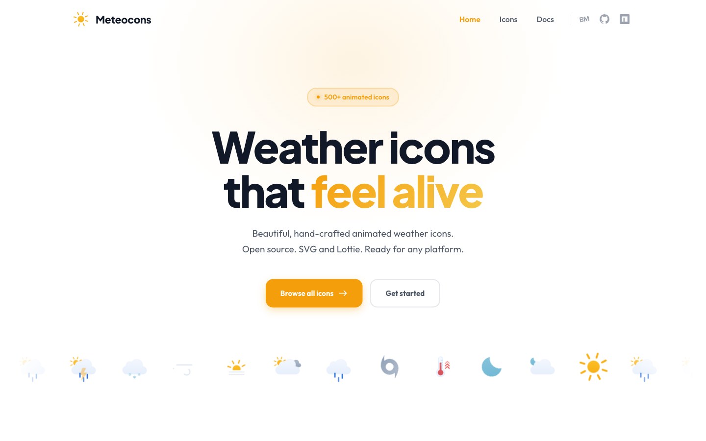
500+ hand-crafted animated weather icons in SVG and Lottie.
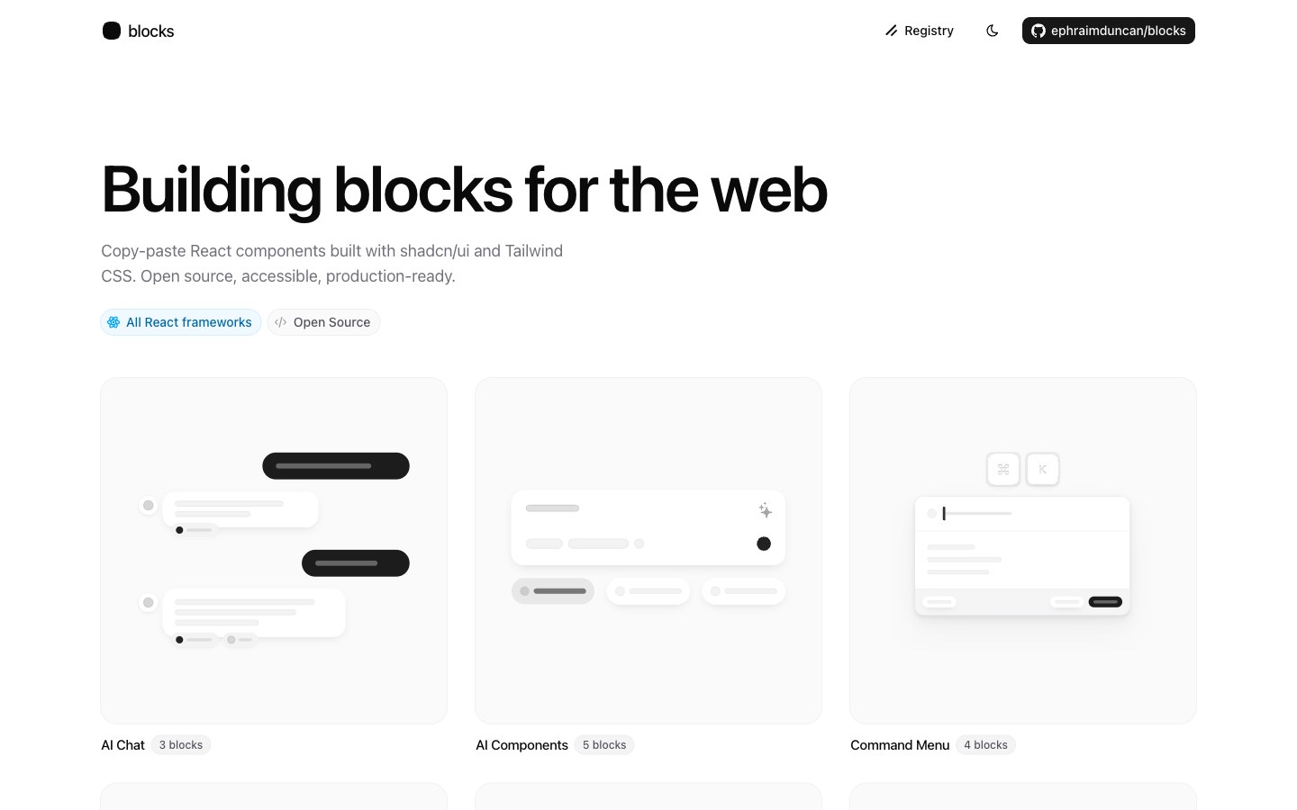
Free, open-source shadcn app blocks — 60+ logins, sidebars, tables, dialogs and file uploads.
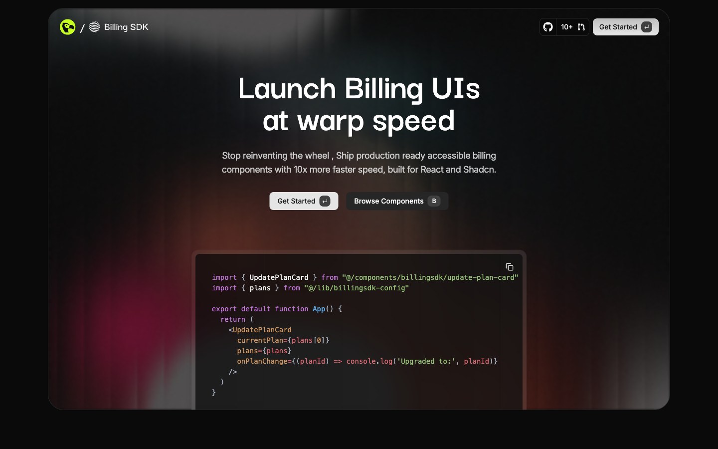
Billing UI — pricing tables, subscription management, usage meters, invoices and cancel flows — installed the shadcn way.
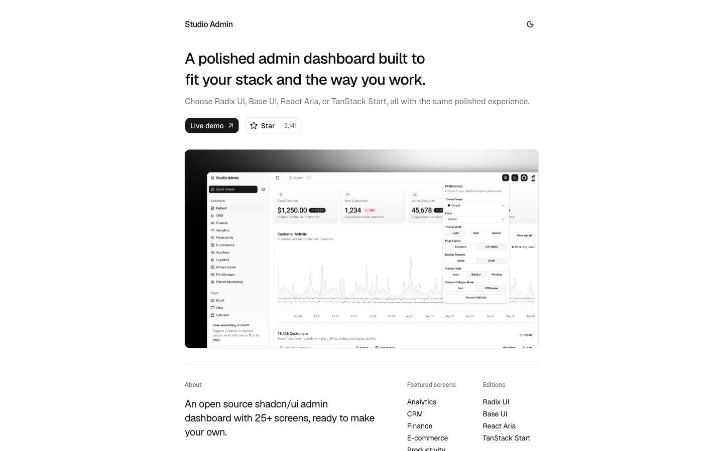
A Next.js 16 and shadcn admin template with several dashboards, theme presets and switchable layouts.
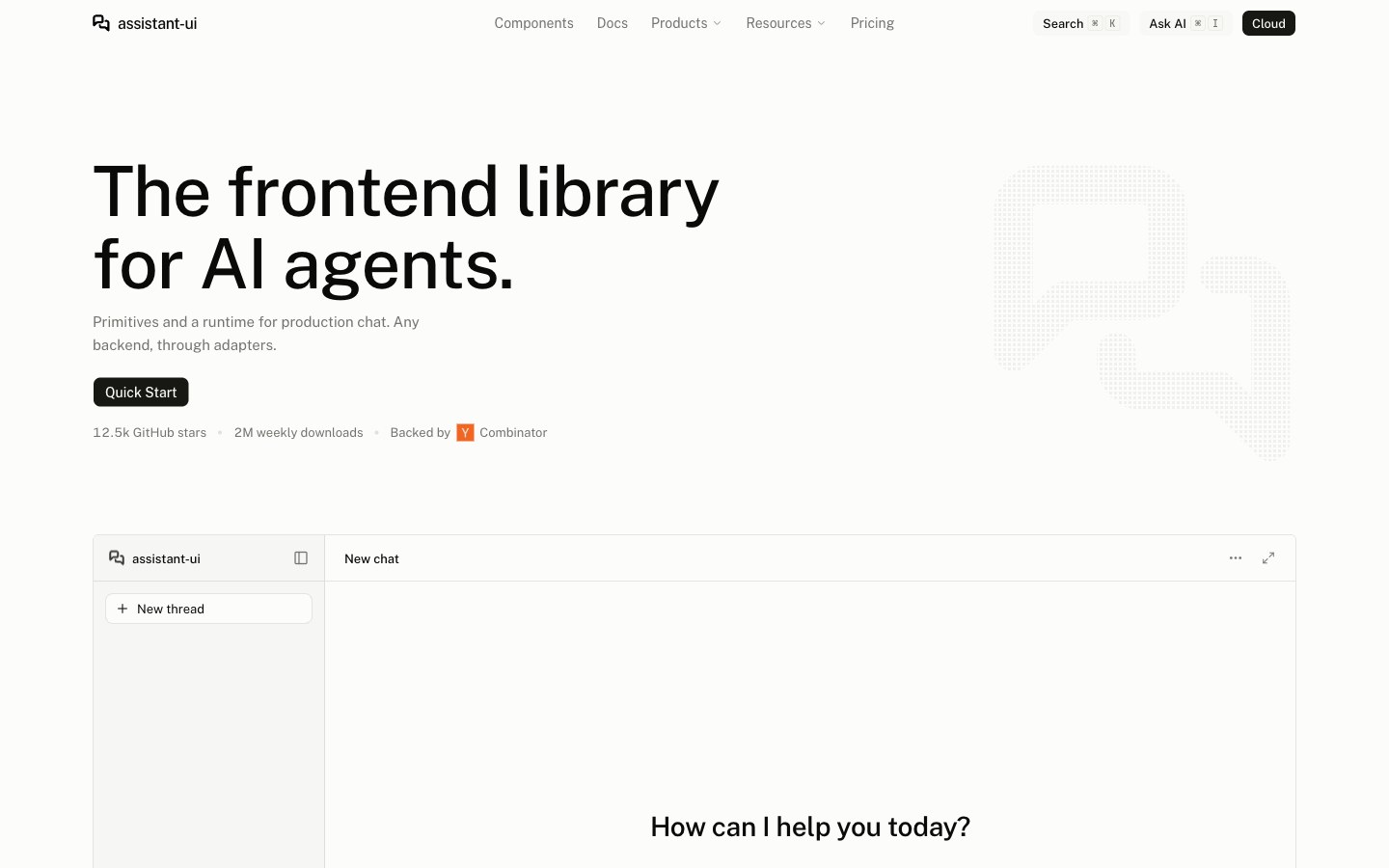
A React library for AI chat interfaces — ChatGPT-style threads, branching, attachments and tool calls, with any model.
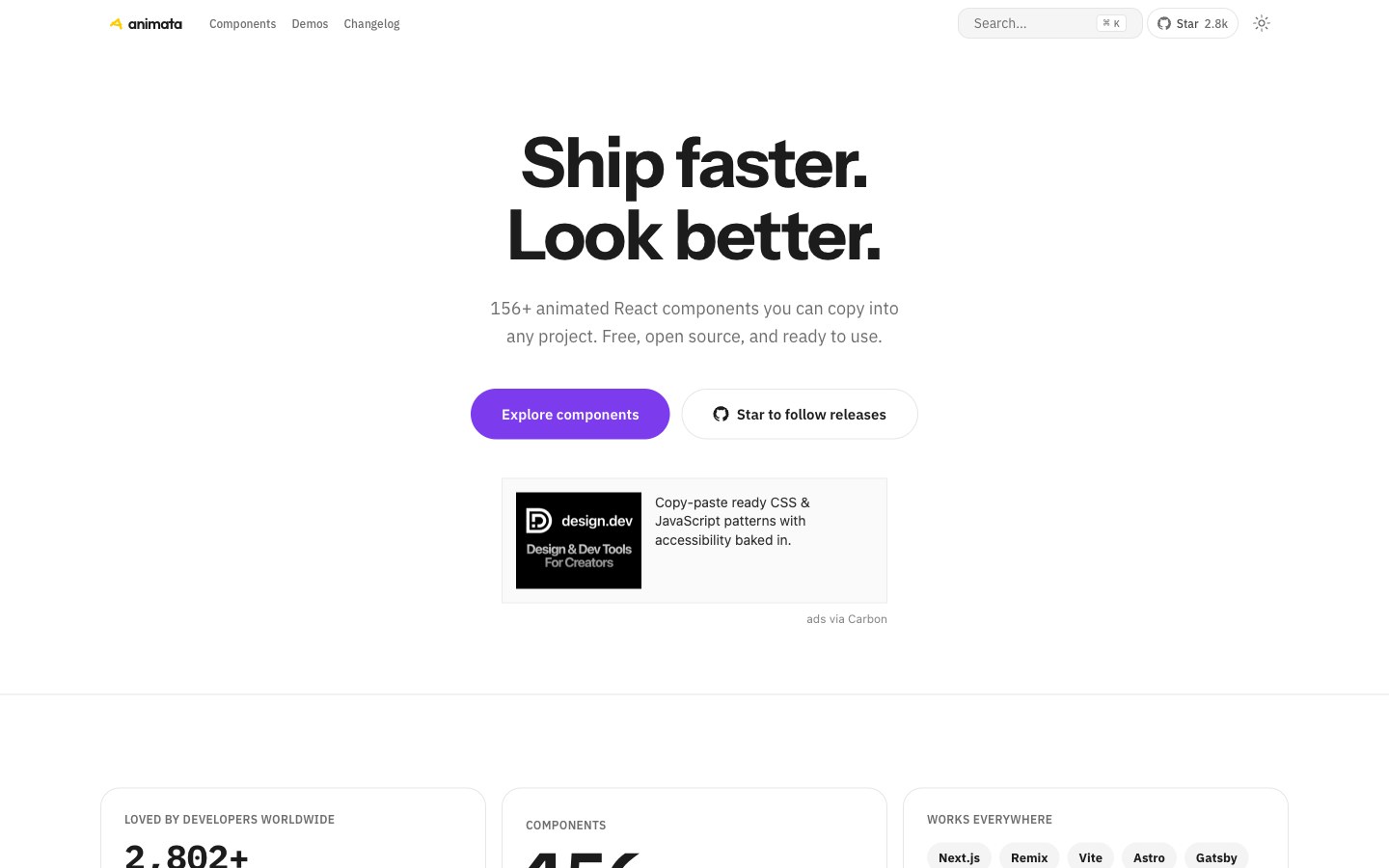
Animation and interaction snippets sorted by type — text, cards, backgrounds, buttons and hover effects.
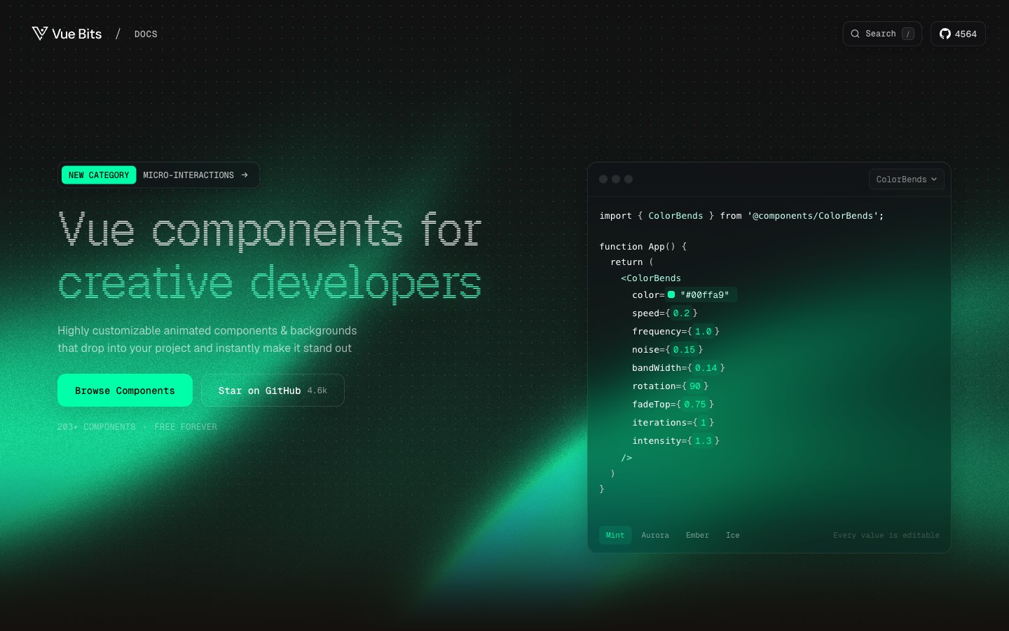
The official Vue port of React Bits — animated text, interactions, components and backgrounds.
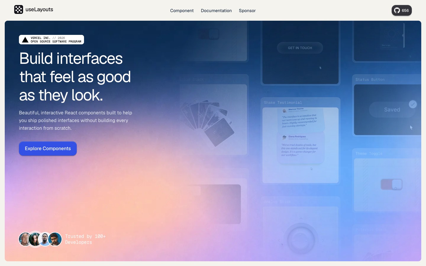
Free micro-interactions that feel like small surprises — haptic buttons, a secret folder, a 3D book, split-on-scroll cards.
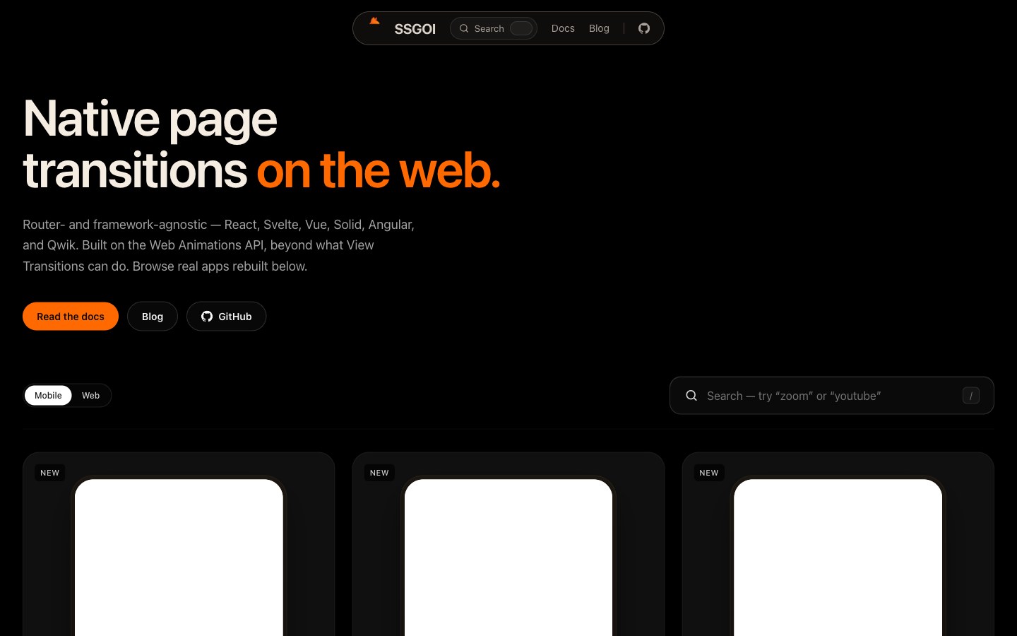
Native-app-style page transitions on the Web Animations API — works across frameworks, with no router lock-in.
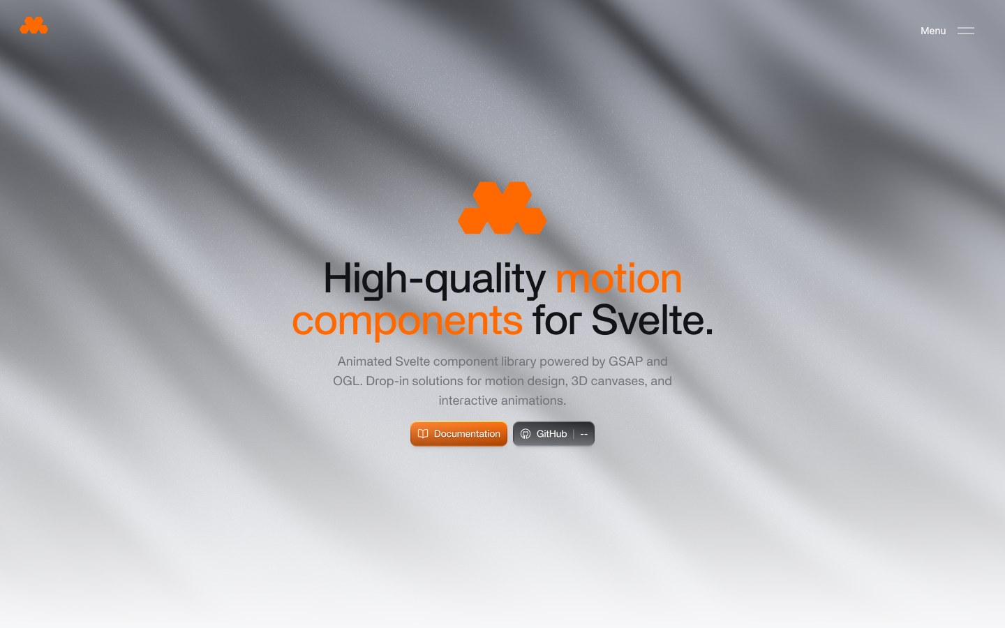
High-quality motion components for Svelte — GSAP-driven interactions and OGL 3D canvases, added with a CLI.
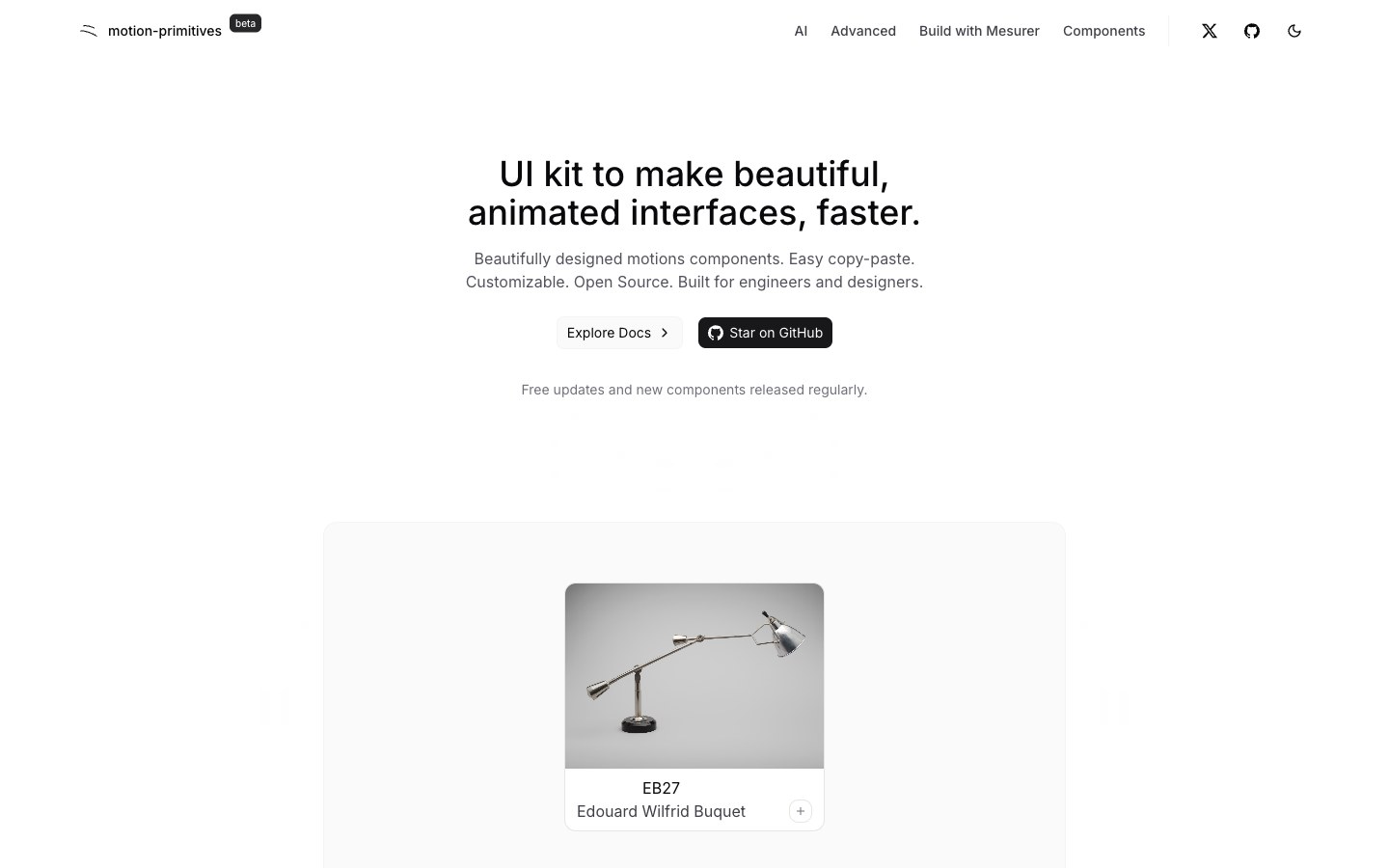
Restrained motion building blocks for product UIs — text effects, border trails, a magnifier and an infinite slider.
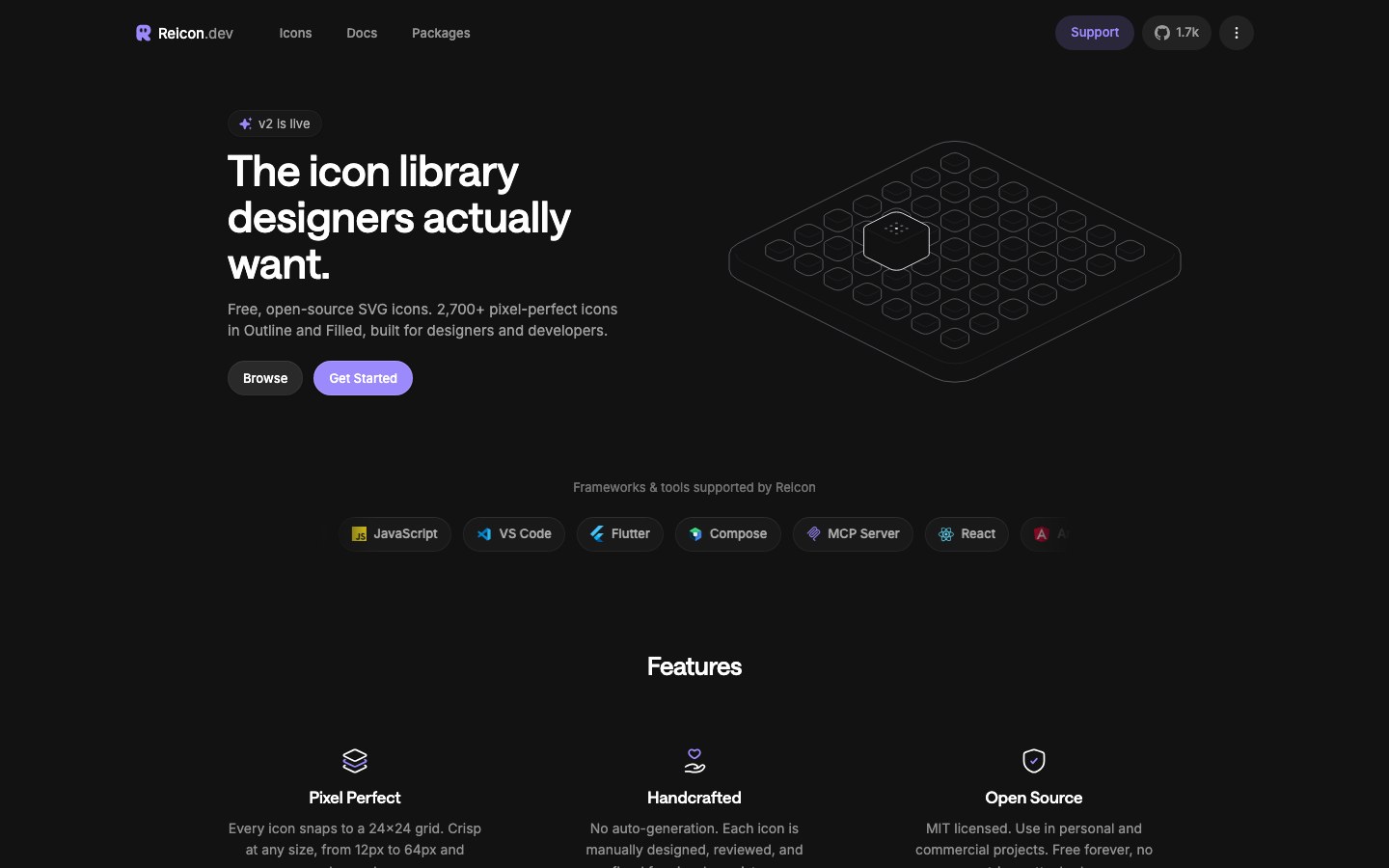
A new open-source set of 2,700+ pixel-aligned icons in outline and solid.
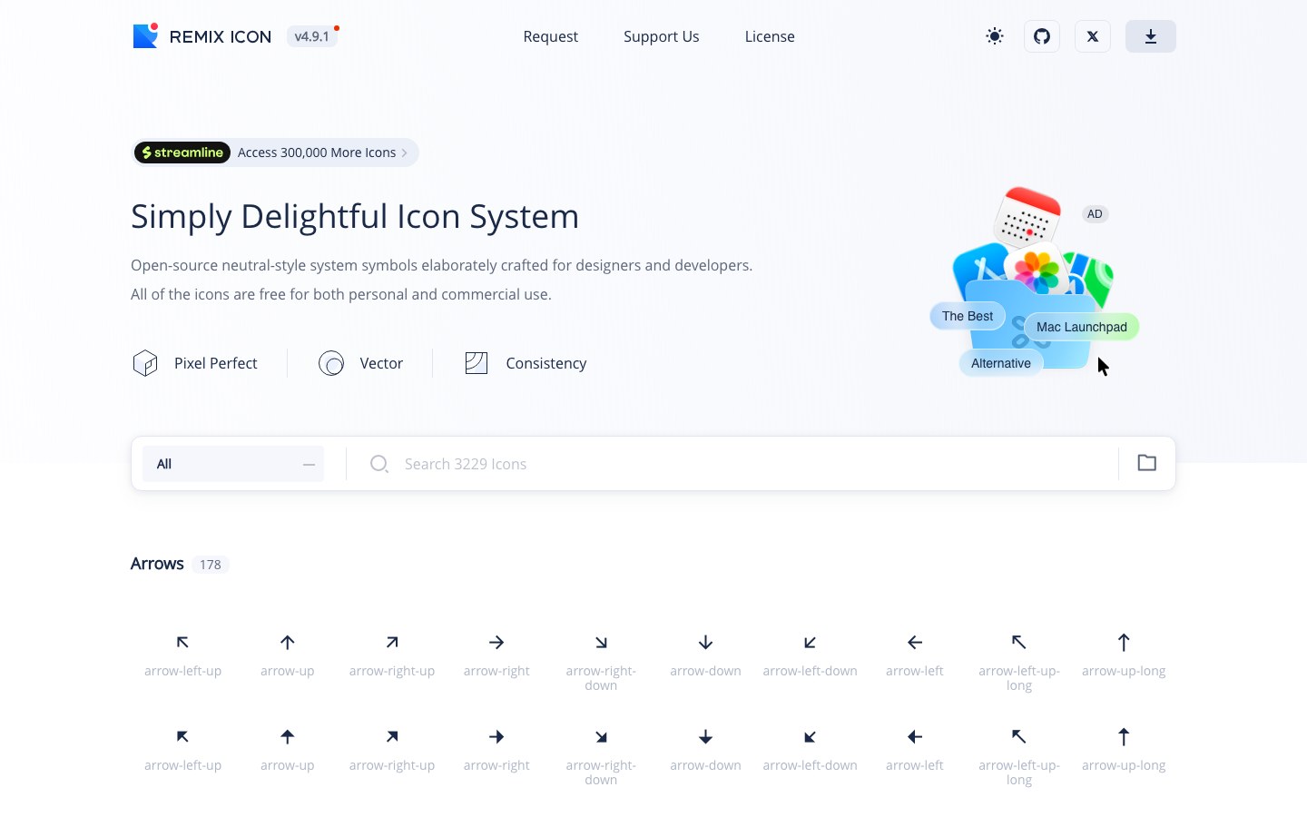
3,000+ neutral icons, each in a matching line and fill pair.
Logos for AI models and brands — OpenAI, Claude, DeepSeek and hundreds more, in color, mono and with wordmarks.
400+ hand-drawn doodle icons, CC0 with no attribution needed, plus animated versions.
1,170 open-source animated icons in Lucide and Hugeicons styles, triggered on hover.
316 Heroicons animated with Motion, with packages for React, Vue, Svelte and Solid.
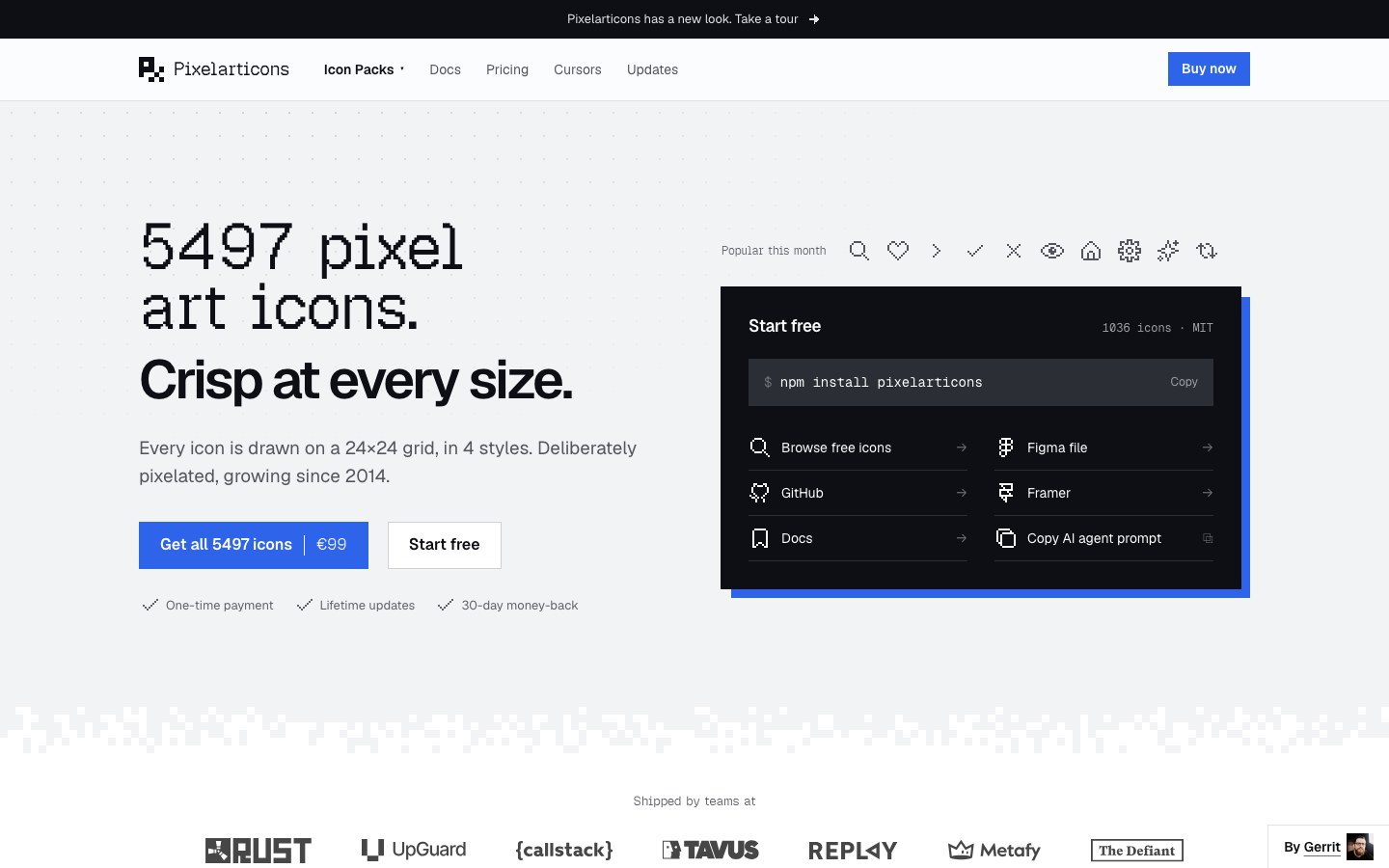
5,400+ pixel-art icons on a 24 grid in four styles, freshly redesigned.
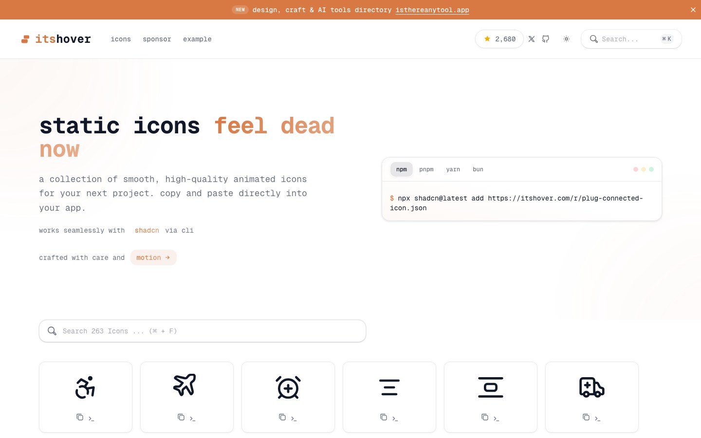
About 200 icons that animate on hover — UI basics, brands, currencies and status.
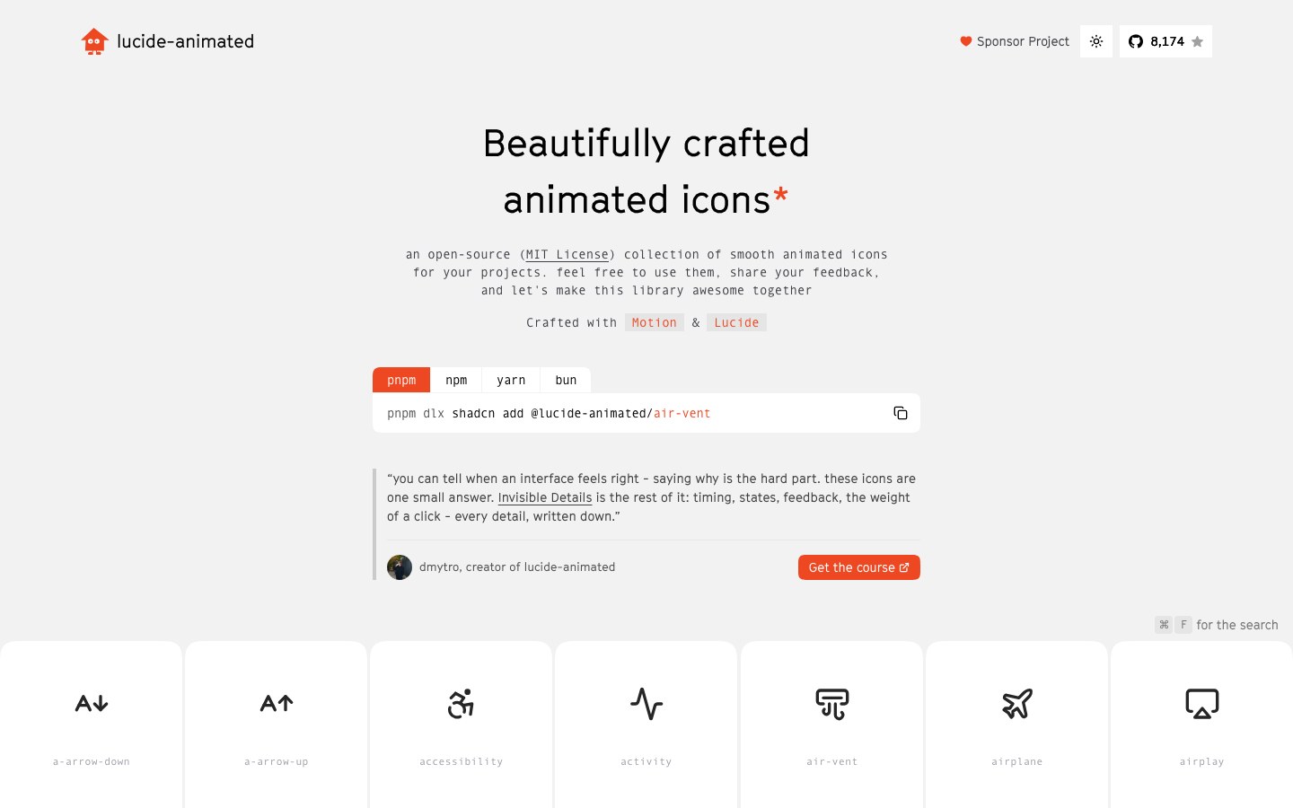
350+ Lucide icons animated with Motion that move on hover, added one by one with shadcn.
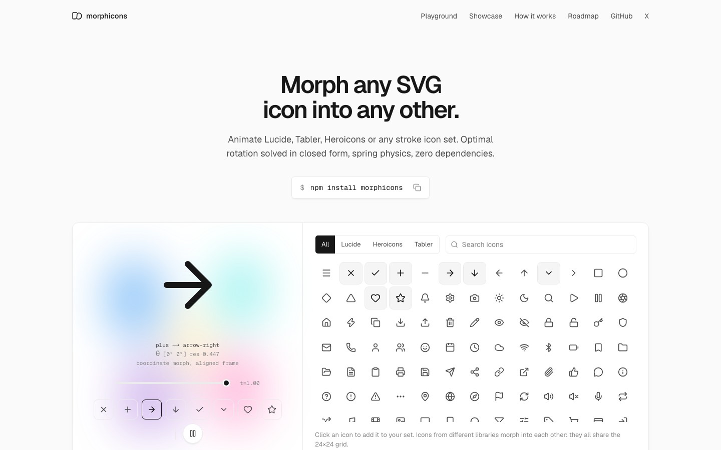
Smoothly morph any line icon into another with spring physics — works with Lucide, Tabler and Heroicons.
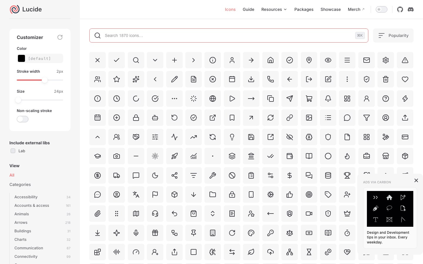
shadcn's default icon set — 1,600+ line icons forked from Feather and still growing.
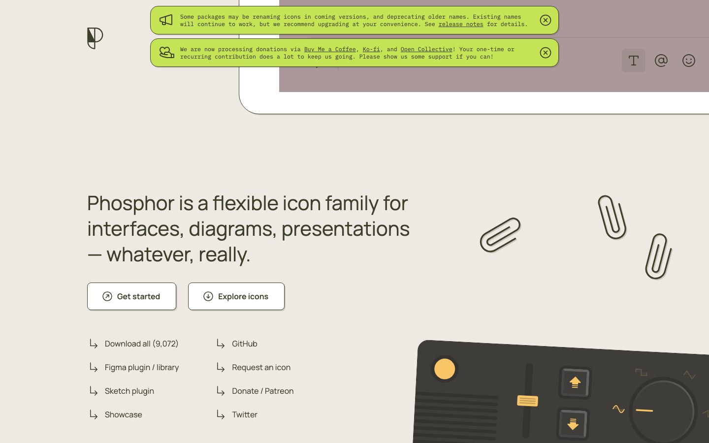
9,000+ friendly icons, each in six weights from thin to fill and duotone.
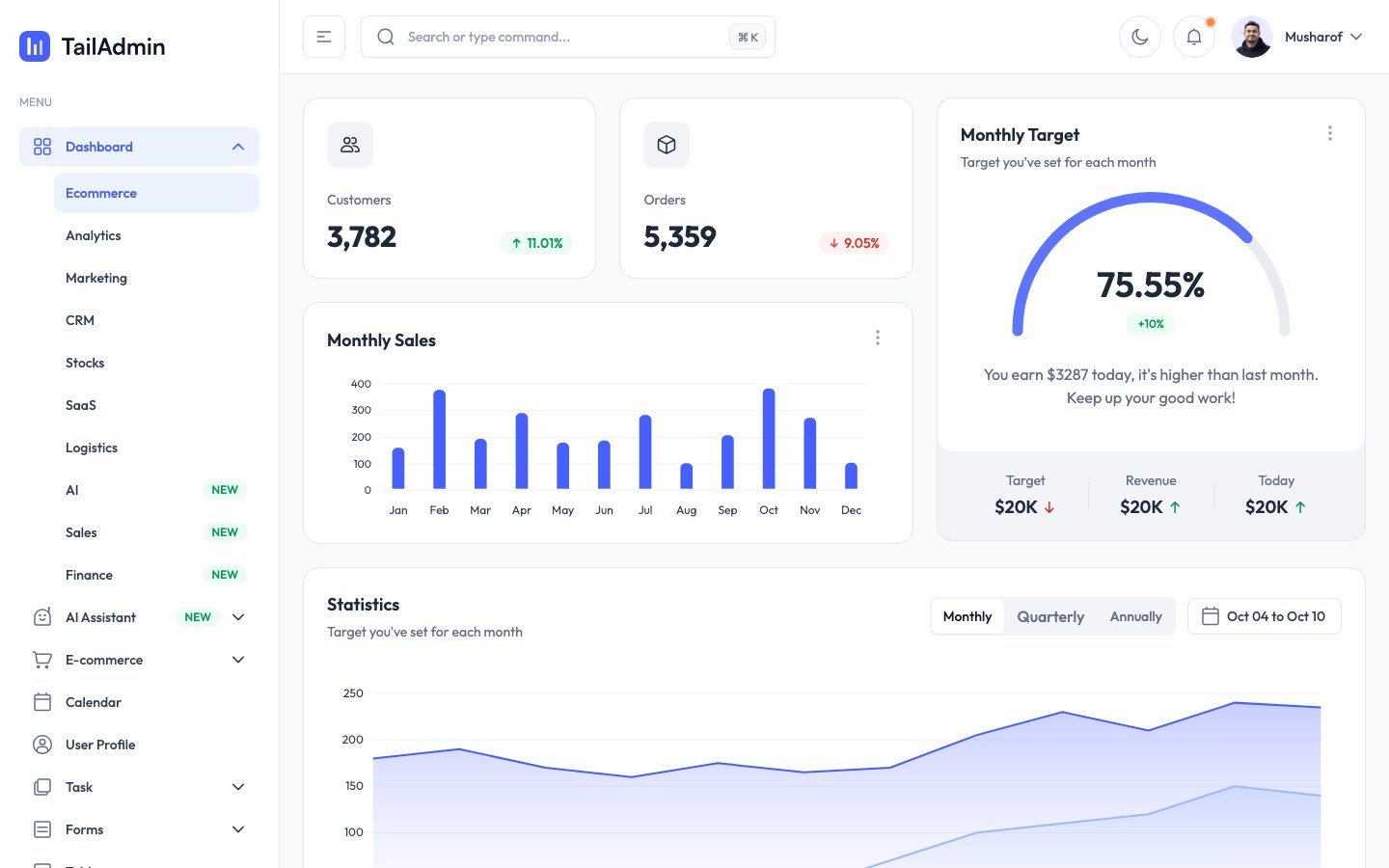
Tailwind admin templates with e-commerce, analytics and CRM dashboards, in React, Vue and Angular versions.
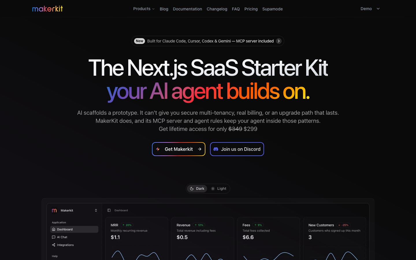
A long-running SaaS kit in Supabase, Drizzle and Prisma flavors, with a free open-source Lite edition.

Vercel's official AI chat app template — ChatGPT-style conversations, attachments, history and model switching.
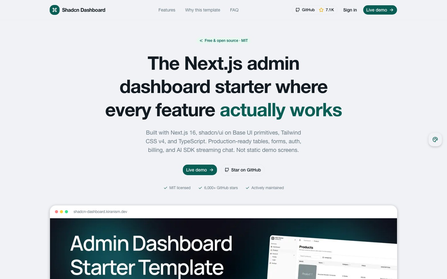
A popular Next.js and shadcn dashboard starter with charts, a product table, kanban and forms.
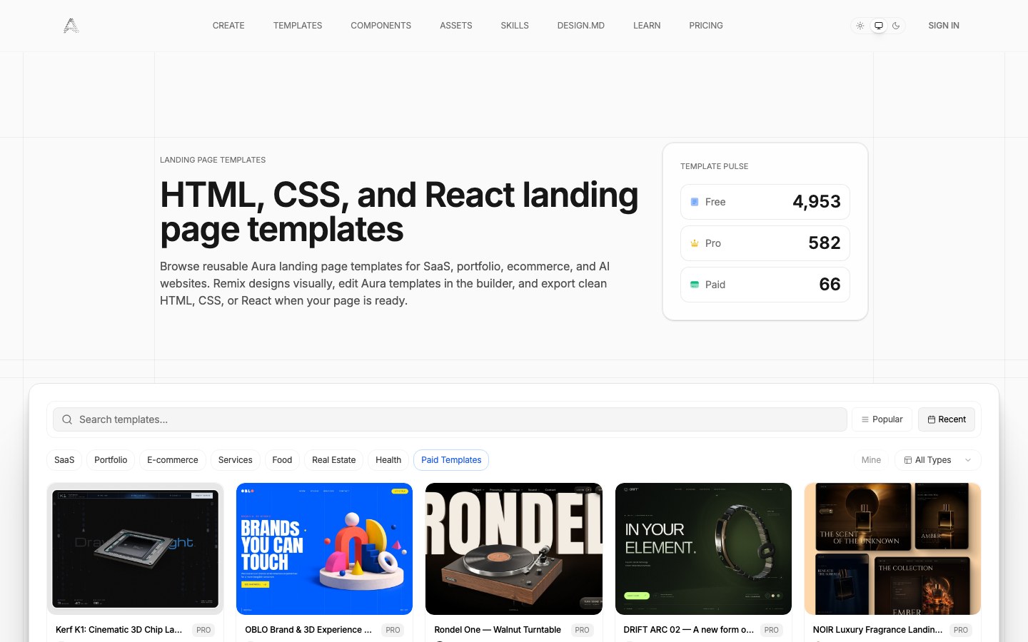
Meng To's AI landing-page builder with 700+ community templates, exportable as HTML, Tailwind or React.
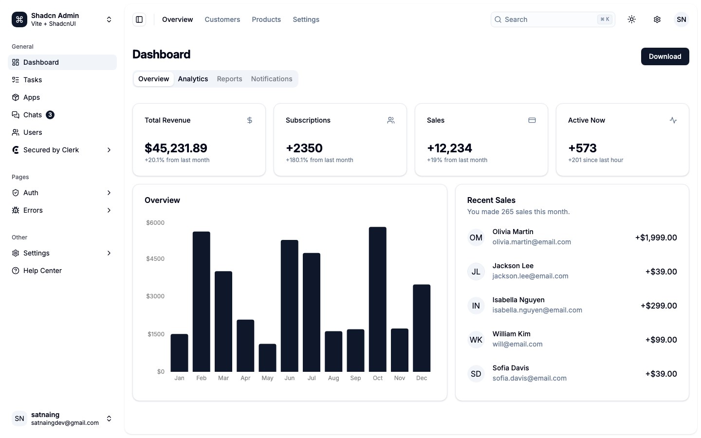
A shadcn admin built with Vite and TanStack Router — dashboard, tasks, chat, users, settings and more.
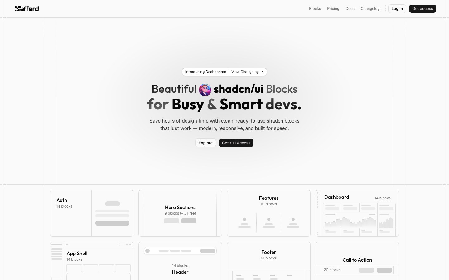
Whole-section shadcn blocks — heroes, auth, app shells, dashboards and pricing — with restrained, precise typography.
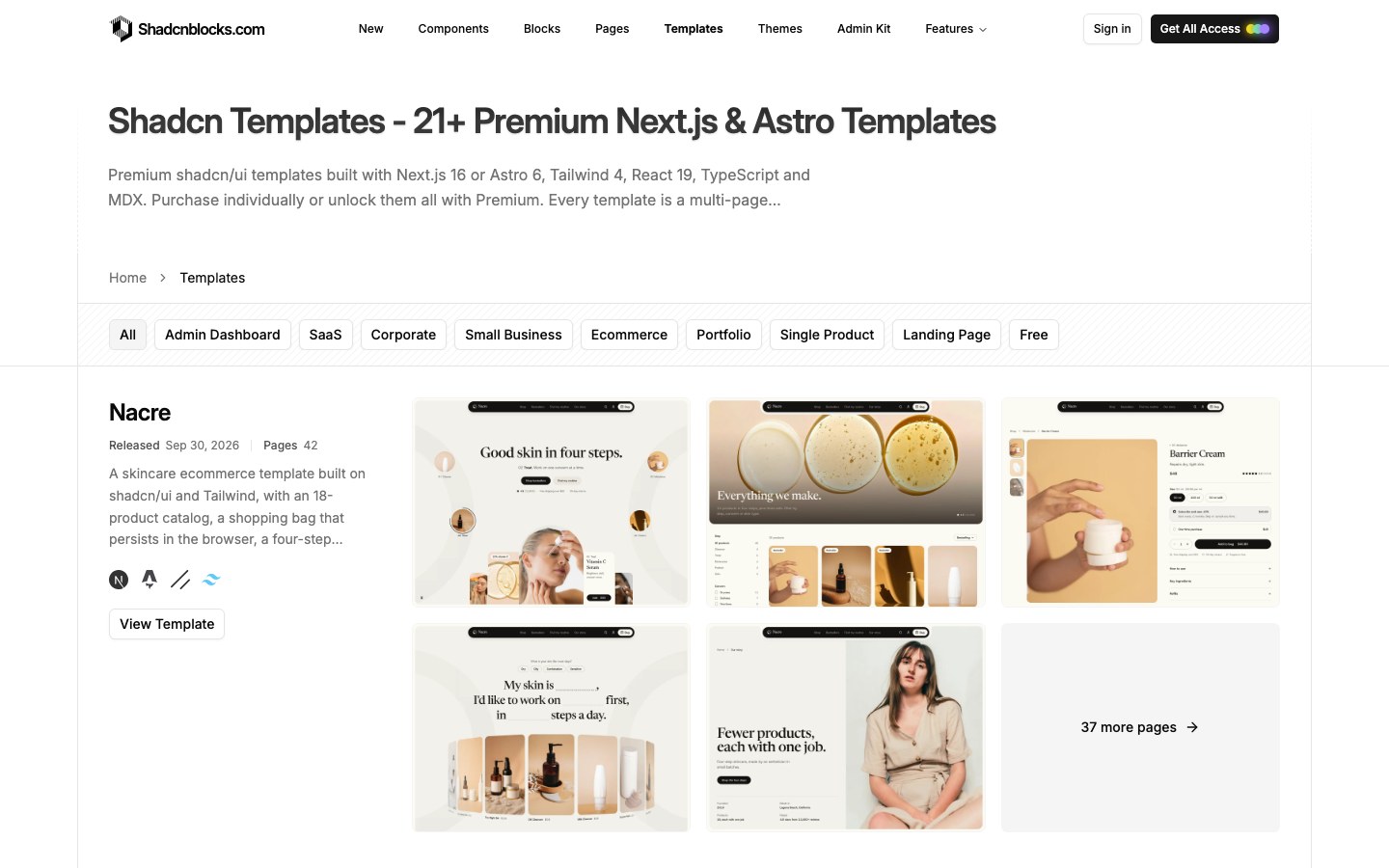
The largest library of shadcn blocks and marketing templates — 1,600+ blocks, for Next.js and Astro.
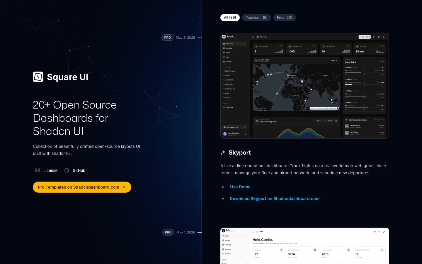
30+ full-page shadcn layouts from the maker of Circle — dashboards, notes, maps and bookmarks, each one clickable.
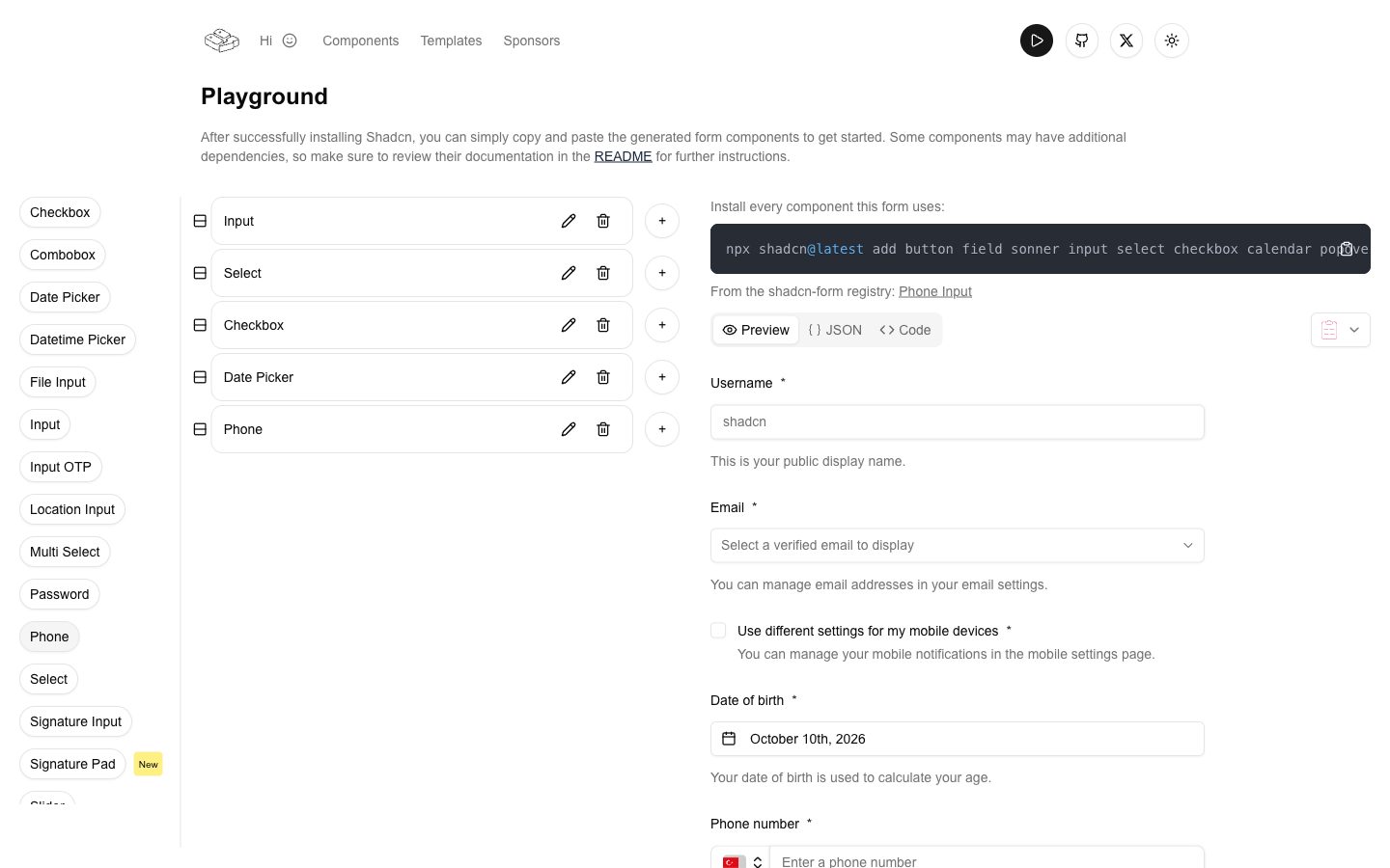
Build forms visually and get shadcn, React Hook Form and Zod code, plus extra fields like phone and tag inputs.
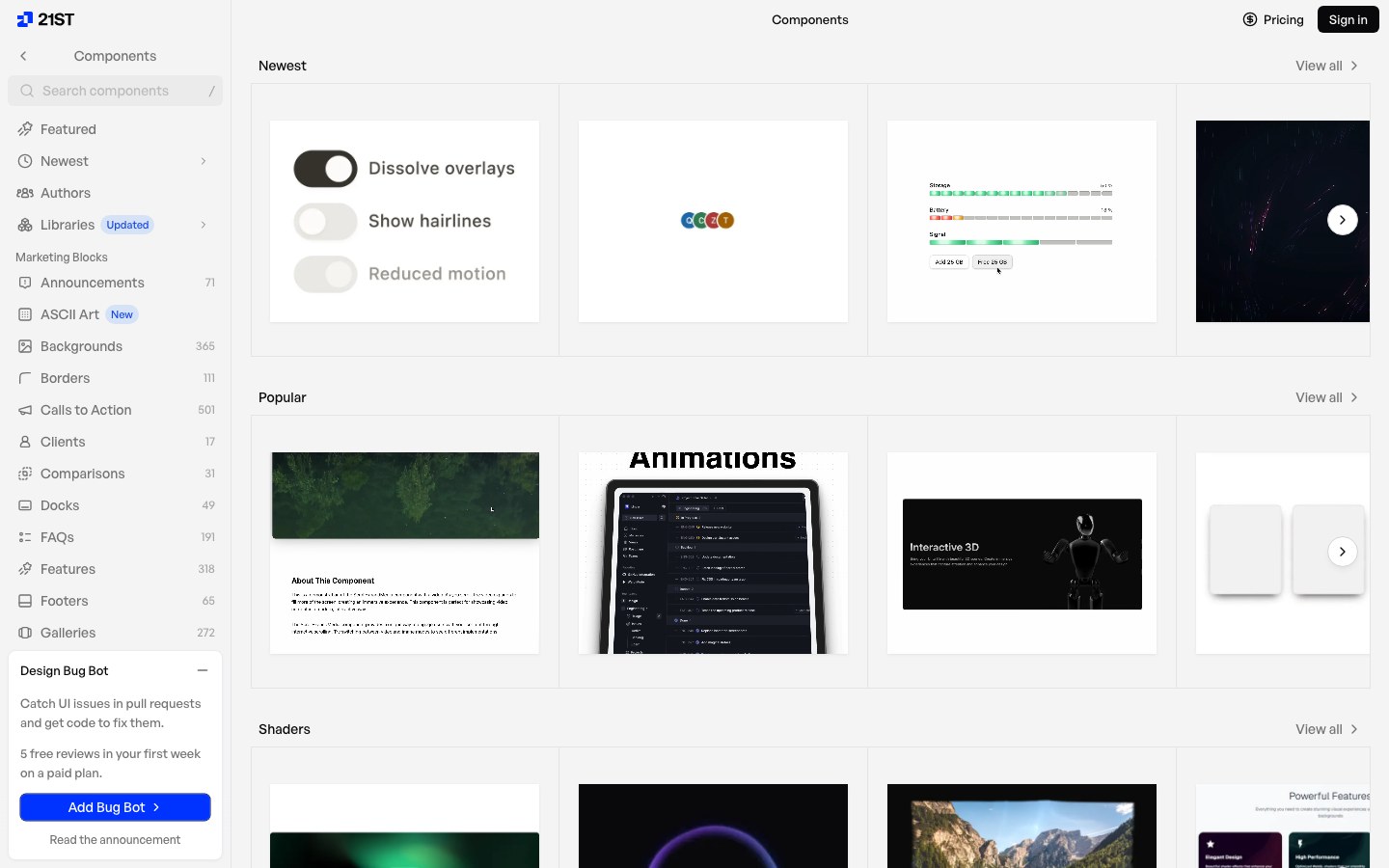
A community marketplace of 10,000+ shadcn components, templates and themes, each one command away.
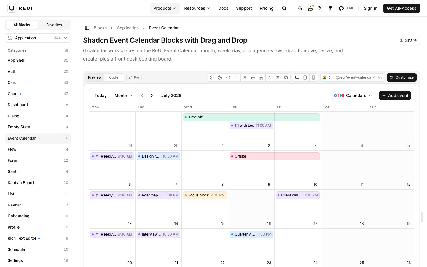
Over a thousand shadcn components and app blocks — data grids, Gantt, kanban, calendars and flows — on Radix or Base UI.
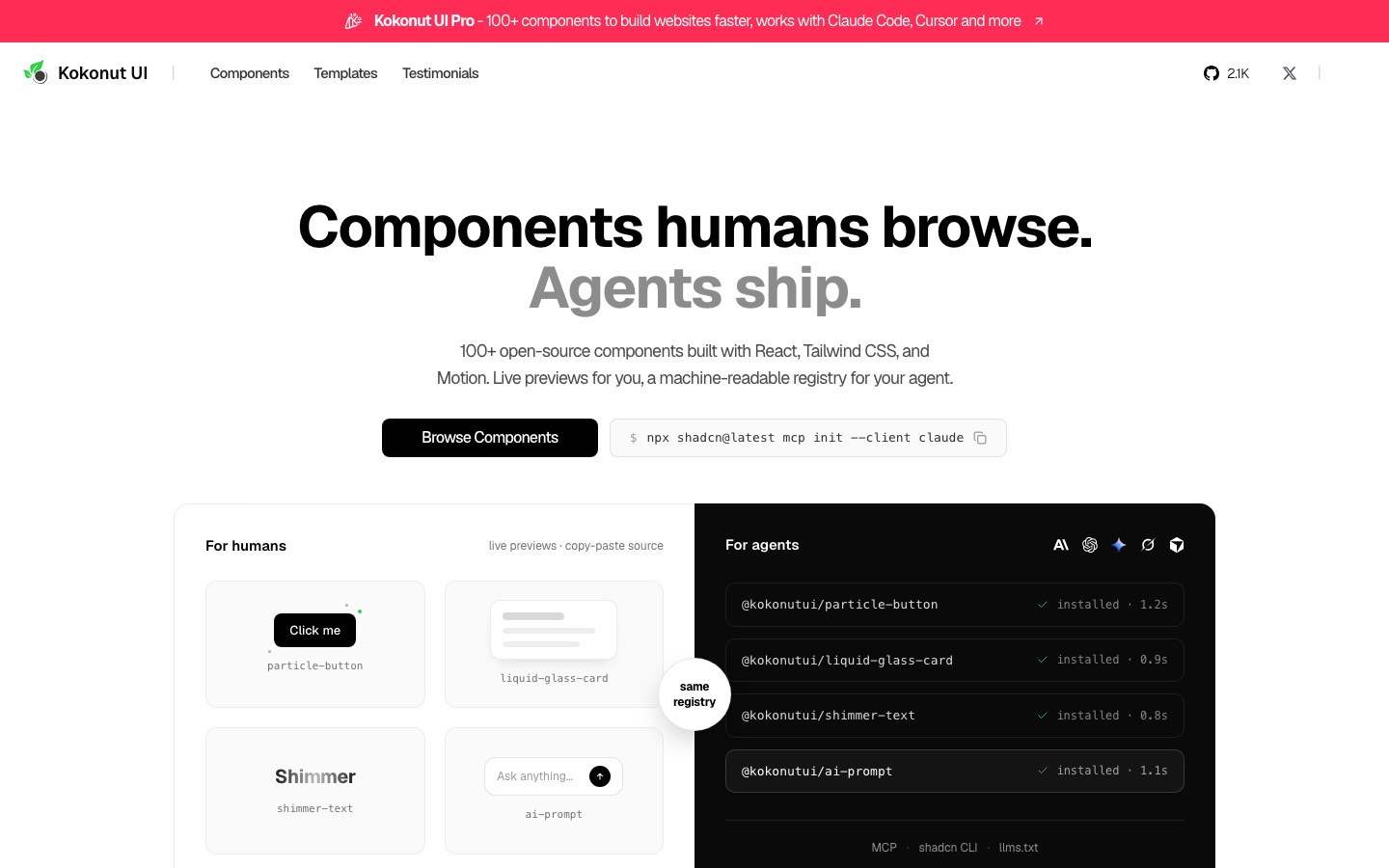
100+ free components — cards, inputs, AI prompt boxes, buttons and text effects — with a polished marketing-site look.
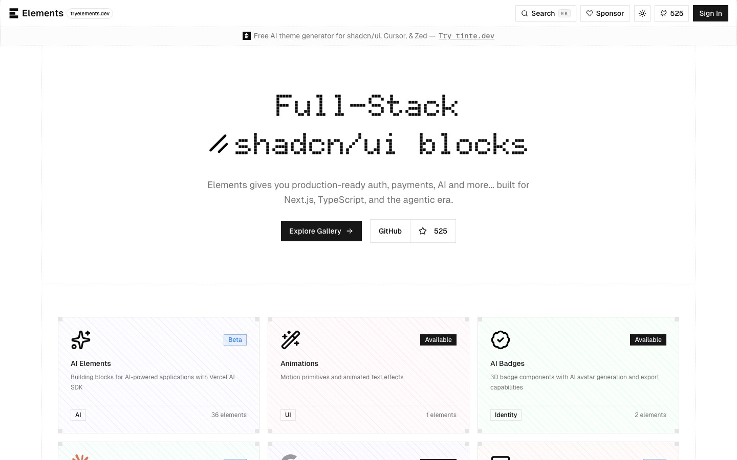
shadcn blocks with the logic wired in — Clerk sign-in, Polar pricing, AI chat, brand logos and GitHub cards.
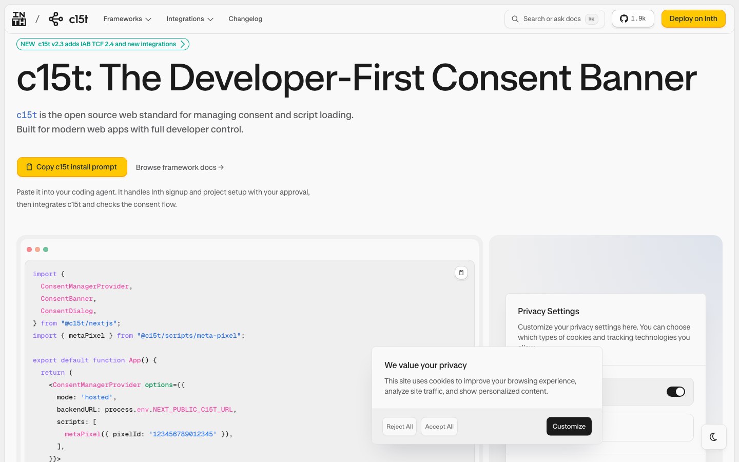
Developer-first cookie consent banners and preference dialogs, fully styleable, with a compliance backend.
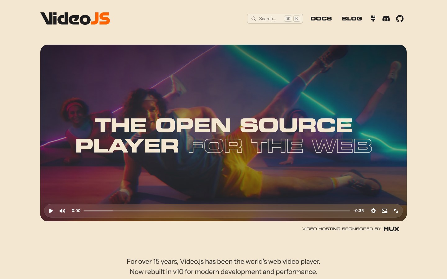
The classic video player rebuilt for v10, merging Vidstack and Media Chrome, with modern skins and React components.
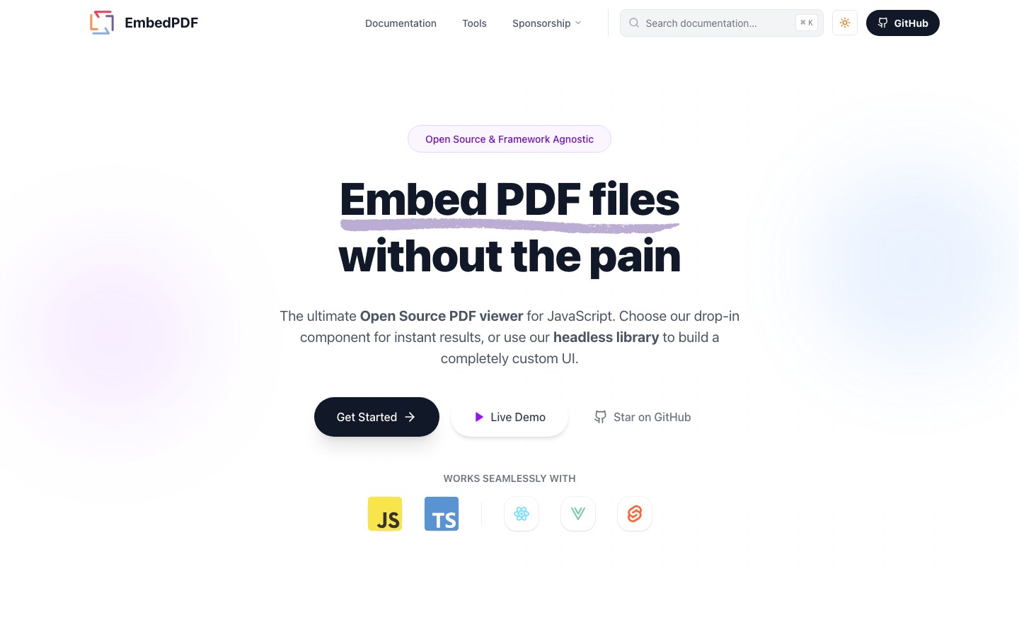
An open-source PDF viewer running PDFium in WebAssembly — annotations, search, thumbnails and redaction, or go headless.
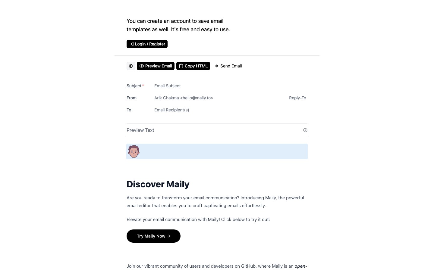
A block-based WYSIWYG email editor that exports HTML compatible with React Email.
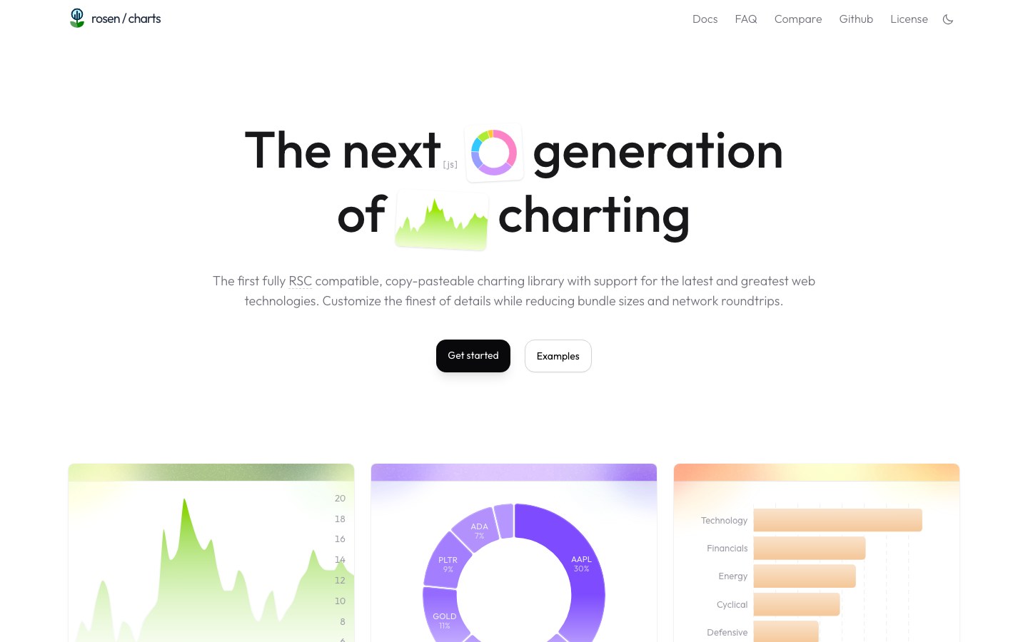
Copy-paste charts built with D3 and Tailwind, ready for React Server Components, with carefully chosen palettes.
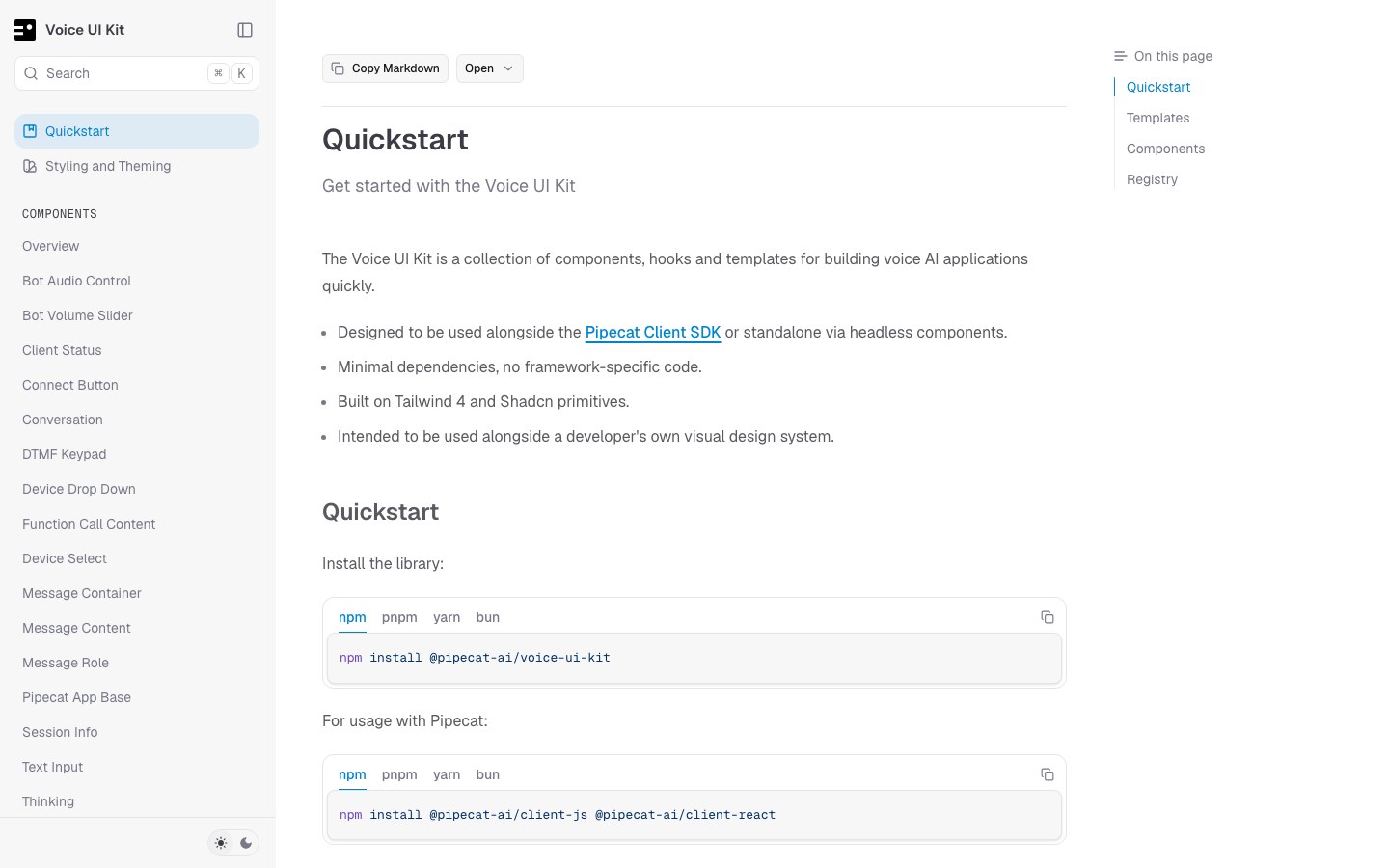
UI for voice AI apps — connect buttons, volume, device pickers, transcripts, a dial pad and audio visualizers.
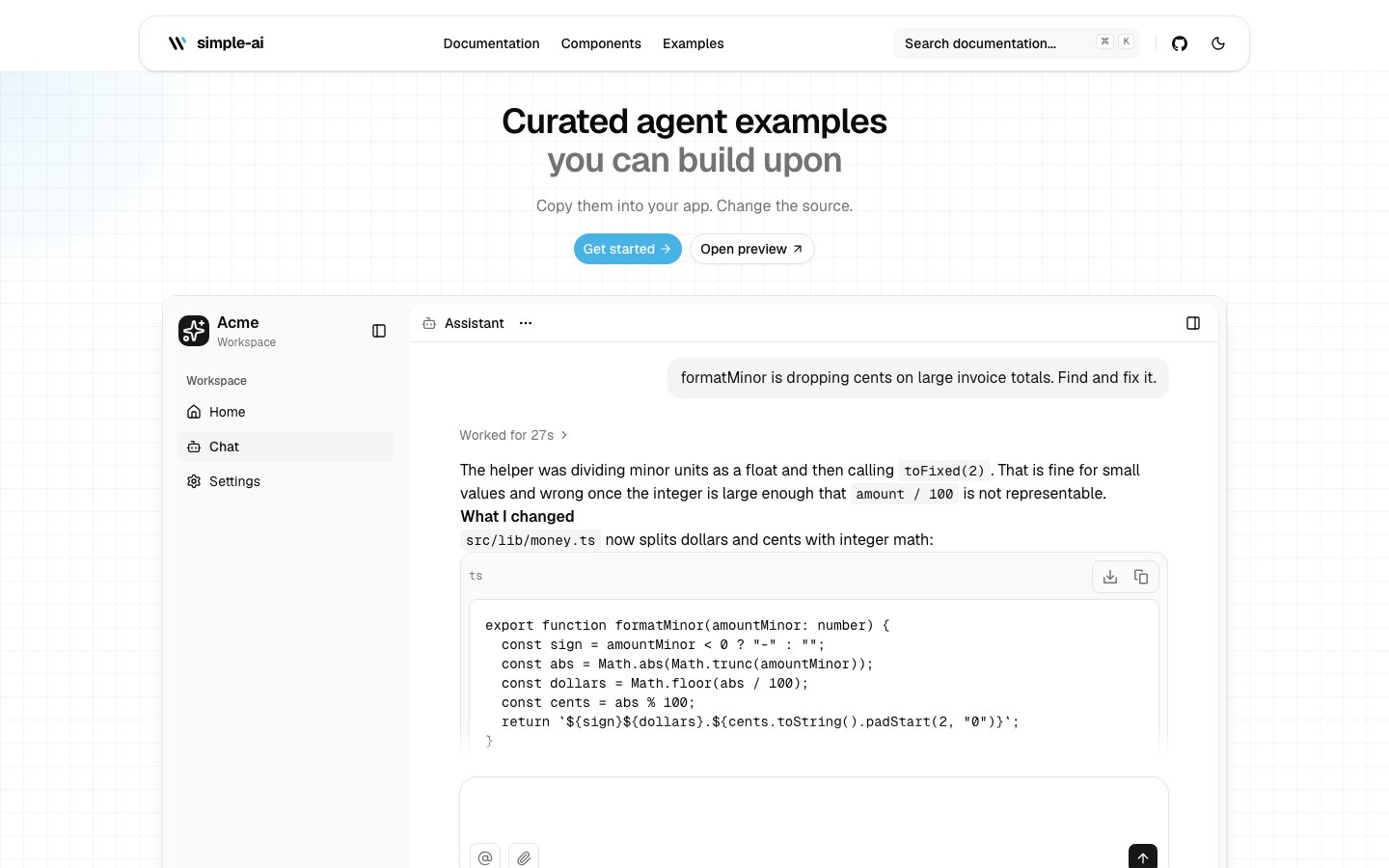
Components for AI apps plus full agent examples — chat inputs, sidebar and popup chats, and workflow nodes.
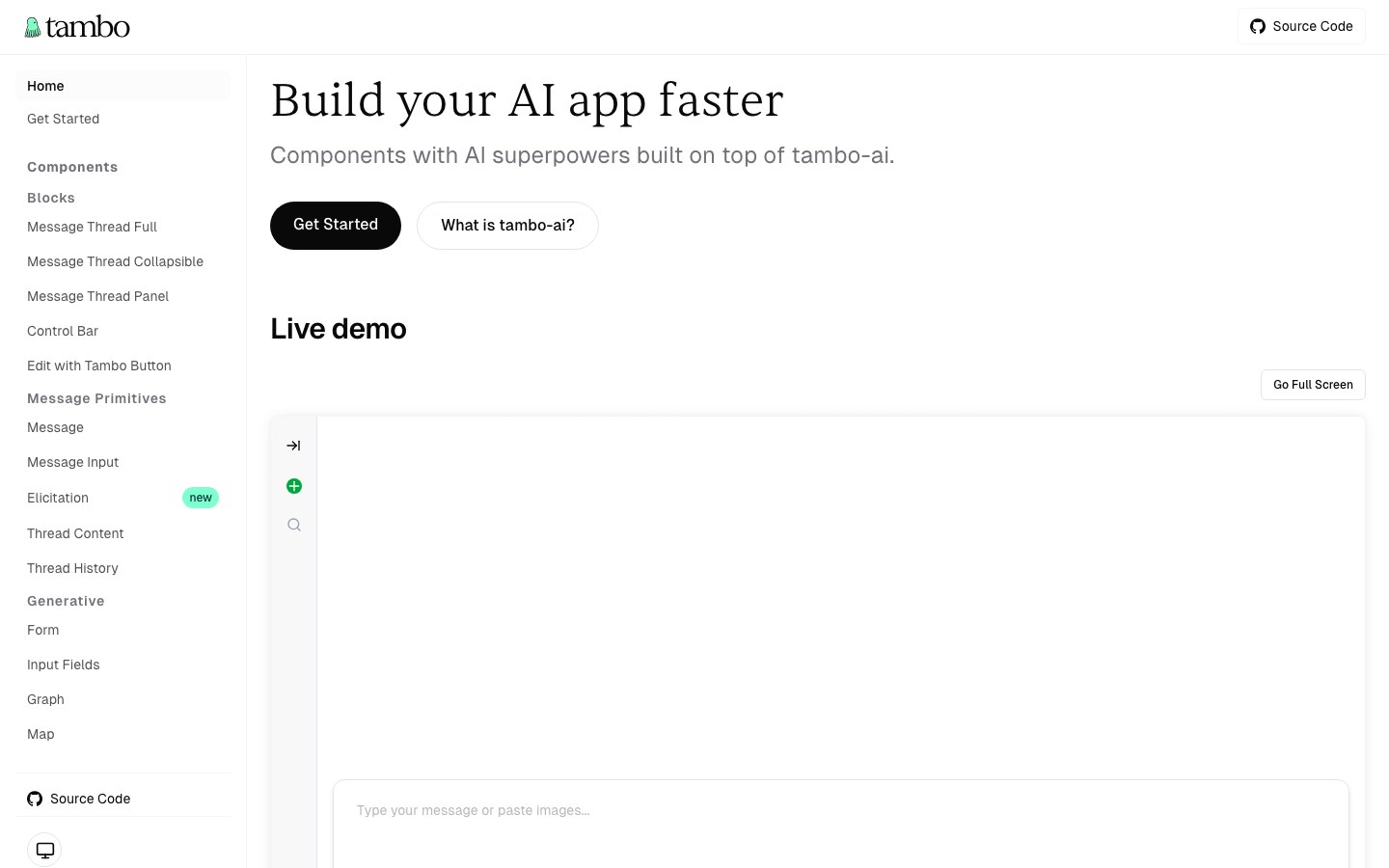
Generative UI components — the AI renders forms, charts and maps right in the chat, with threads, inputs and controls.
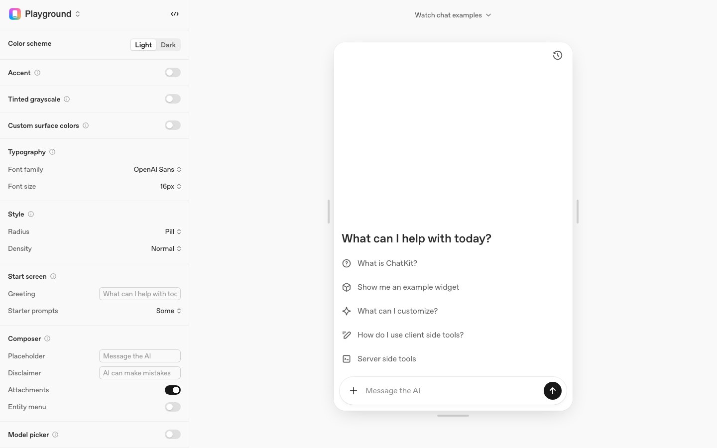
OpenAI's embeddable chat component with the ChatGPT interaction, themable down to color, radius, density and font.
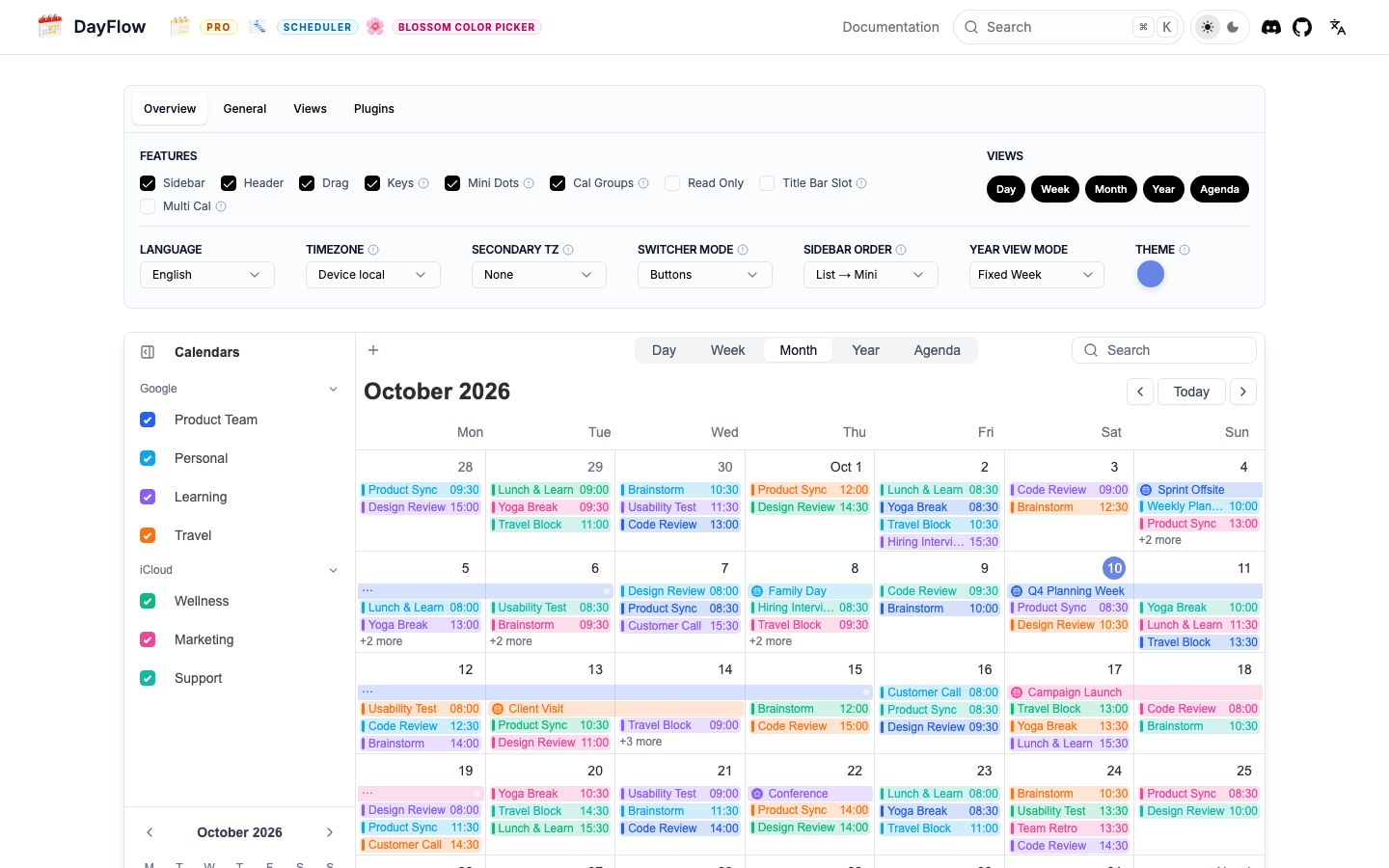
A lightweight calendar with Google Calendar-style week and month views, for React, Vue, Angular and Svelte.
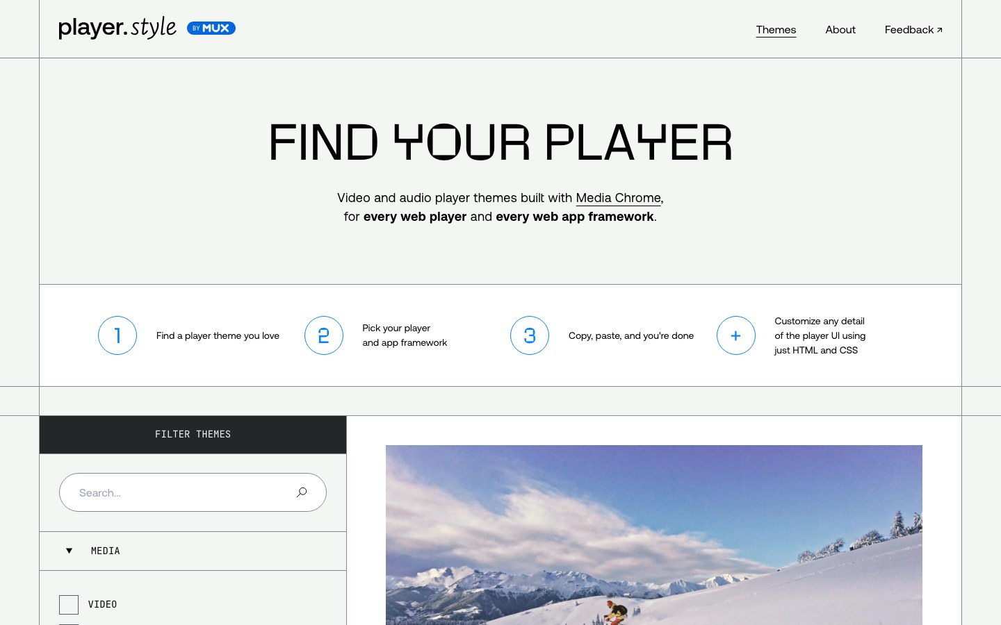
Themes for audio and video players from Mux — YouTube, Netflix and Winamp looks built on Media Chrome.
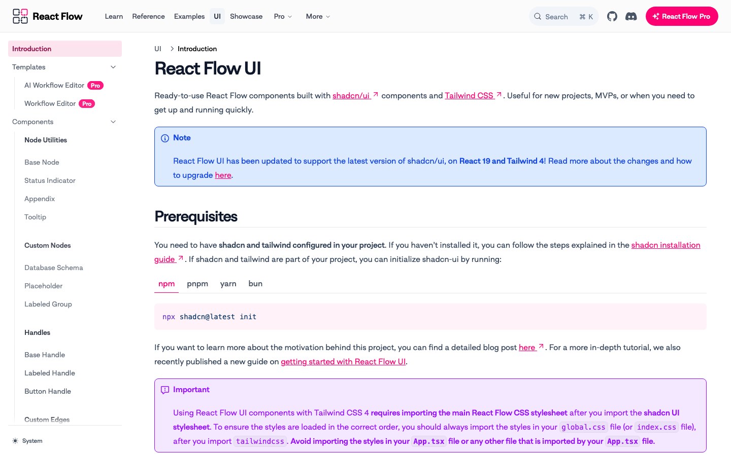
Official shadcn-style node components for React Flow — base nodes, status indicators, toolbars and an AI workflow editor.
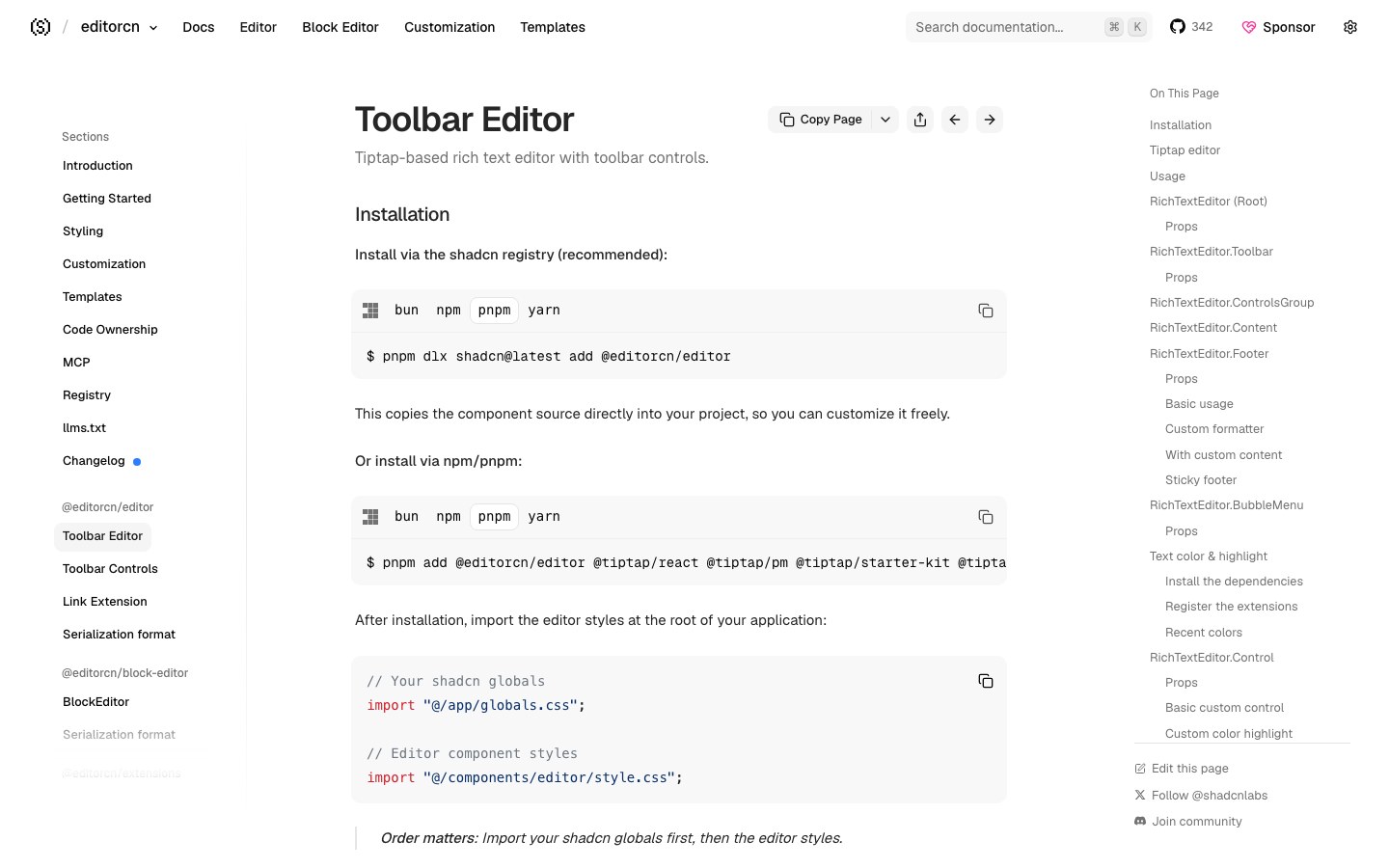
A Tiptap rich-text editor for shadcn, in a toolbar style and a Notion-style block style.
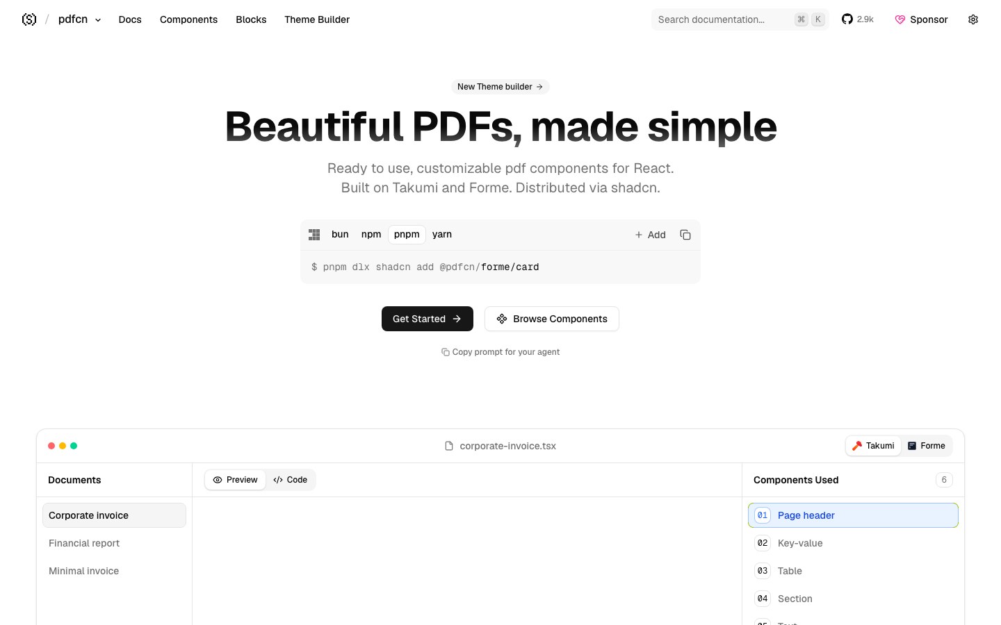
Lay out PDFs with React components — invoices, reports and résumés — installed the shadcn way.
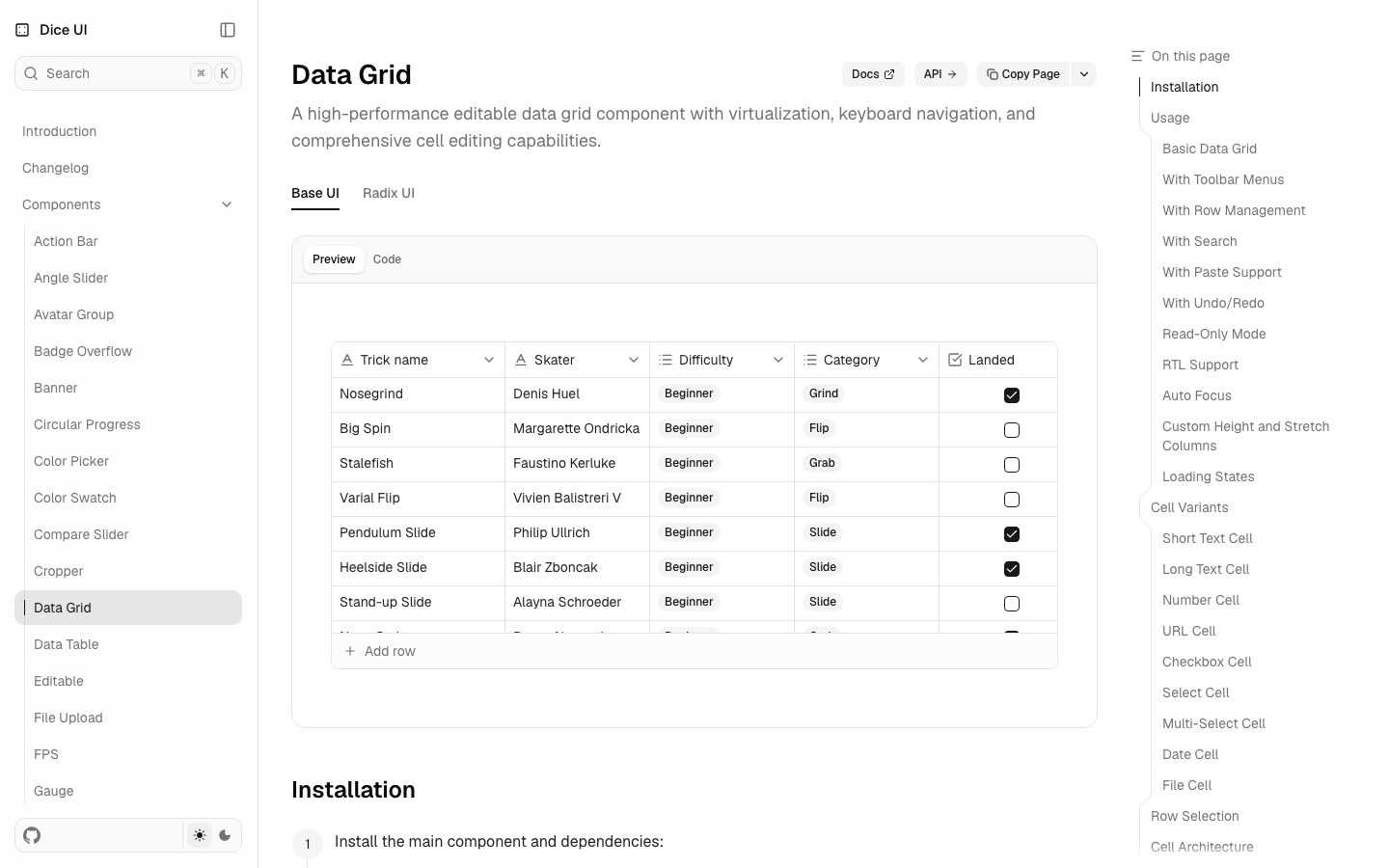
The complex components shadcn lacks — data grid, kanban, cropper, angle slider, color picker and compare slider.
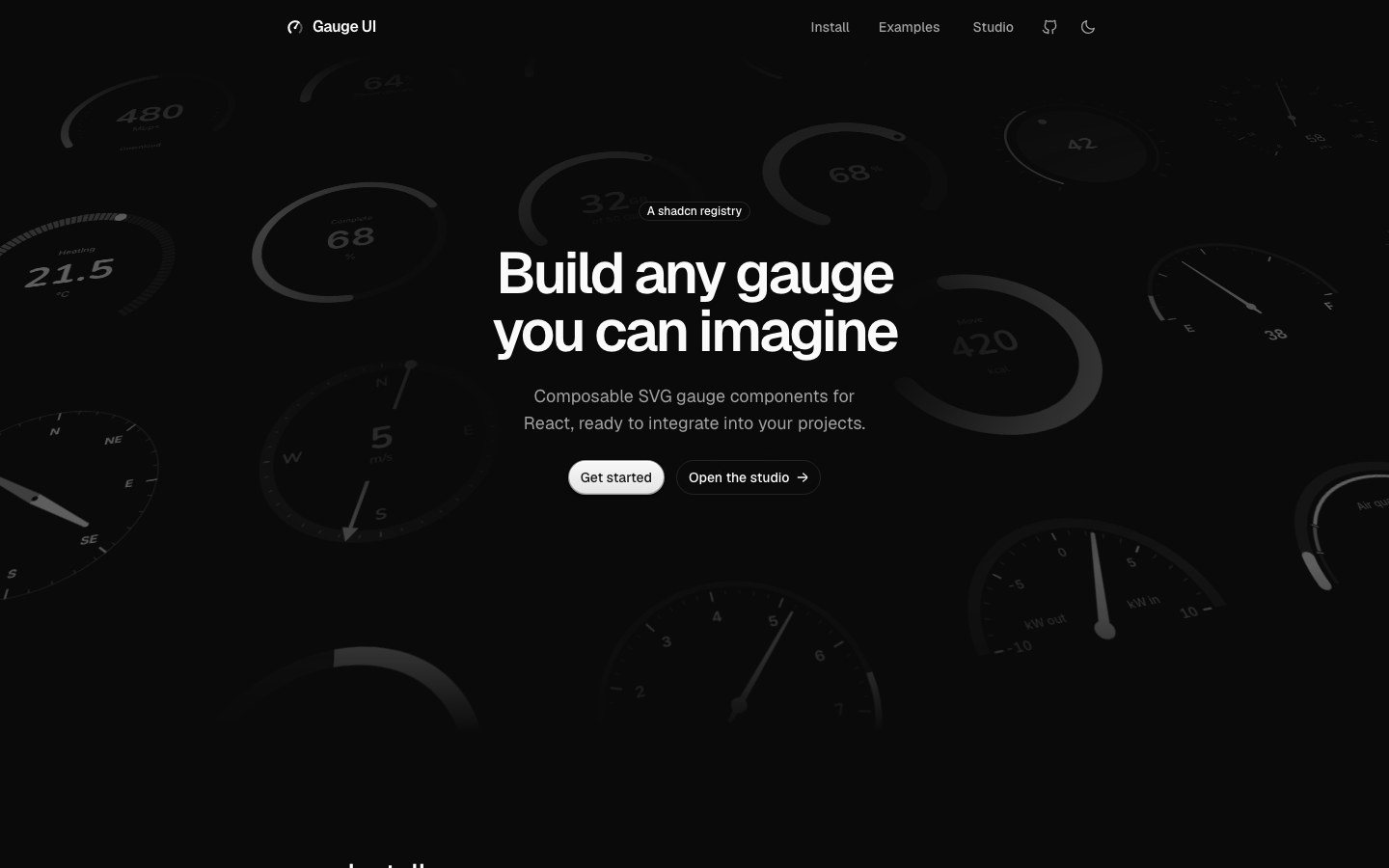
Composable SVG gauges for speedometers, progress rings, temperature and daylight readouts.
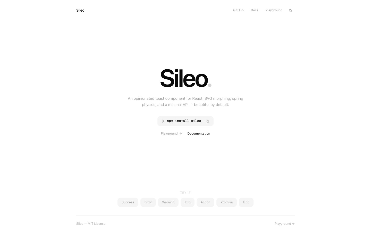
Toasts with strong character — SVG morphing and spring physics make them unfold like a droplet.
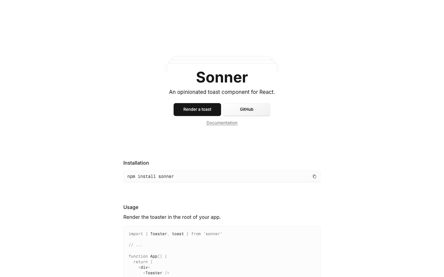
Emil Kowalski's toast component, whose stacking interaction became the standard — shadcn's toast uses it.
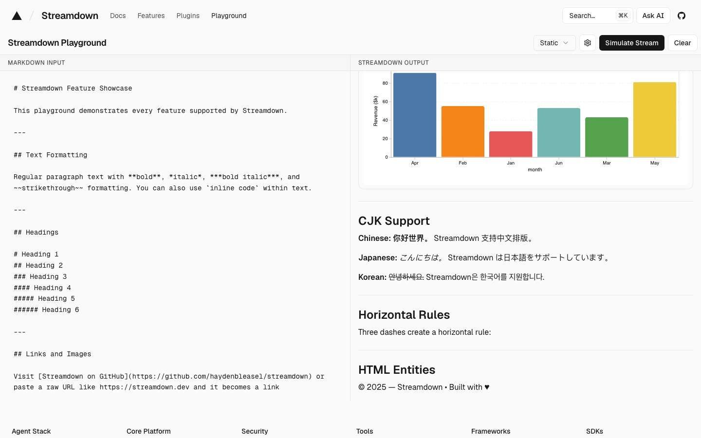
Vercel's streaming Markdown renderer that keeps AI replies from breaking mid-stream — with code, math and Mermaid.
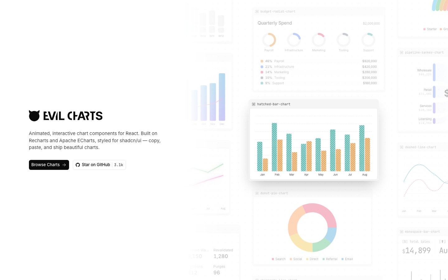
Animated shadcn charts on Recharts and ECharts, with gradients, glow and interactions already tuned.
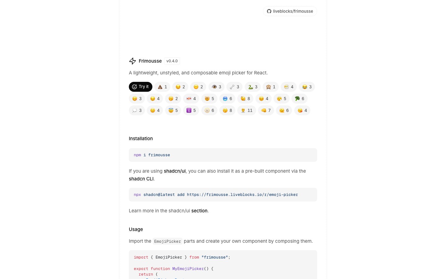
A small, unstyled, composable emoji picker from Liveblocks, also installable as a shadcn component.
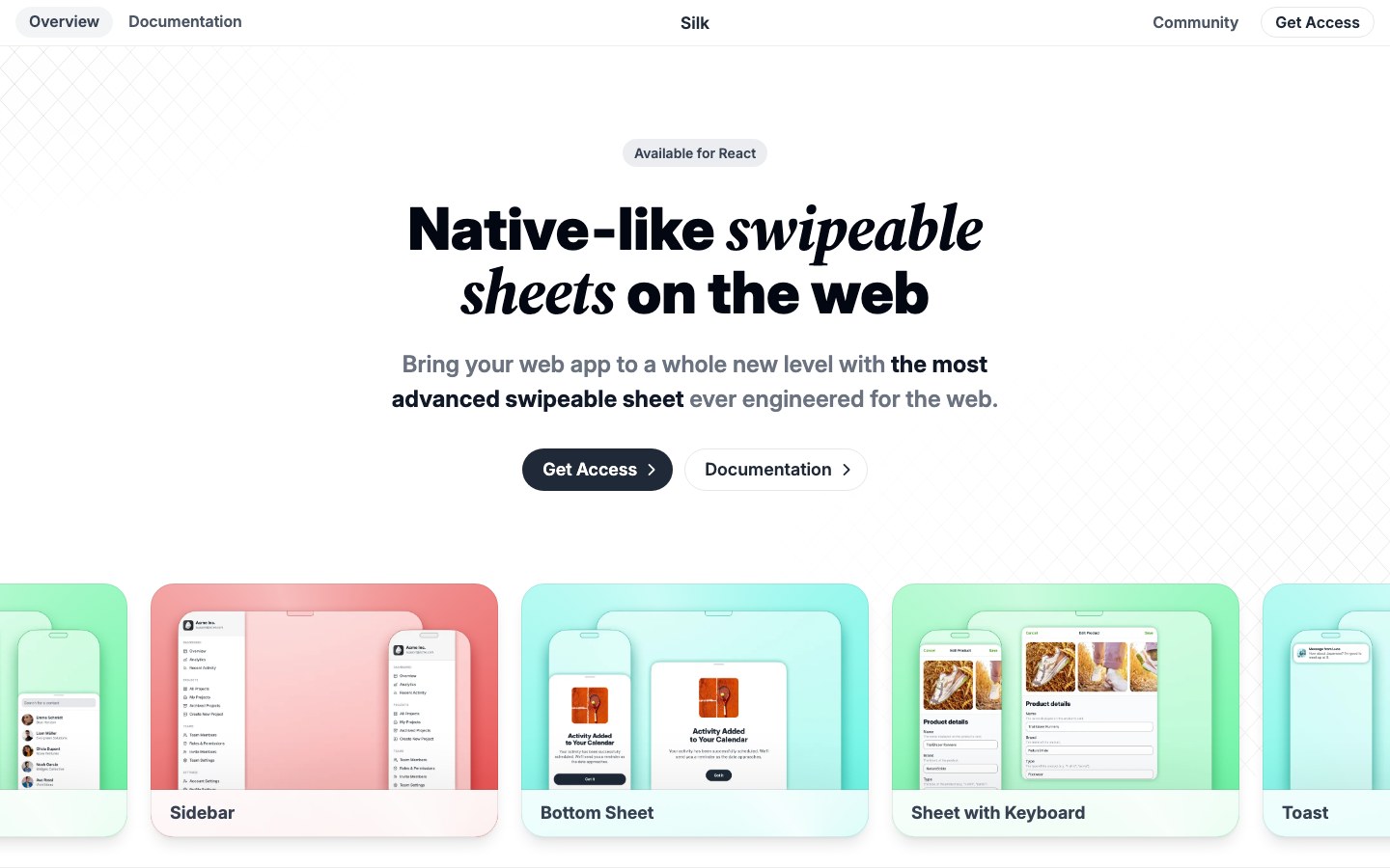
Native-feeling swipeable sheets for the web — drawers, card stacks, long pages and galleries with iOS-like physics.
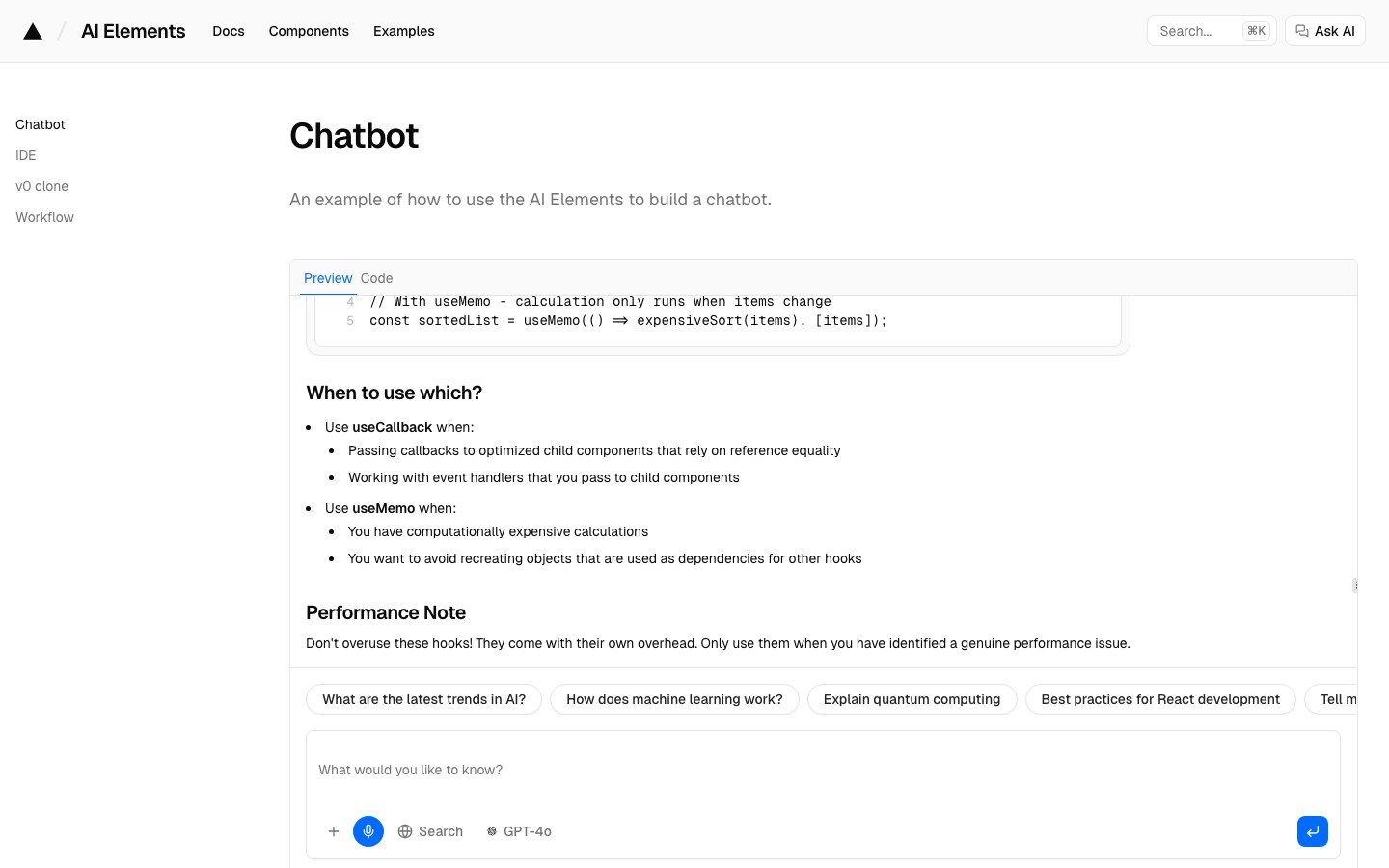
Vercel's registry of AI interface components — conversations, reasoning, tool calls, code blocks and model pickers.
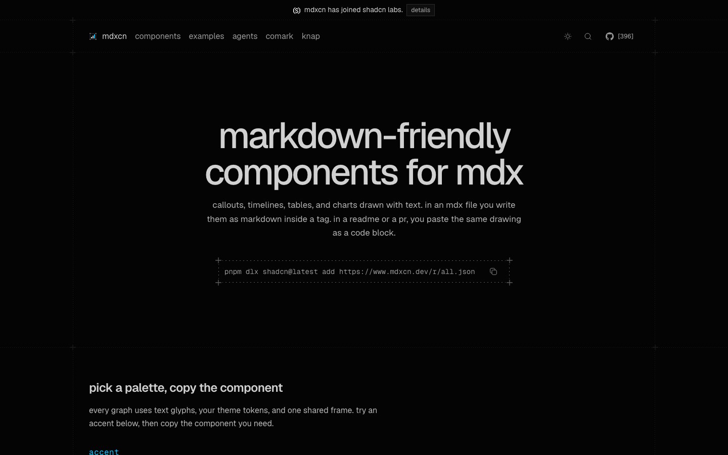
Callouts, steps, timelines, tables and charts for MDX docs, all drawn in plain-text characters.
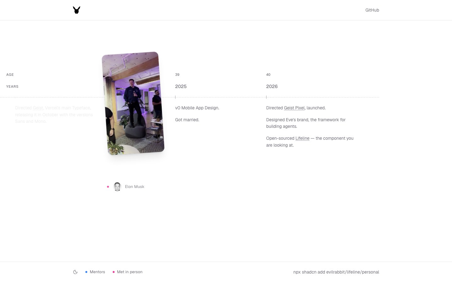
A black-and-white timeline from Vercel designer Evil Rabbit that lays out a person's or company's story year by year.
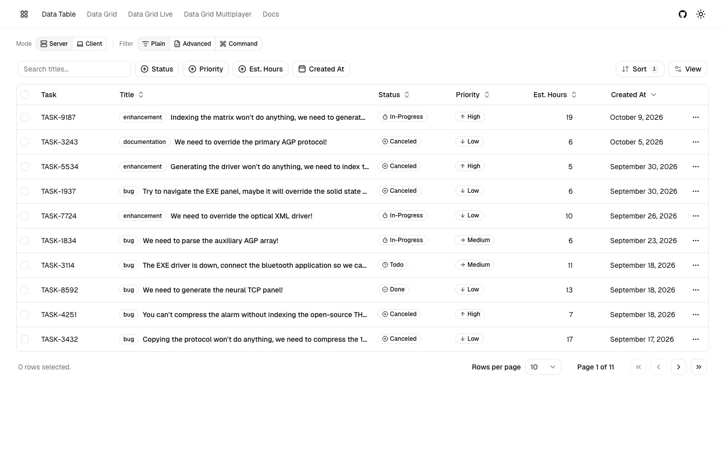
The most complete data table for shadcn — advanced filters, sorting, views and an editable spreadsheet-style grid.
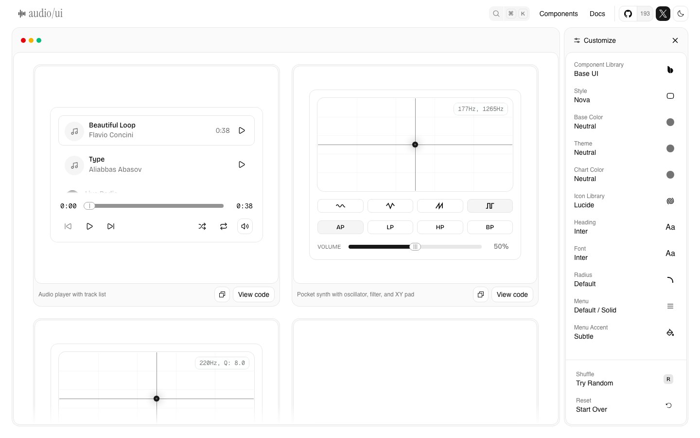
Components for audio interfaces — players, knobs, faders, channel strips and XY pads, like a mixing desk built in shadcn.
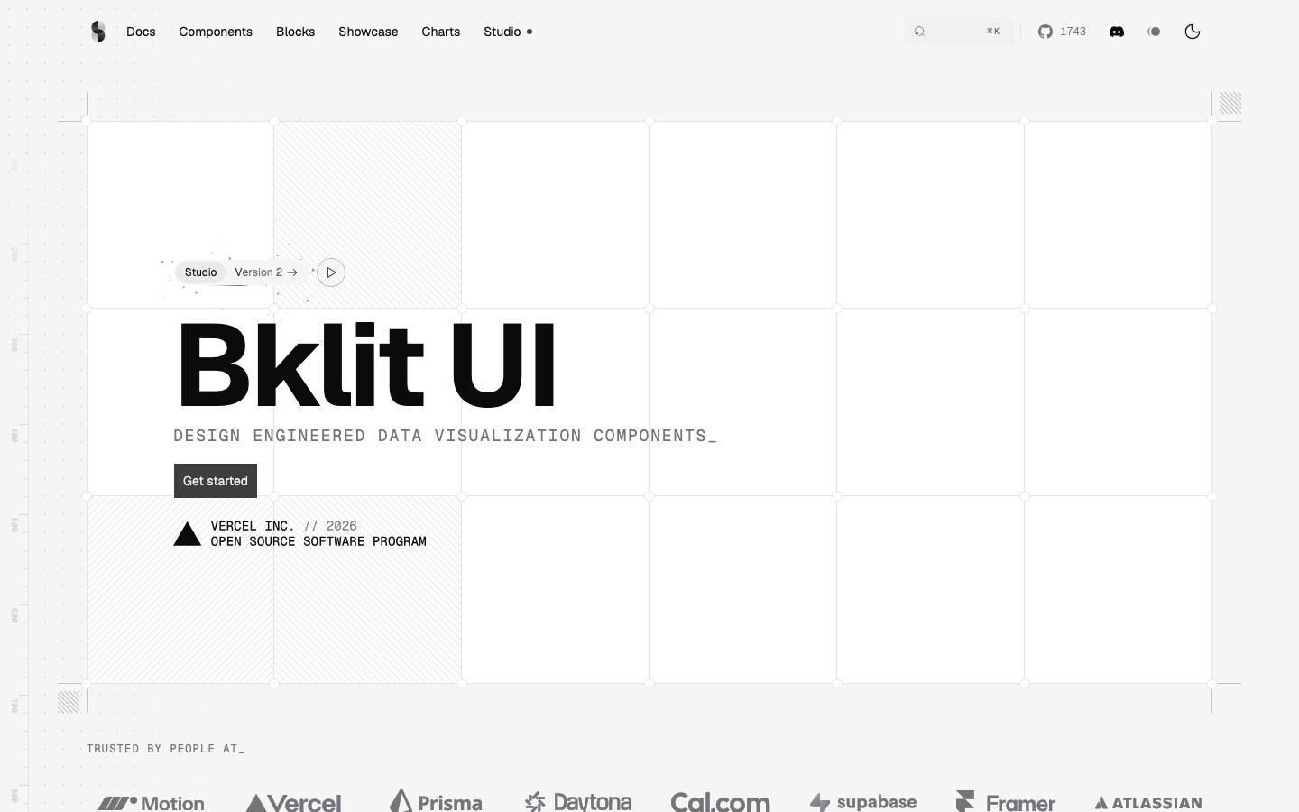
A shadcn chart registry on visx — area, candlestick, funnel, gauge and choropleth charts with shared motion and themes.
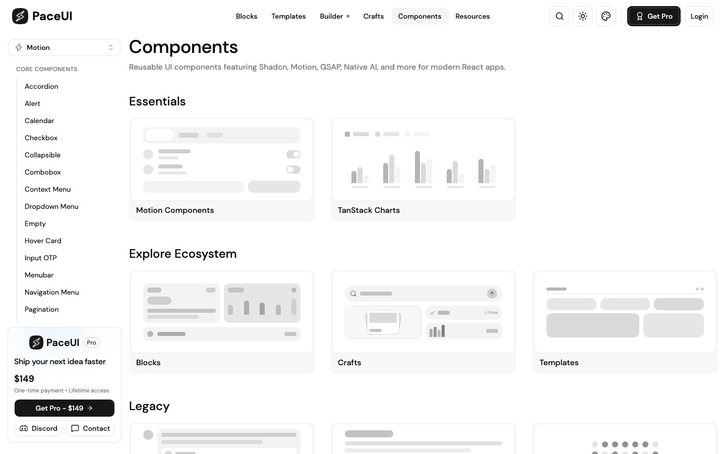
Motion- and GSAP-powered blocks and templates for Next.js and TanStack Start.
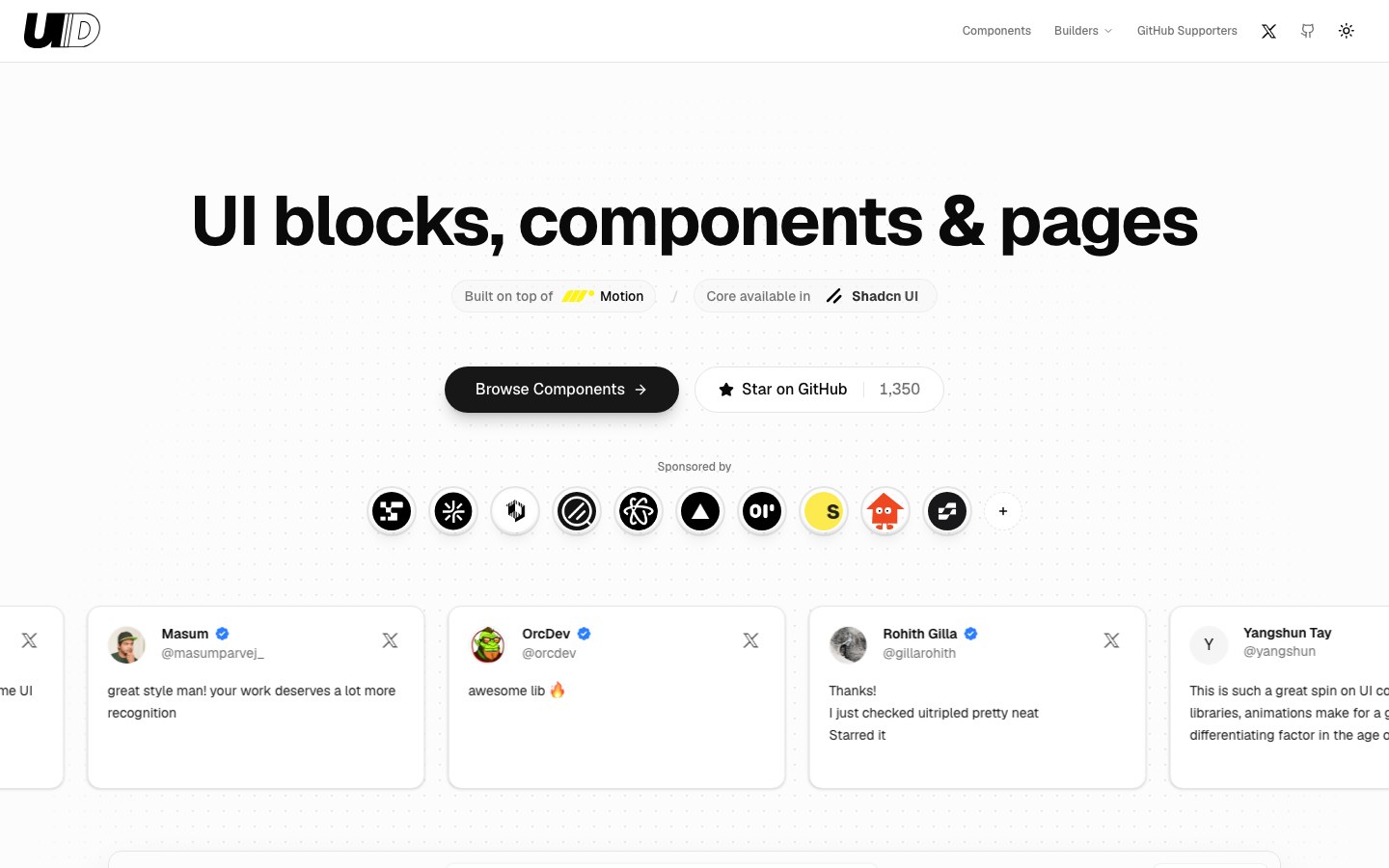
Motion-powered blocks, components and full pages, each in both shadcn and Base UI versions.
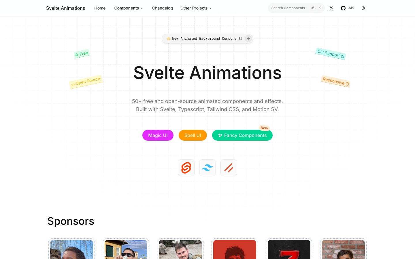
Magic UI and Spell UI effects ported to Svelte 5.
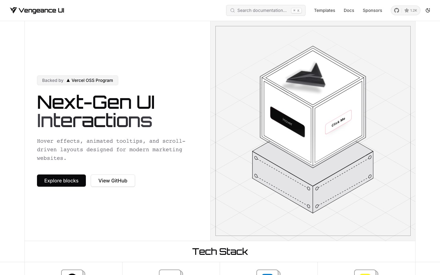
Motion for marketing sites — hover effects, animated tooltips, scroll-driven layouts and a pixelated image trail.

150+ open-source animated components and templates in the vein of Magic UI.
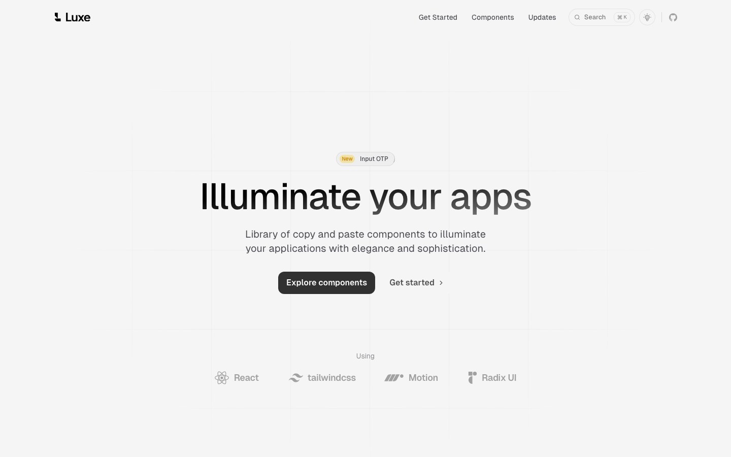
Dark, refined copy-paste components with soft light effects and smooth transitions.
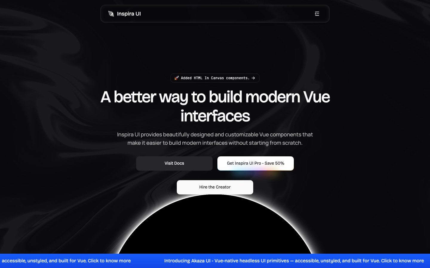
The largest motion library for Vue and Nuxt, with many effects ported from Aceternity and Magic UI.
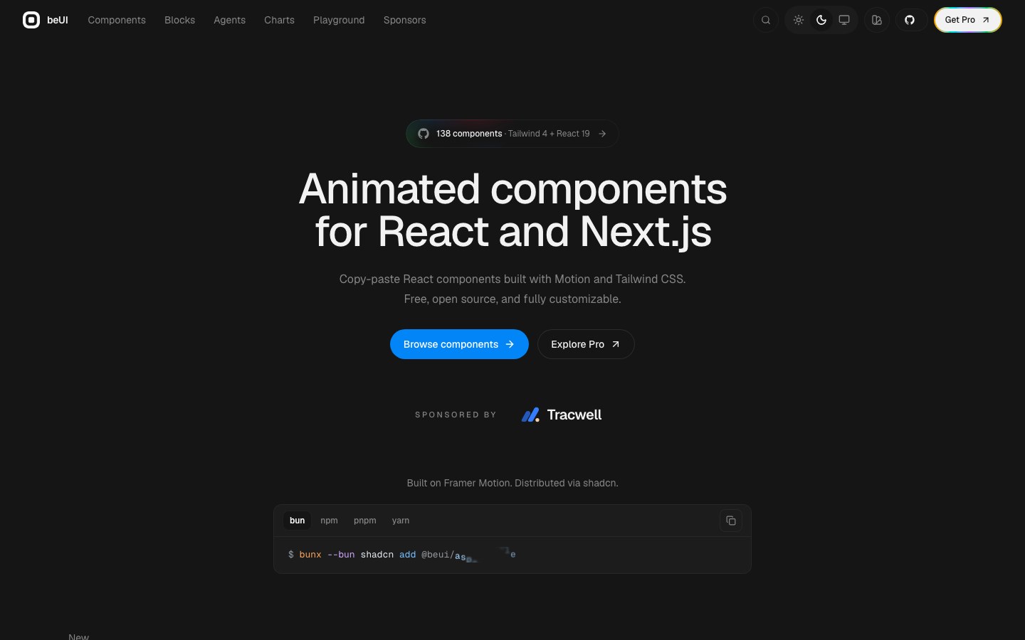
Motion components such as a dynamic island, bloom menu, card folder, AI message bubbles and finance charts.
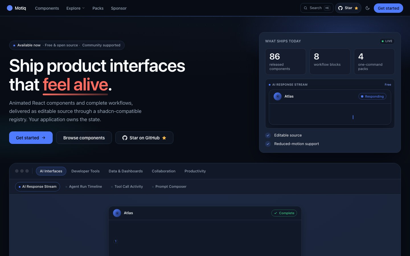
Motion components for product UIs in four sets — AI response streams, collaboration, data and dev tools.
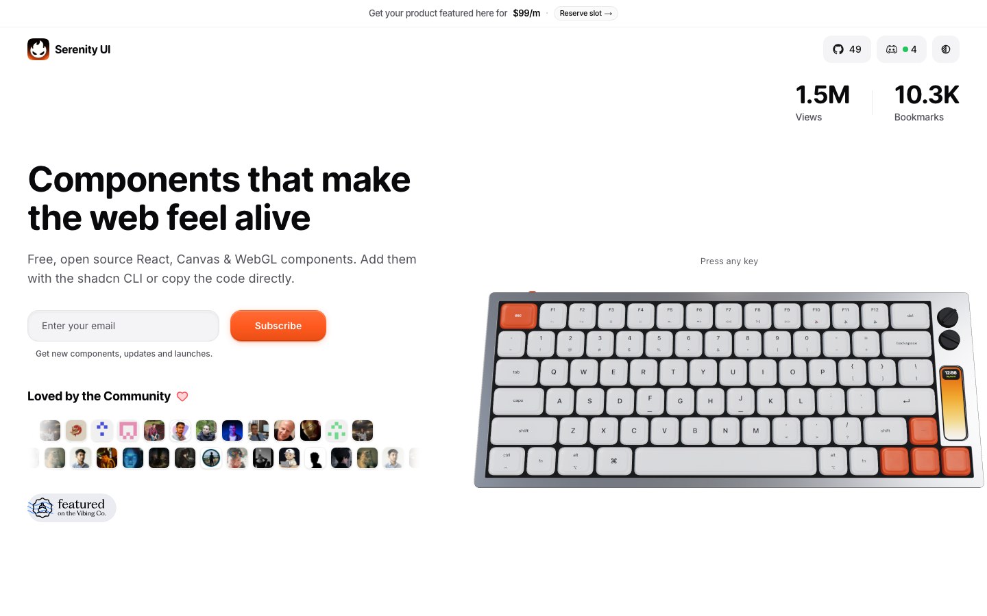
Playful, tactile components — a retro mechanical keyboard with live synthesized sound and a 3D flip-book portfolio.
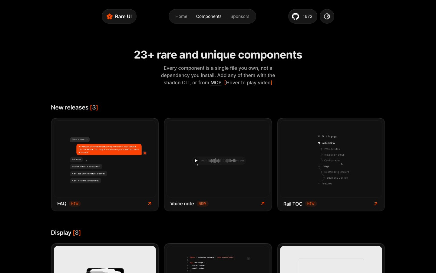
Motion components you won't find elsewhere — a fluid orb, gravity letters, a folder and a duration picker.
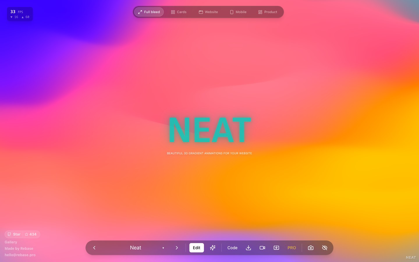
A generator for animated 3D gradient backgrounds — pick a preset, tune colors and speed, copy the code.
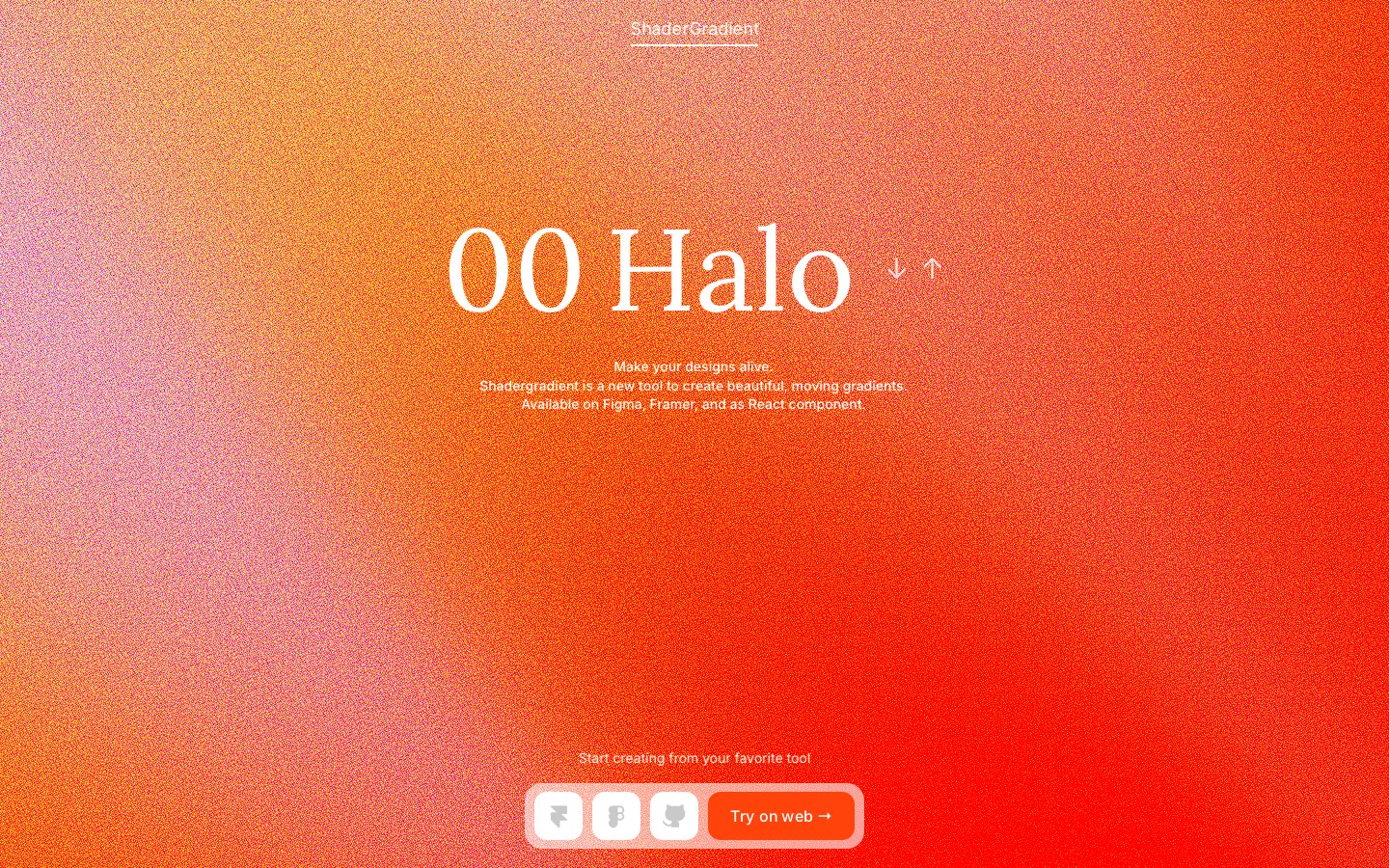
Flowing 3D gradient backgrounds you tune in the browser, then export to React, Framer or Figma.
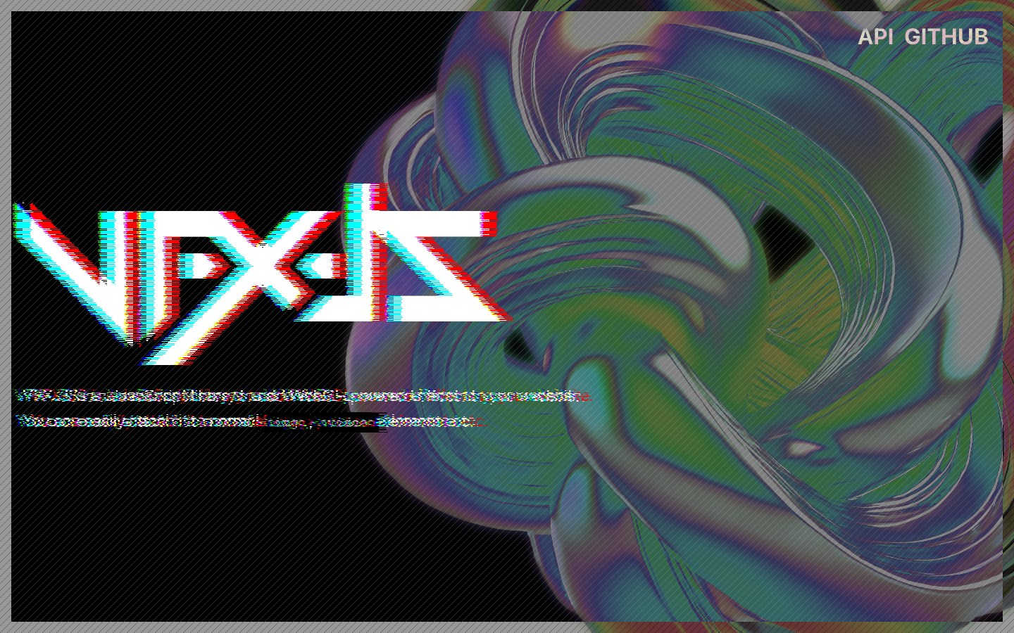
Drop WebGL effects onto plain images, videos and text — glitch, pixelate, glow and warp.
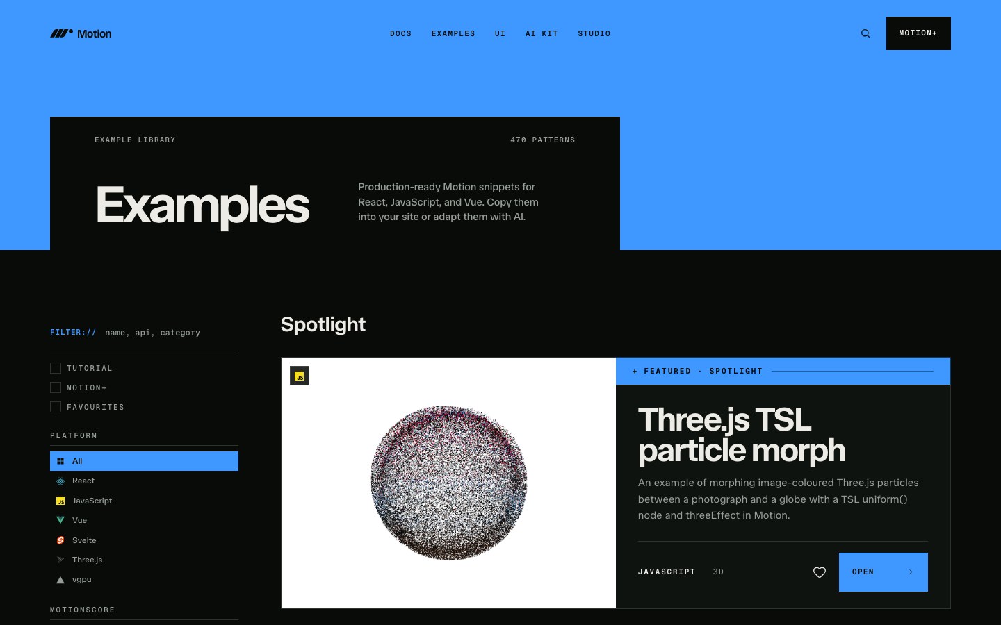
Motion's official gallery of 462 copyable animation snippets, filterable by React, JavaScript and Vue.
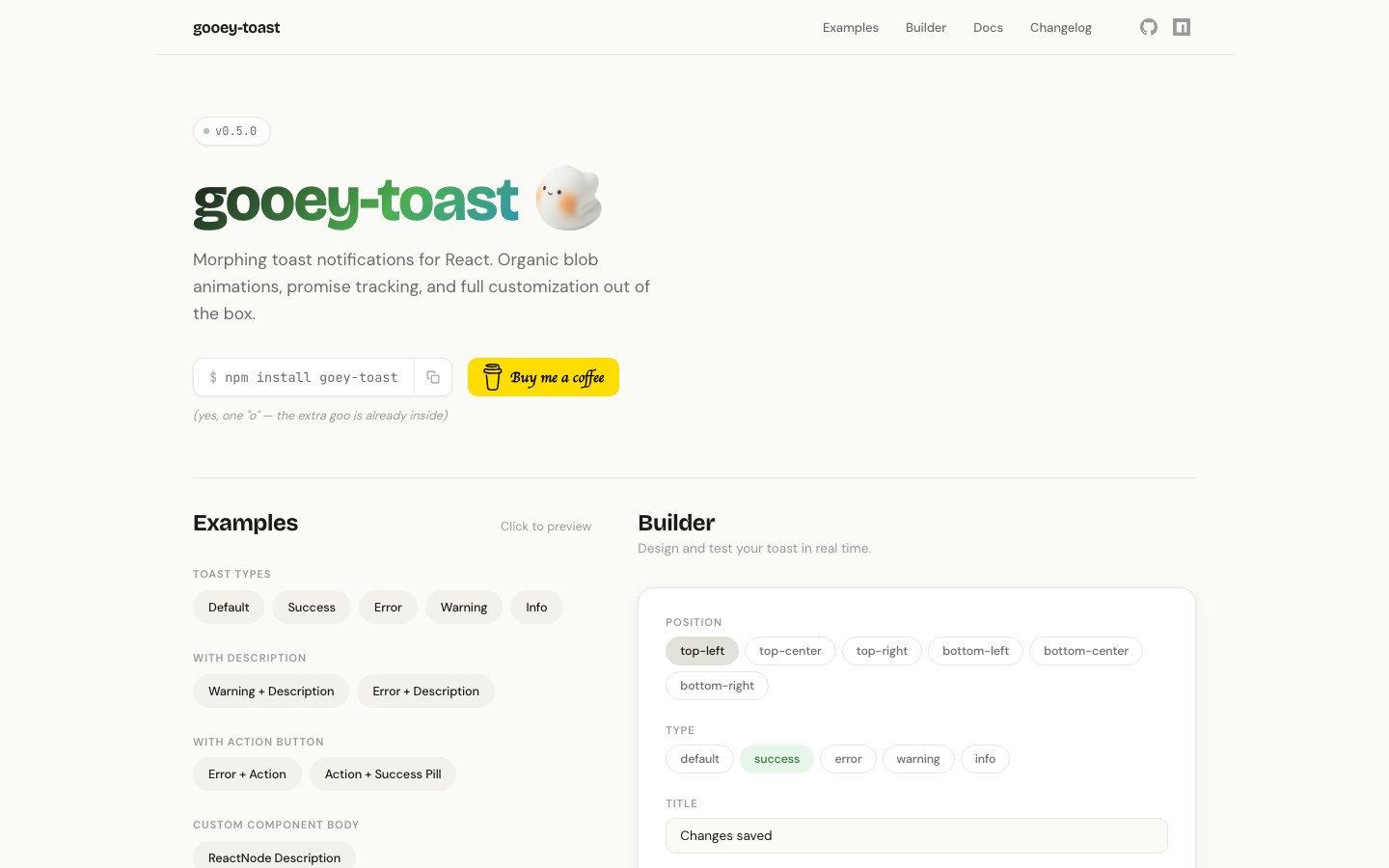
Gooey, morphing toasts built on Sonner — they stretch like liquid as they pop in, merge and change state.
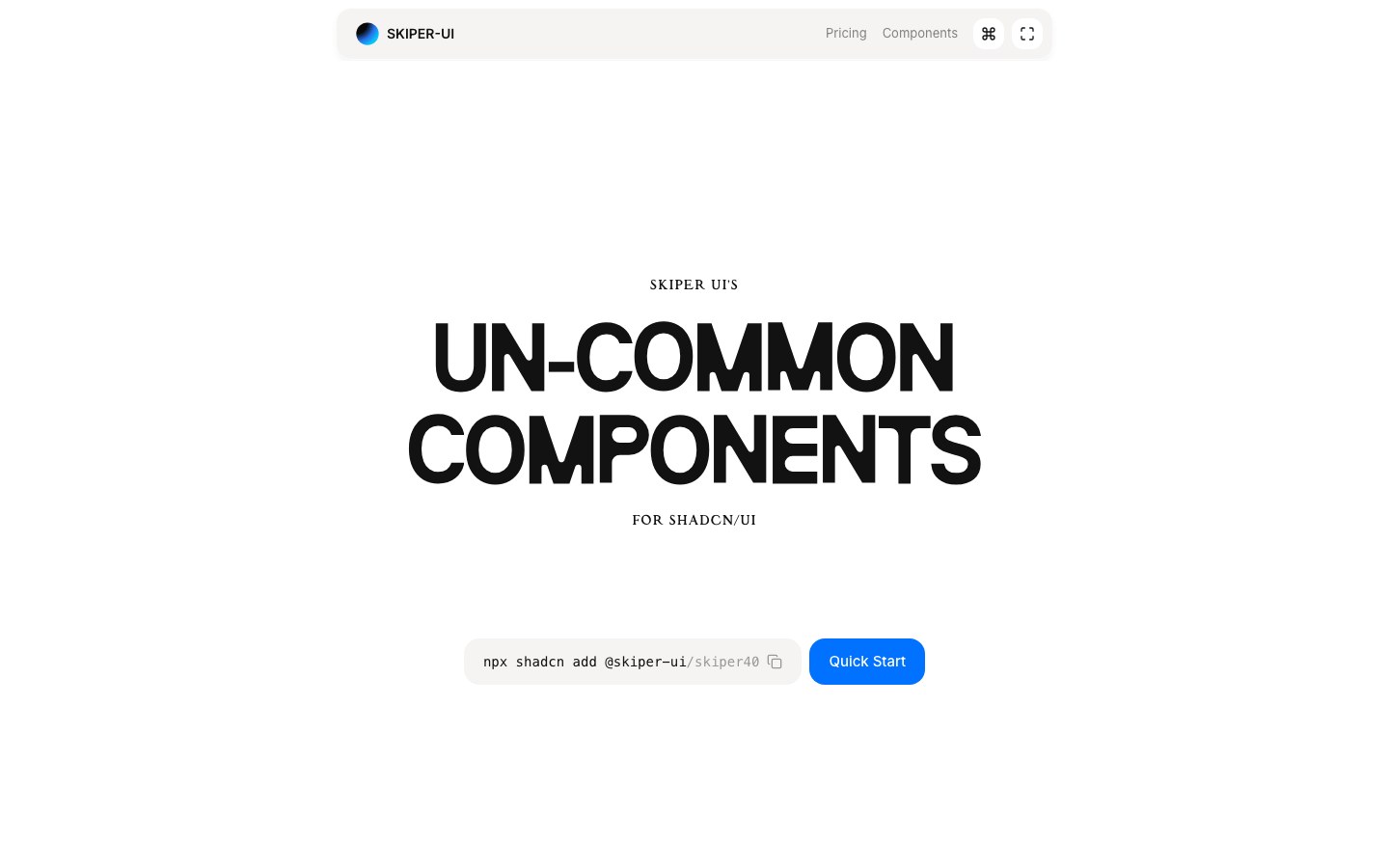
Unusual shadcn motion components — bold scroll, image, text and transition effects with an experimental streak.
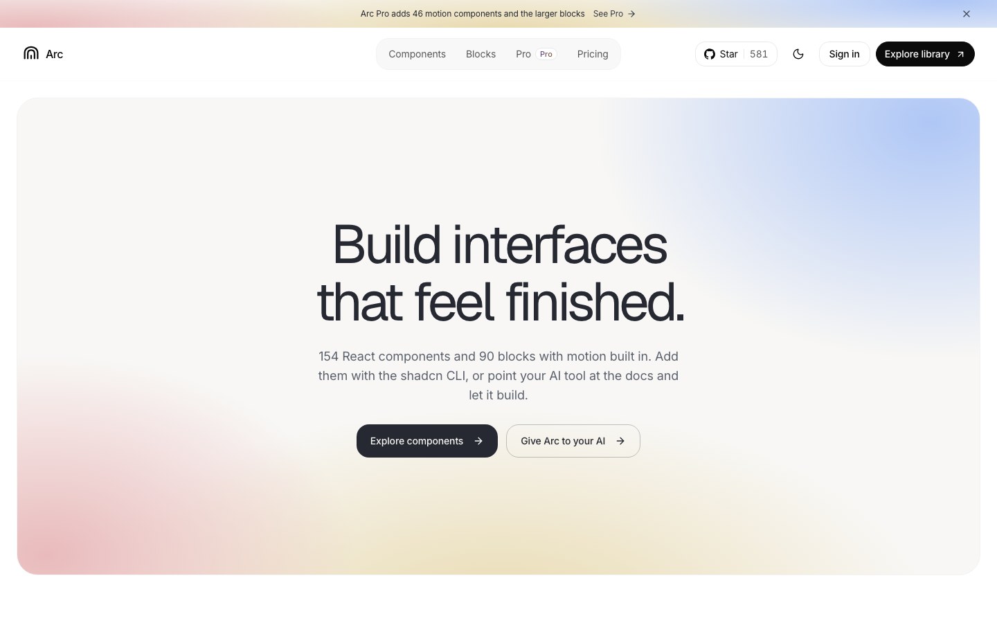
Quiet motion for the basics — buttons, dialogs and more, all moving on one shared set of motion tokens.
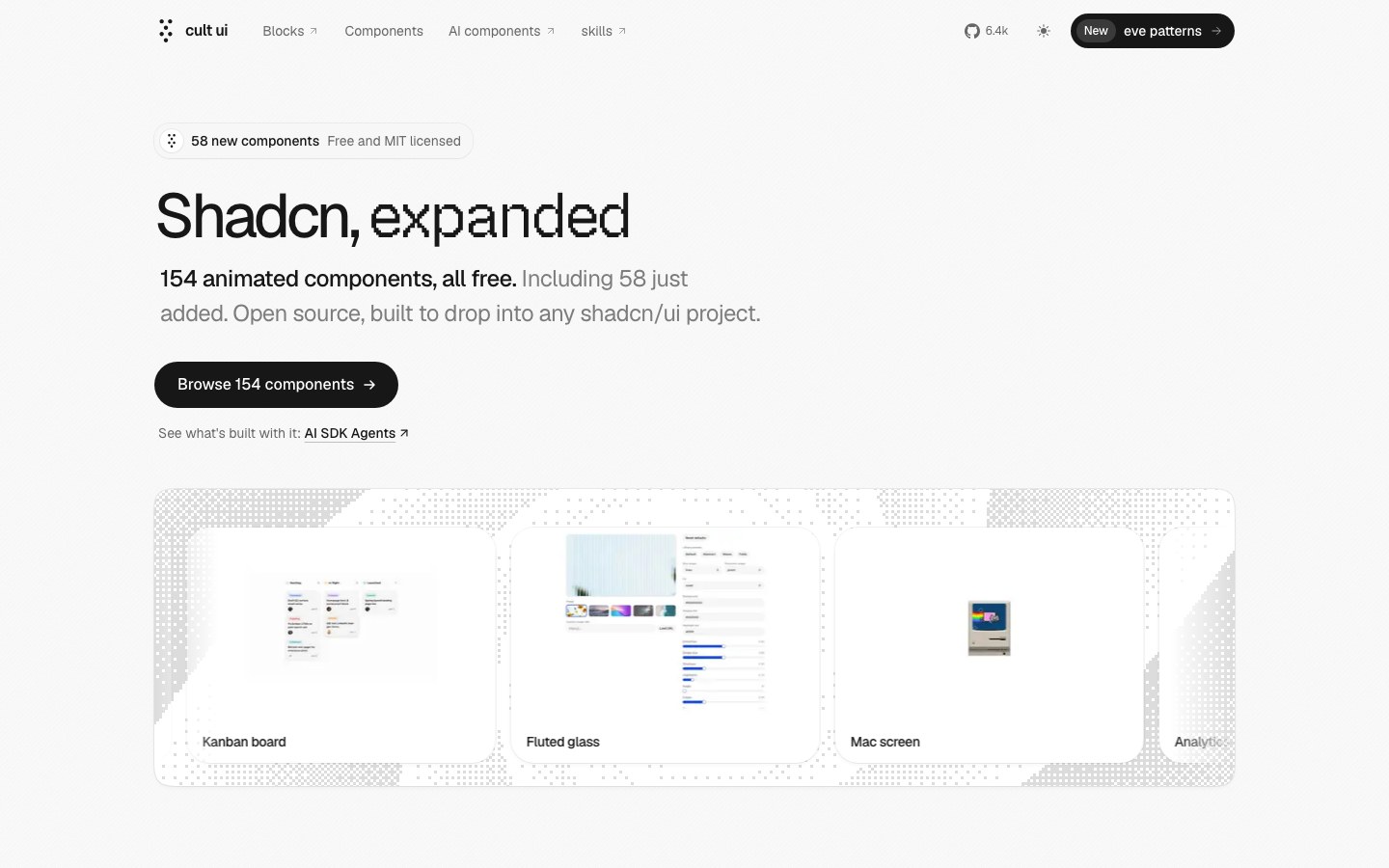
154 free animated components with an Apple feel — dynamic island, Mac screen, folding cards — plus AI blocks.
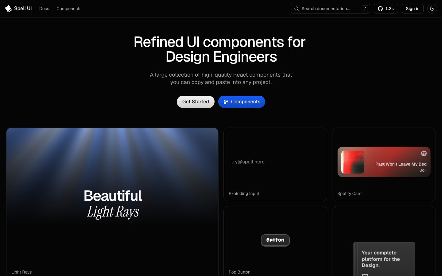
Finely tuned components for design engineers — signature writing, exploding inputs, light rays and a perspective book.
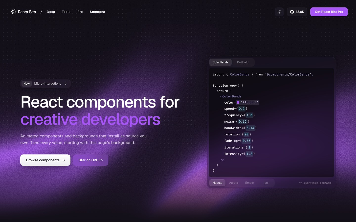
The largest open collection of animated React components — text, interactions, UI and backgrounds, each with live controls.
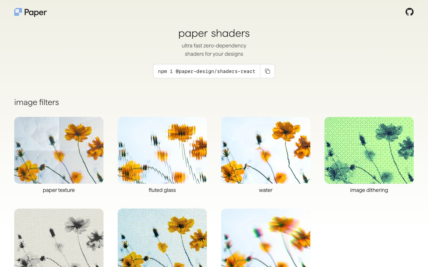
Zero-dependency shaders from the Paper design tool — mesh gradients, liquid metal, halftone and dithering, tunable live.
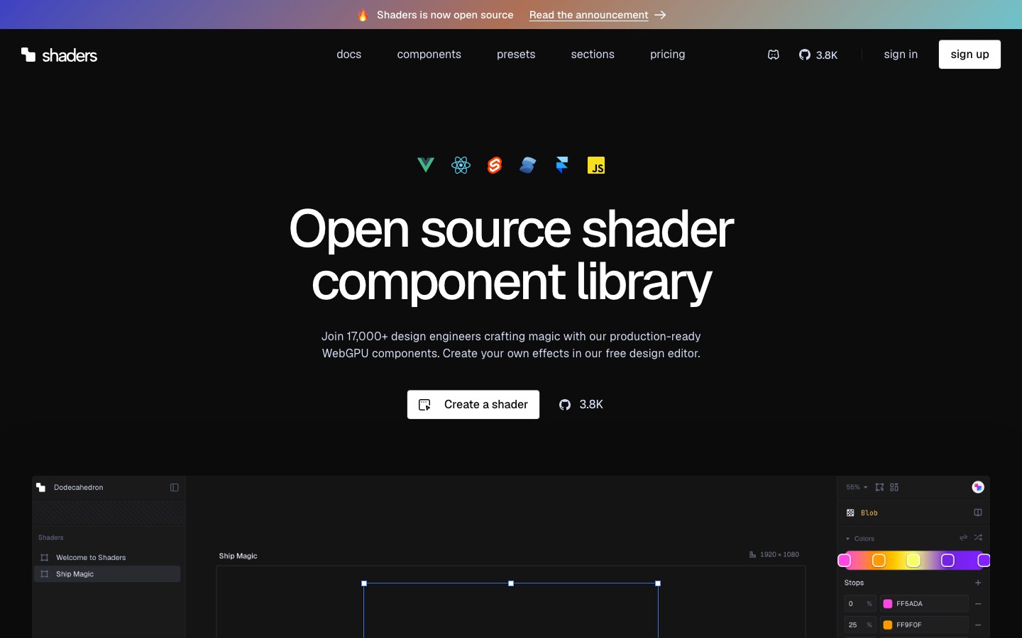
WebGPU shader components — gradients, fluids, noise and light — that stack like ordinary components, plus a visual editor.
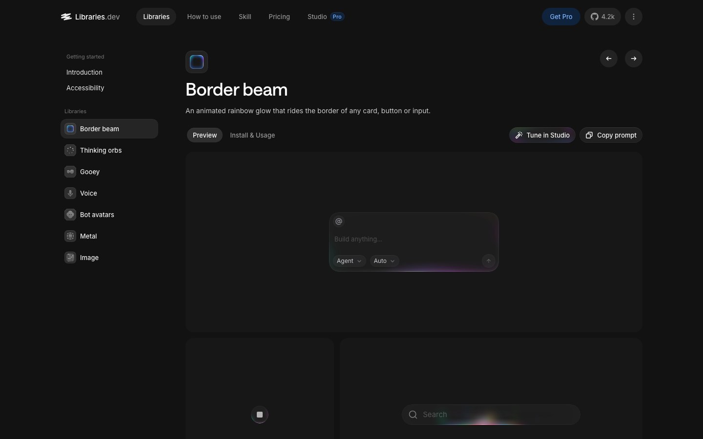
Single-effect motion packages from the maker of Transitions.dev — border beams, thinking orbs, liquid metal and gooey blobs.
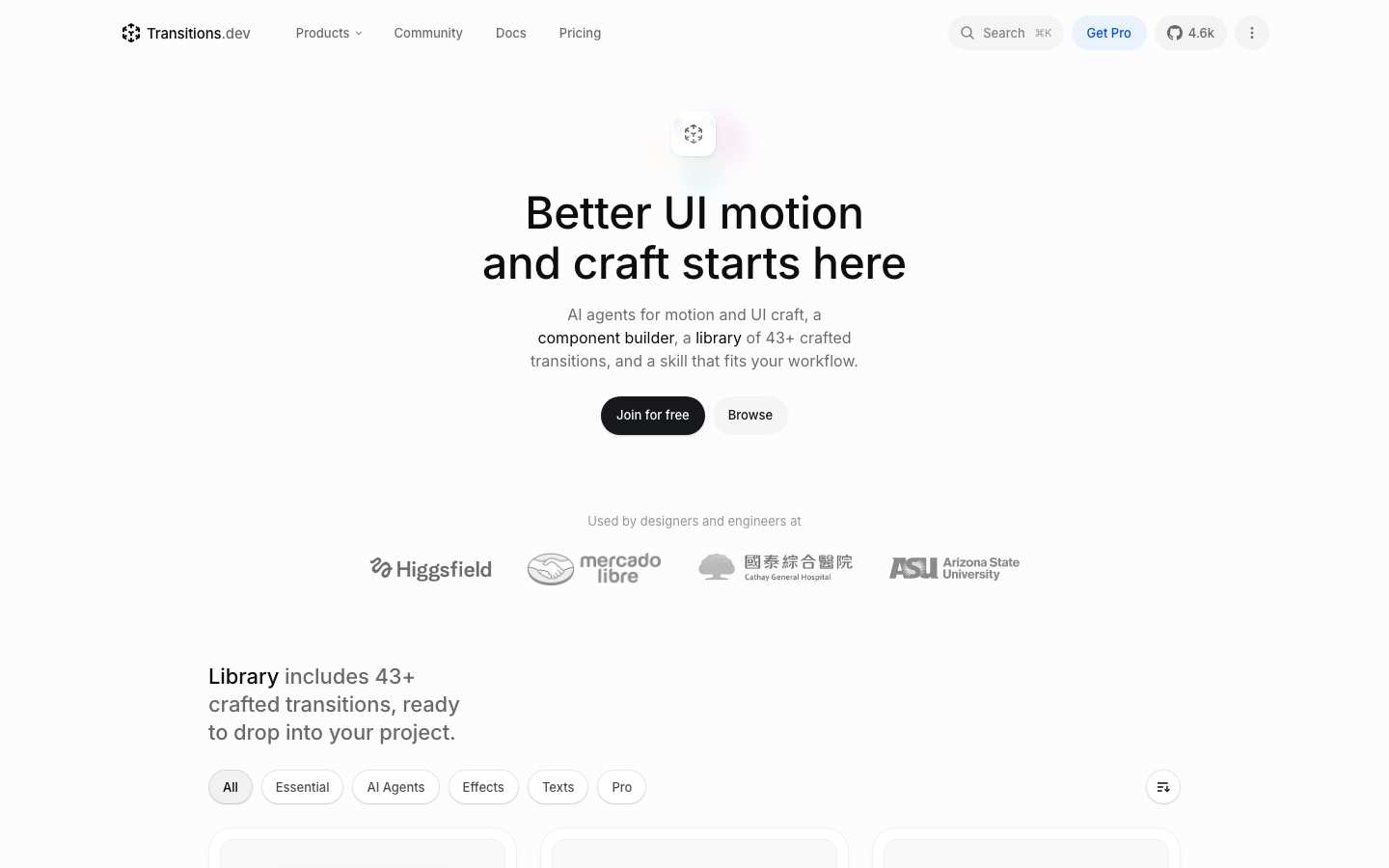
Production-grade UI transitions from a design engineer, ready to copy as CSS or React.
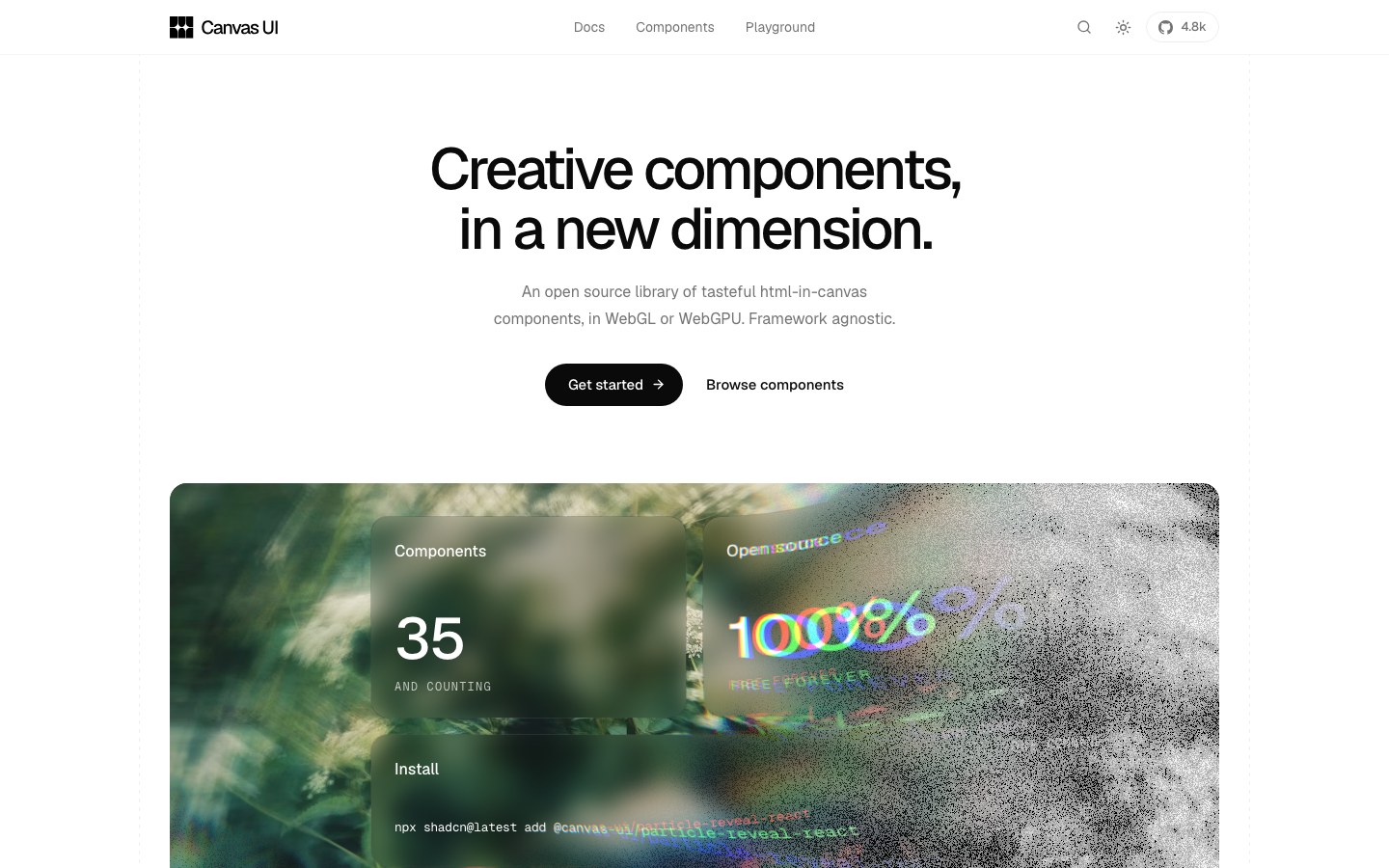
Creative WebGL and WebGPU canvas effects as components, from the author of React Bits.
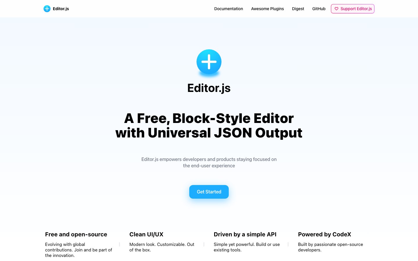
A clean, block-style editor that outputs tidy JSON instead of HTML.
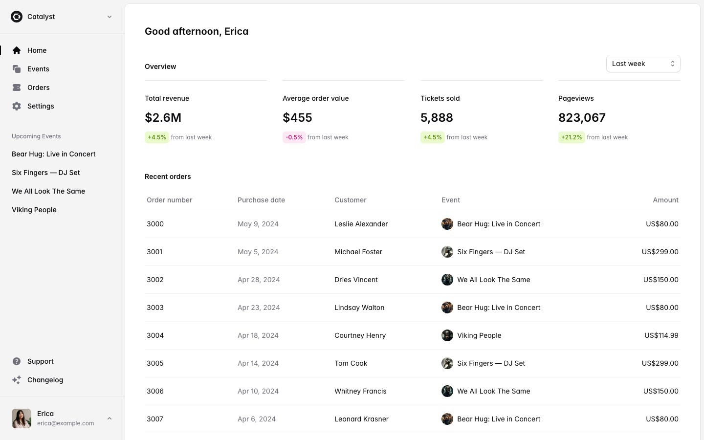
Tailwind Labs' official paid kit: application UI, marketing blocks and full templates like the Catalyst app.
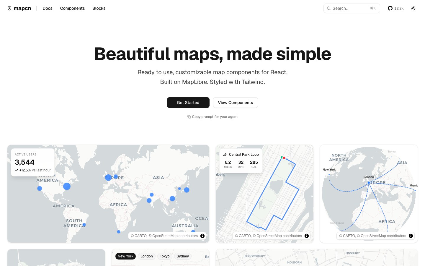
Beautiful shadcn-style map components on MapLibre — maps that finally look good by default.
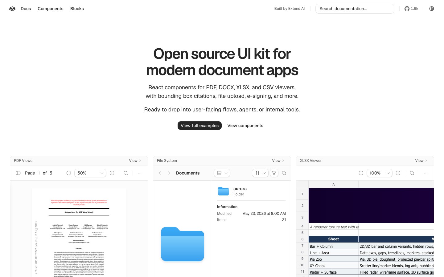
Components for document apps — PDF, DOCX and XLSX viewers with citation boxes.
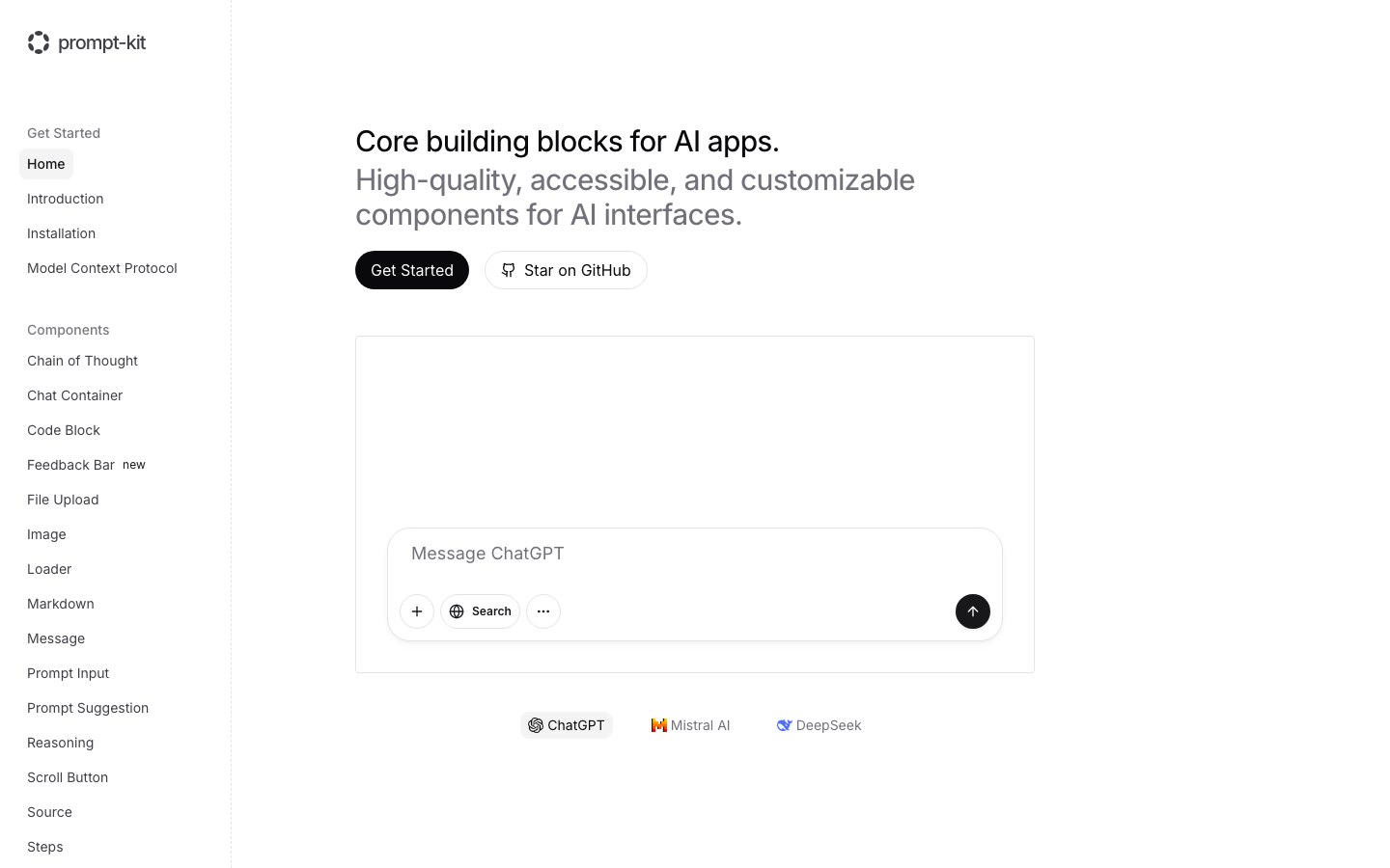
Building blocks for AI chat apps with a restrained, Vercel-like feel — including full chat blocks.

UI components for AI agents — thinking states, tool calls and streaming text, for React, Vue and Svelte.
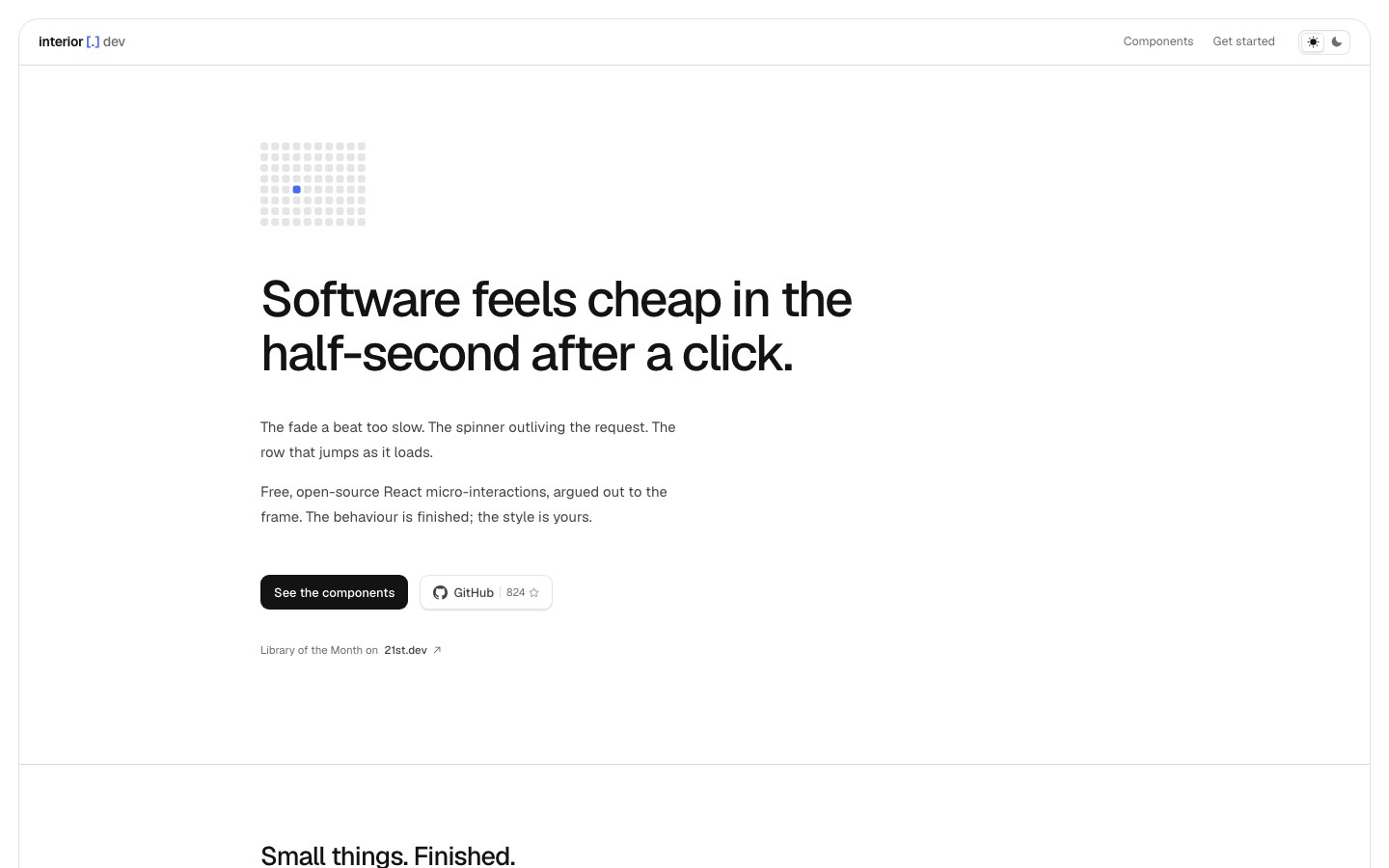
Carefully argued micro-interactions for the half-second after a click.
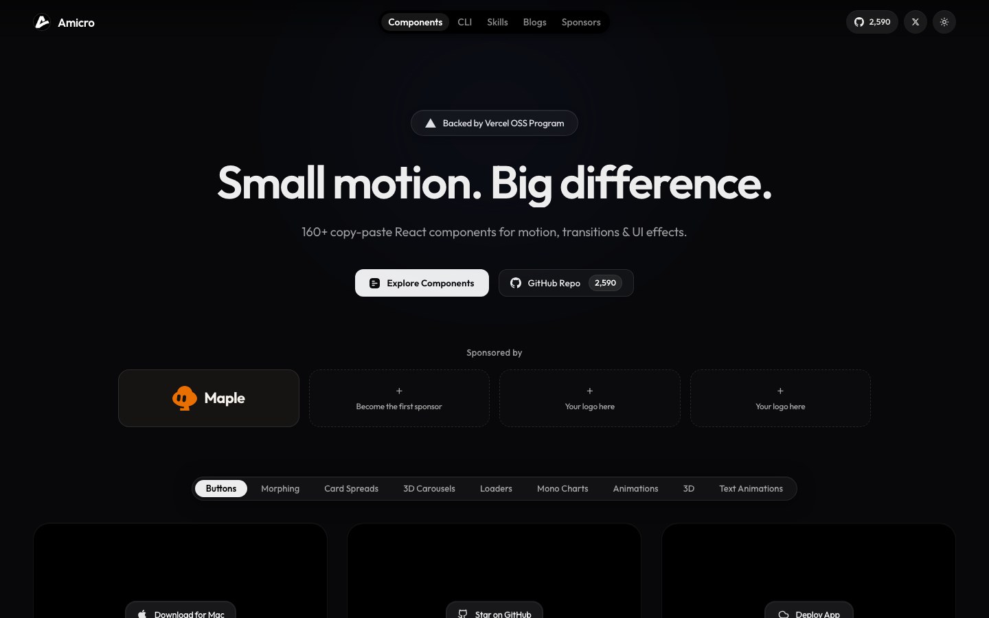
Micro-interactions, loaders and monochrome animated charts for the last half-second of polish.
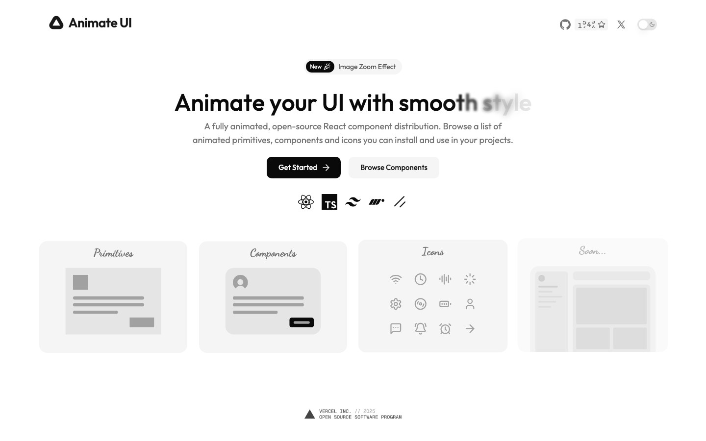
Fully animated, shadcn-style components with smooth, restrained motion at the primitive level.
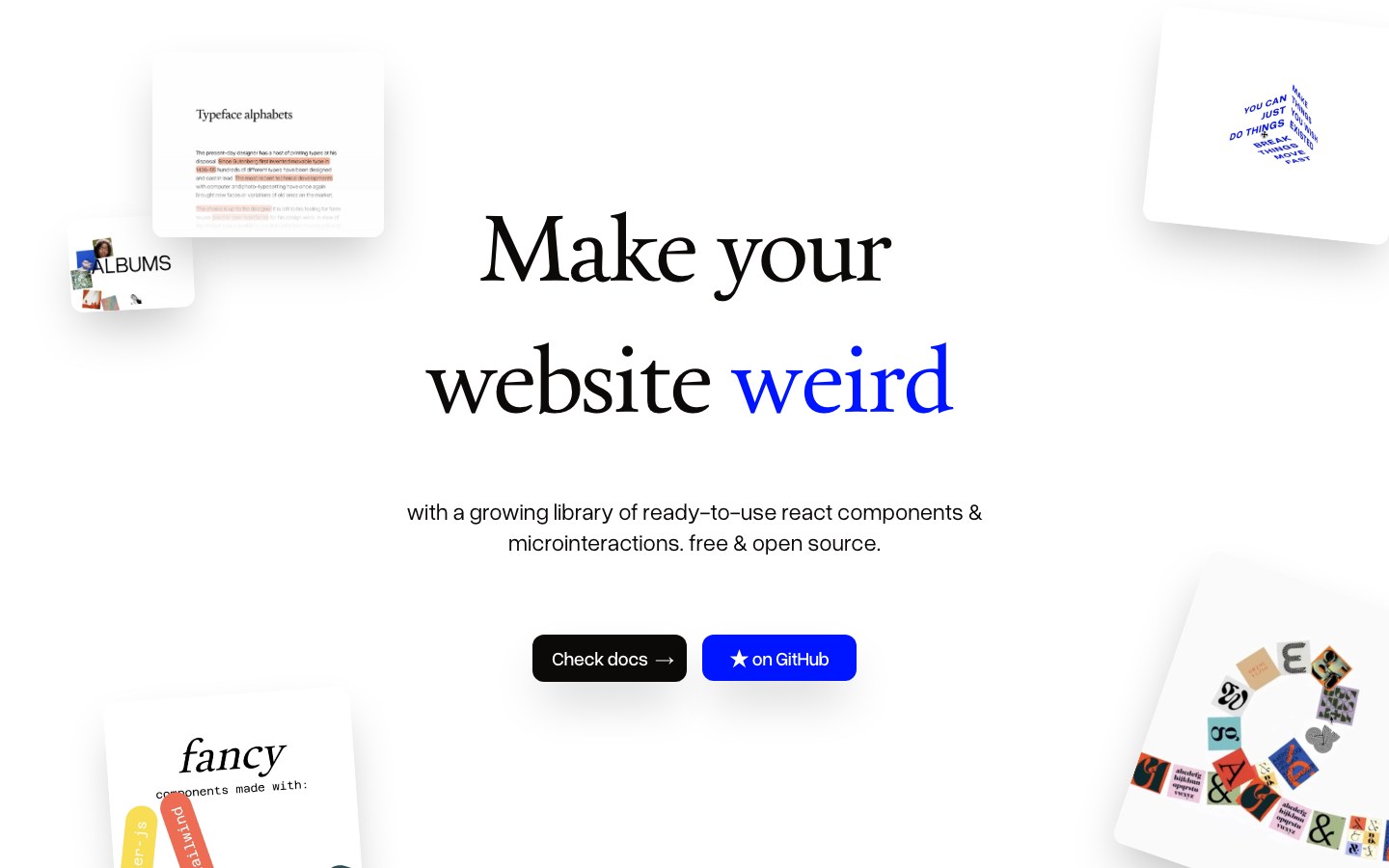
Playful text effects and micro-interactions for React — fun without being loud.
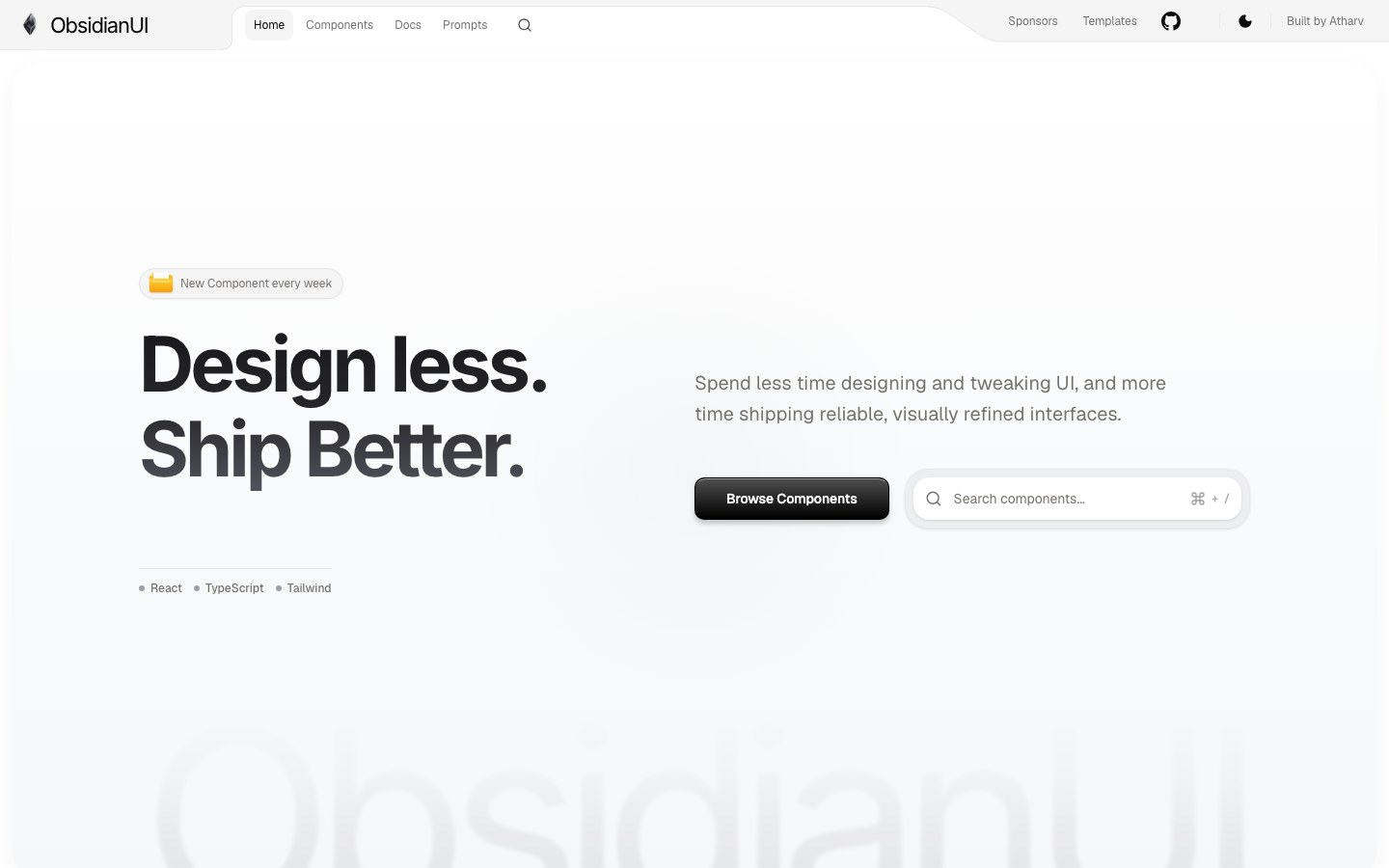
Dark, premium-feeling React and Tailwind components, blocks and landing-page templates.
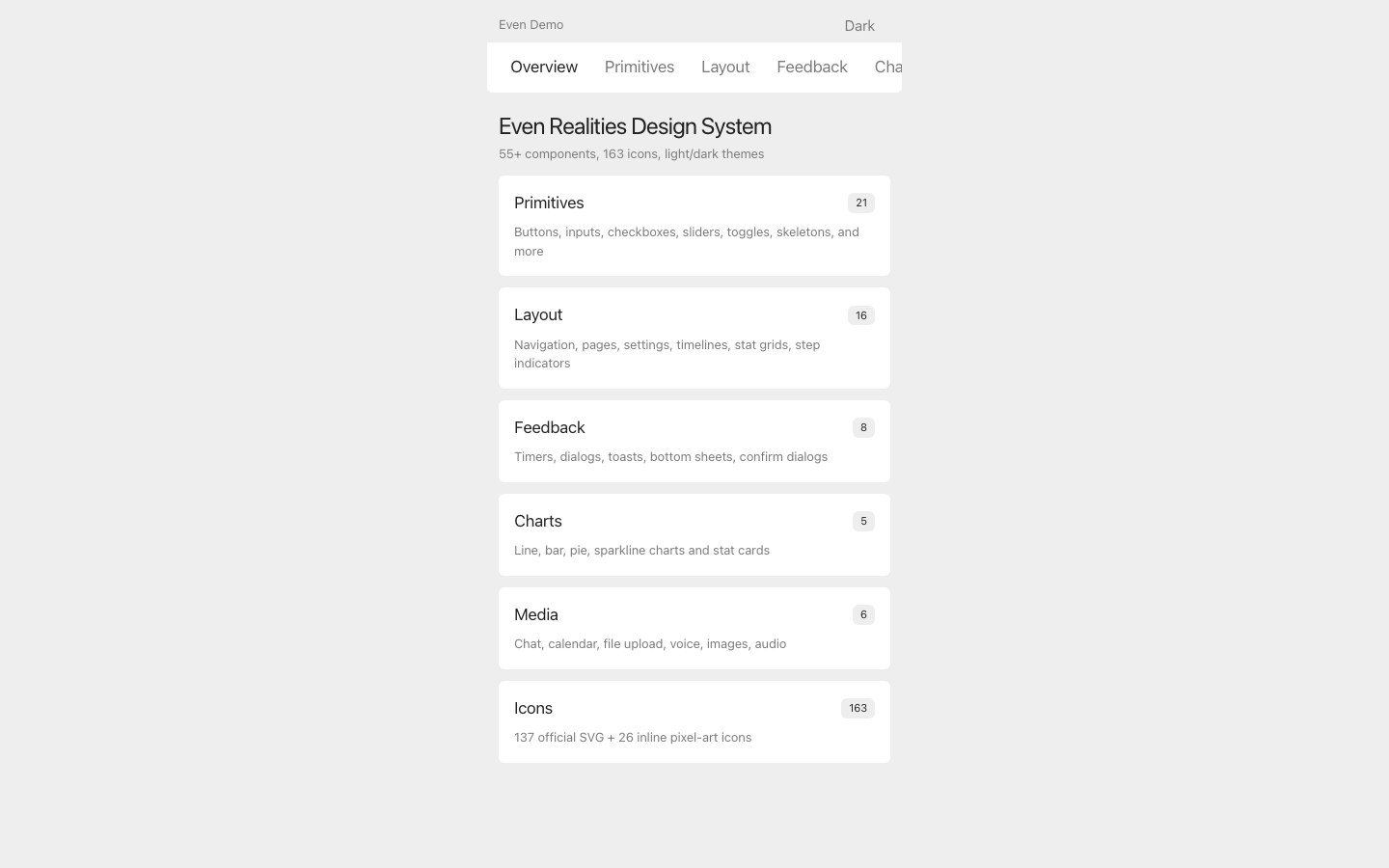
A design system for smart-glasses apps — dark screens, 55+ components and 191 pixel icons.

Polished React components, screens and illustrations — each a single file you copy and adapt.
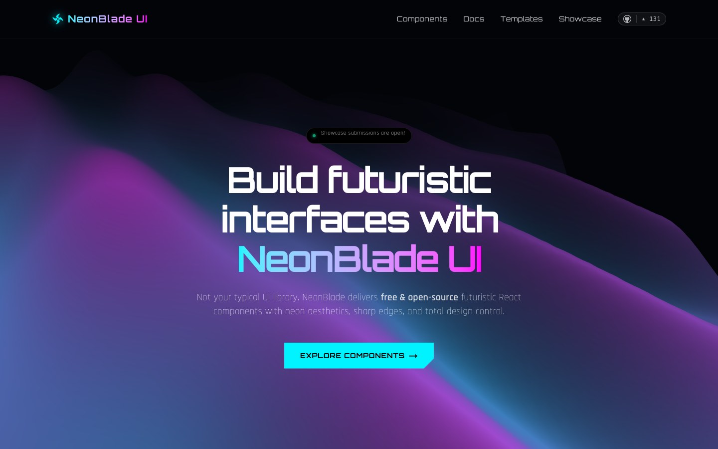
Neon cyberpunk React components with a CLI — built for game and Web3 pages.
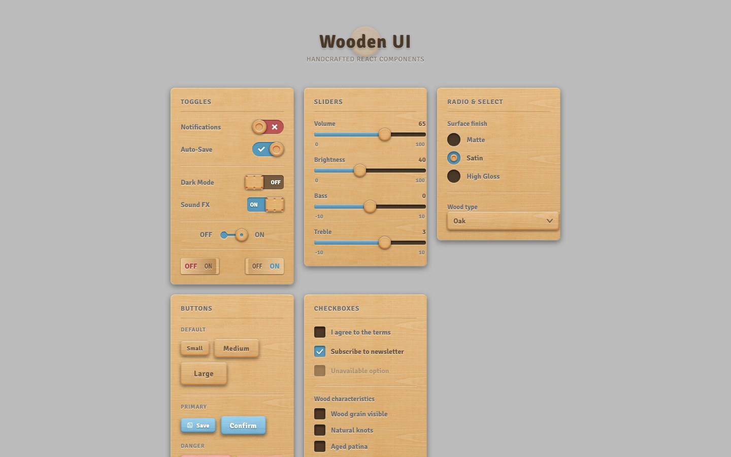
Skeuomorphic form controls carved from wood grain, made with nothing but CSS shadows.
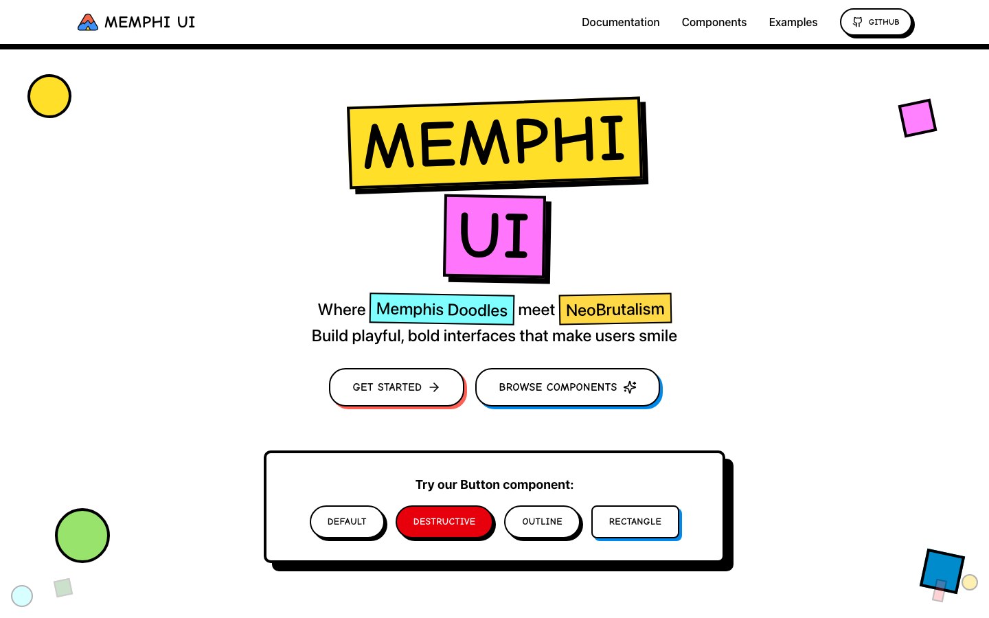
Memphis-style meets neobrutalism — squiggles, clashing color and playful, bold components.
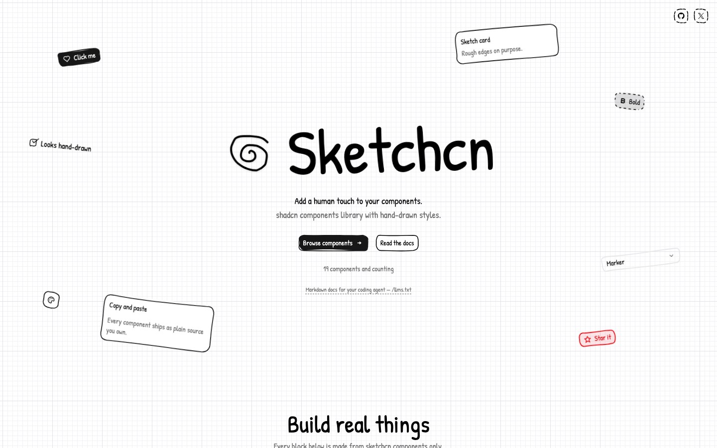
Hand-drawn shadcn components powered by rough.js, installed straight from the shadcn CLI.
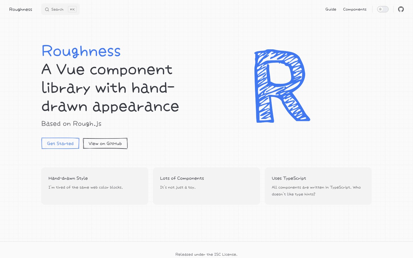
A hand-drawn Vue component library built on Rough.js — a rare full set in this style for Vue.
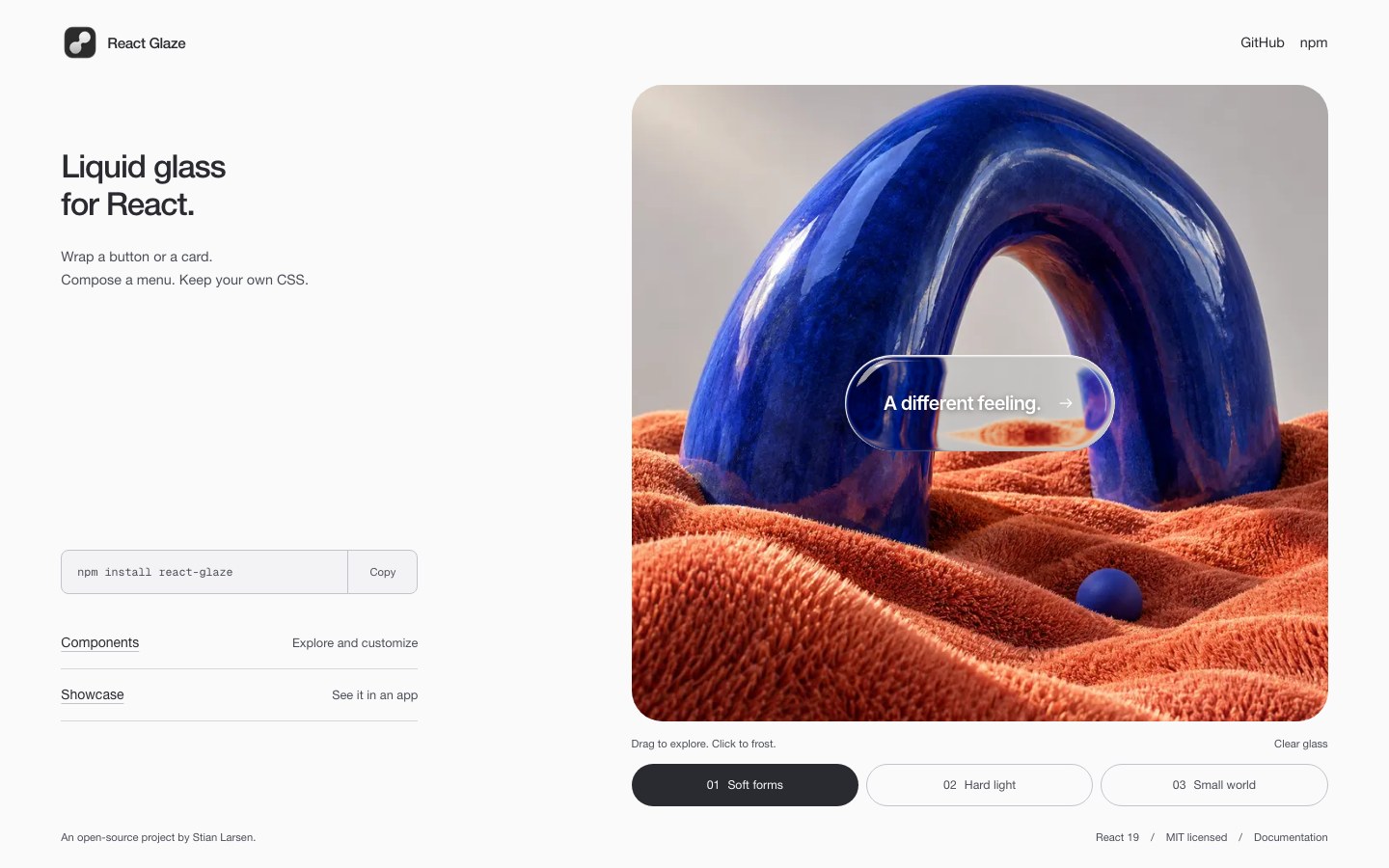
True-refraction liquid glass containers and morphing menus for React, with springy motion.
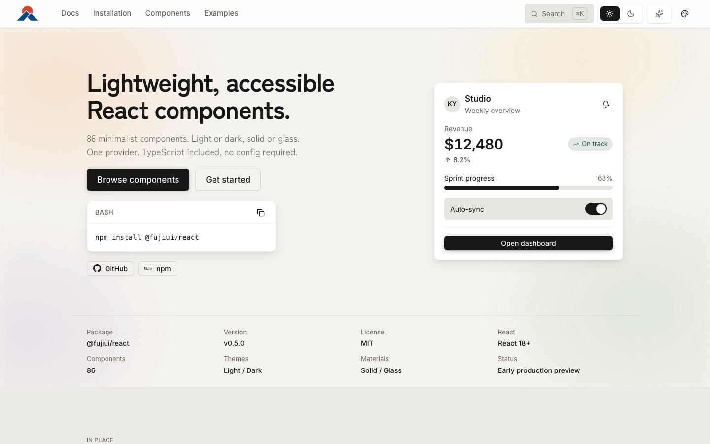
Restrained, accessible React components with an optional liquid-glass material switched by one provider.
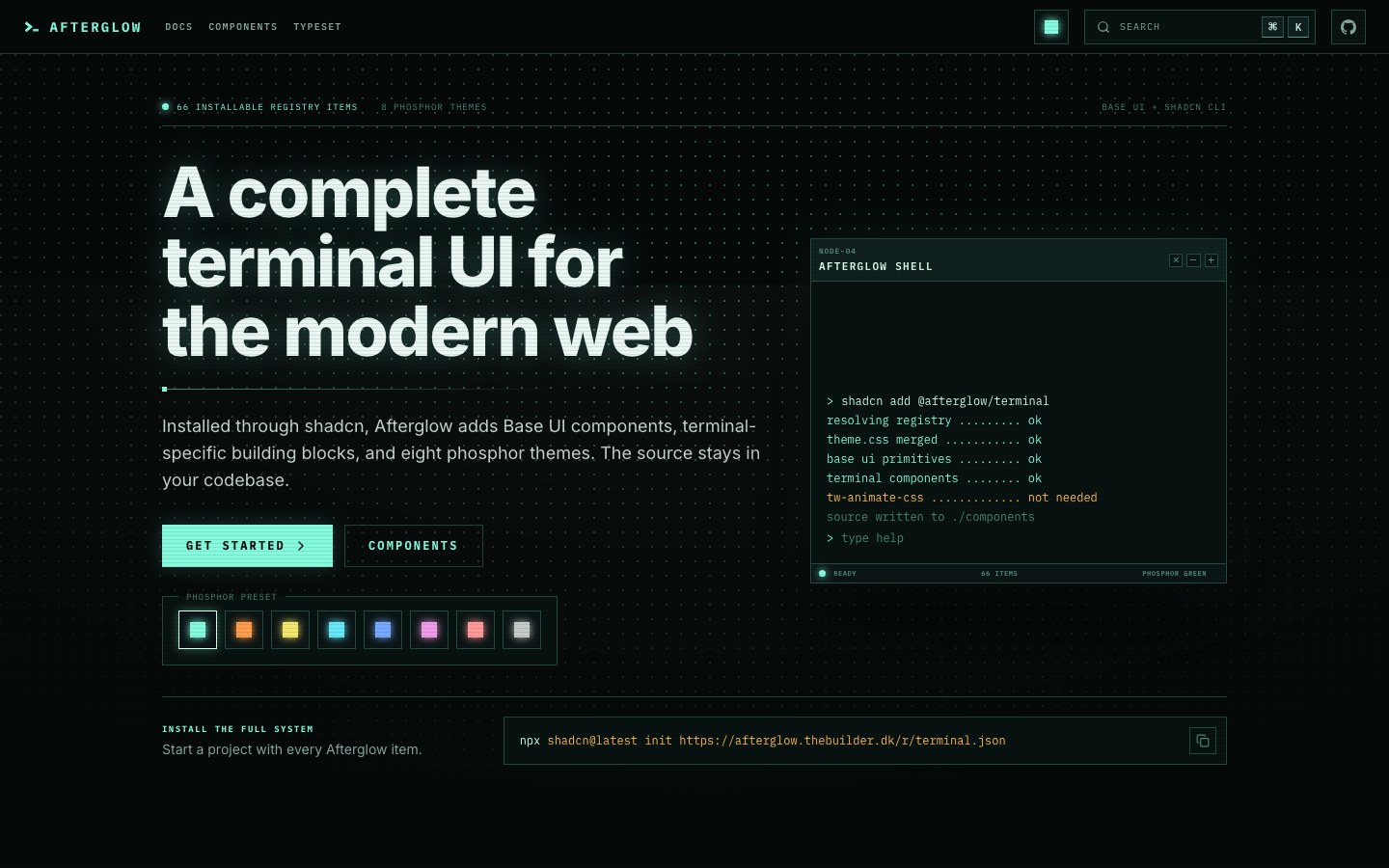
A terminal-style CRT UI kit with eight phosphor themes, installed through the shadcn registry.
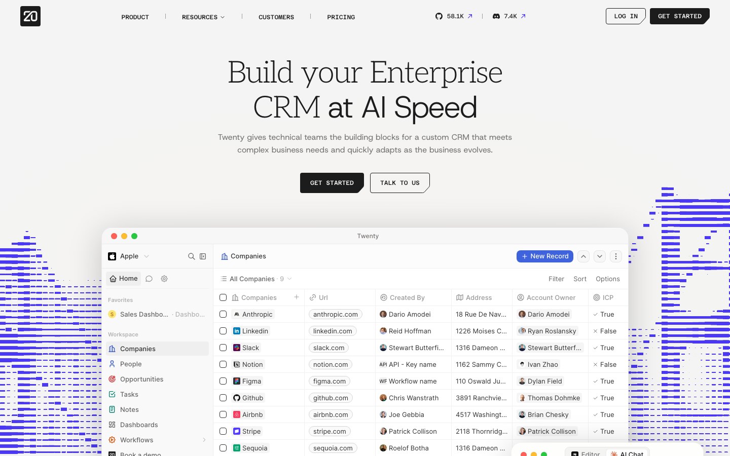
The UI package of Twenty, the open-source CRM — a Notion-like table-and-database interface.
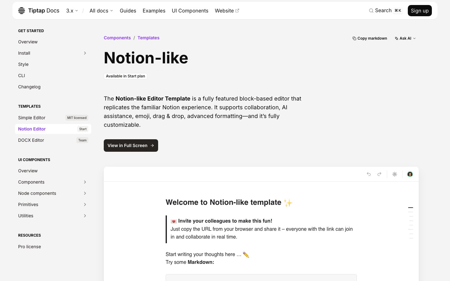
Tiptap's complete Notion-like editor template — blocks, drag and drop, collaboration and AI.
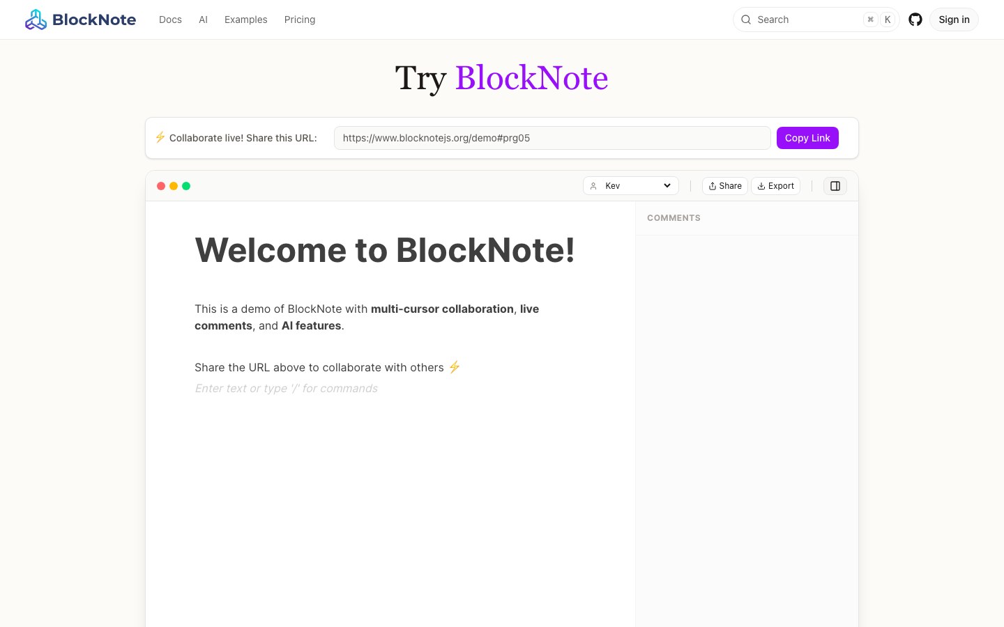
A Notion-style block editor for React — slash menu, drag handles and collaboration out of the box.

The UI package of Plane, the open-source alternative to Linear and Jira.
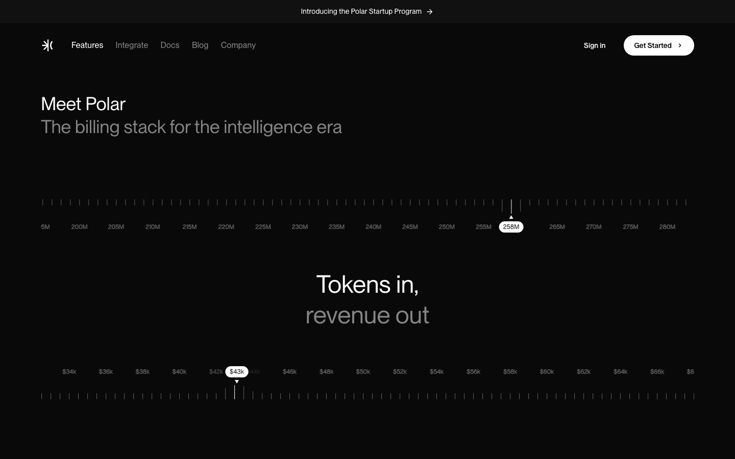
The component package of Polar, the open-source billing platform — dark and minimal.
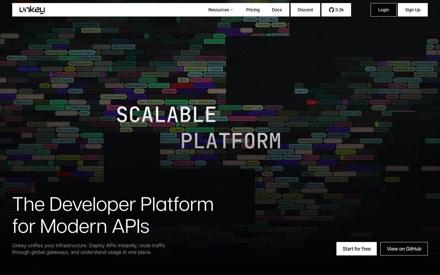
The design system of Unkey, the API platform — dark, dotted, unmistakably developer-tool.
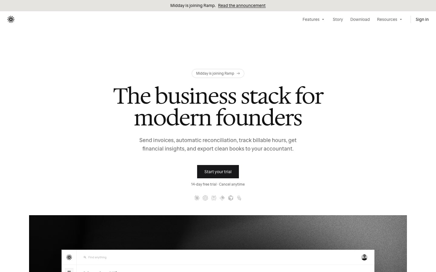
The UI package of Midday, the open-source business app — black and white, minimal, typographic.
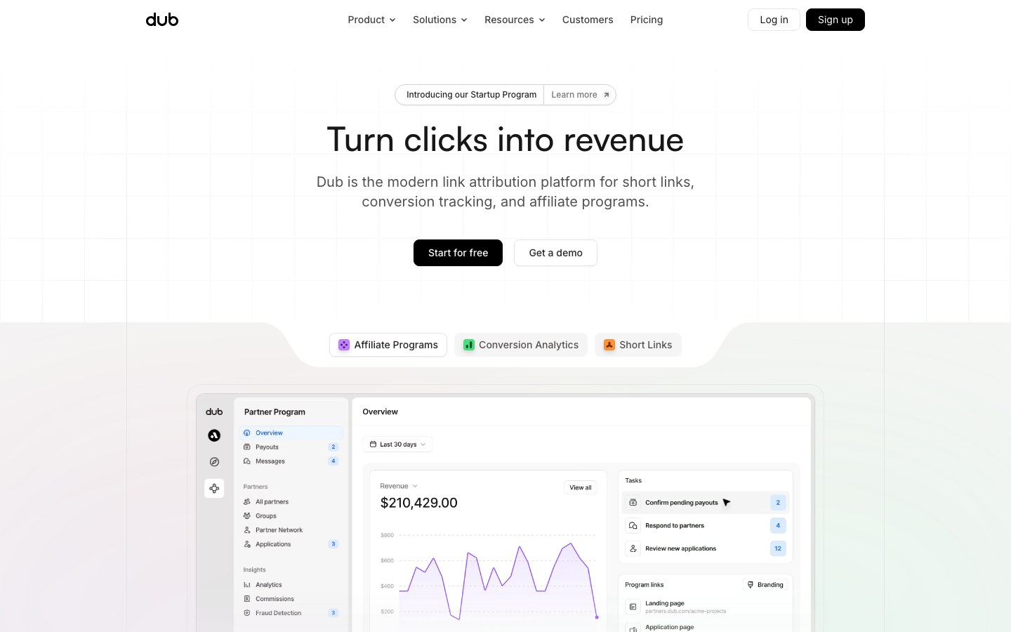
The component package behind Dub, the link attribution platform — clean, Linear-style SaaS interface.
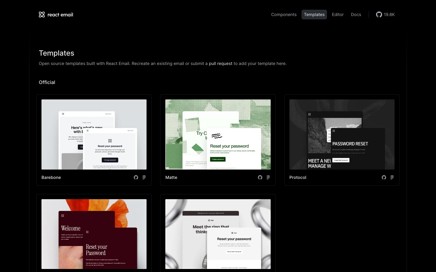
Resend's components for building emails in React — with templates that feel like Linear's and Vercel's.
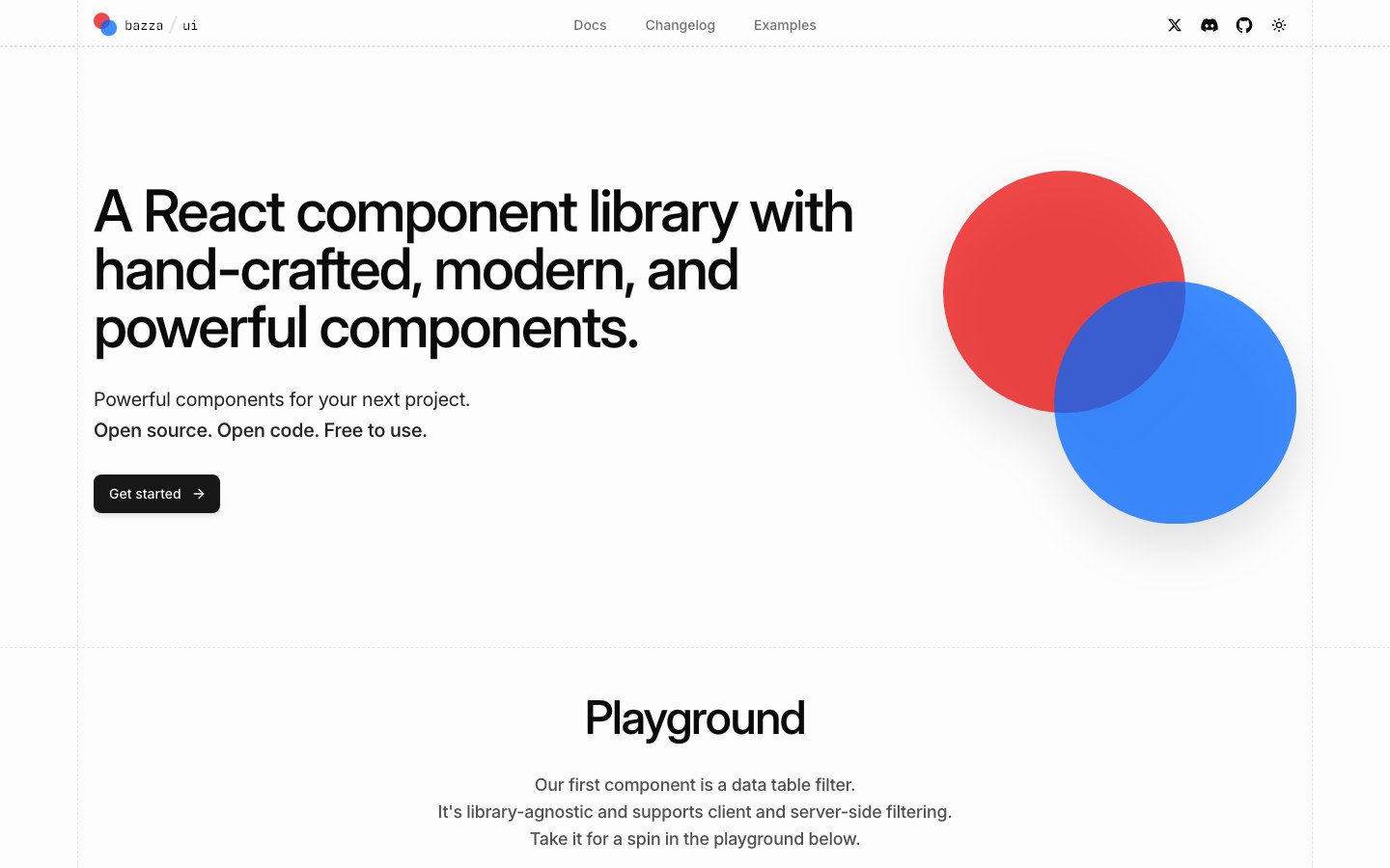
Hand-crafted React components, starting with a Linear-style data table filter for client and server data.
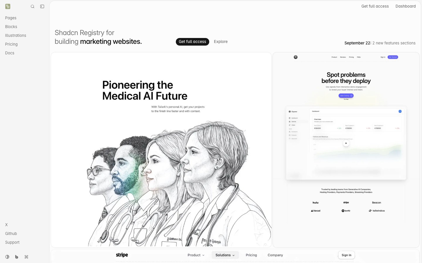
Premium-feeling marketing blocks and app pages for shadcn/ui projects.
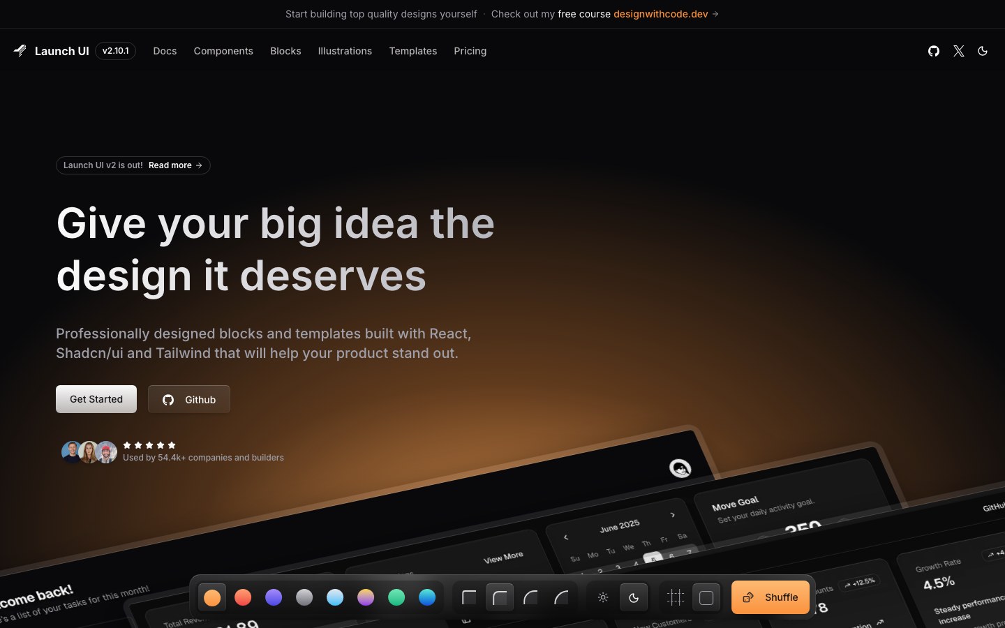
Dark, polished landing-page components in the Linear and Vercel vein, delivered through the shadcn registry.
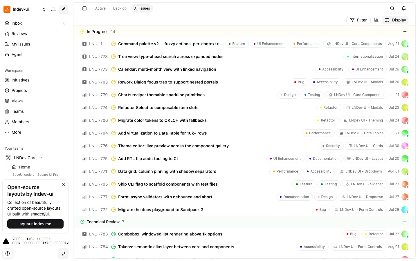
An open-source, Linear-style project management UI built with shadcn/ui — clone it and make it yours.
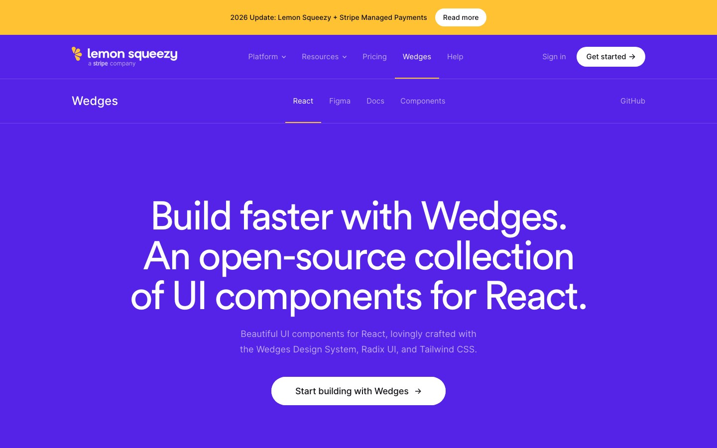
Lemon Squeezy's own React components, built on Radix and Tailwind with its playful purple brand.
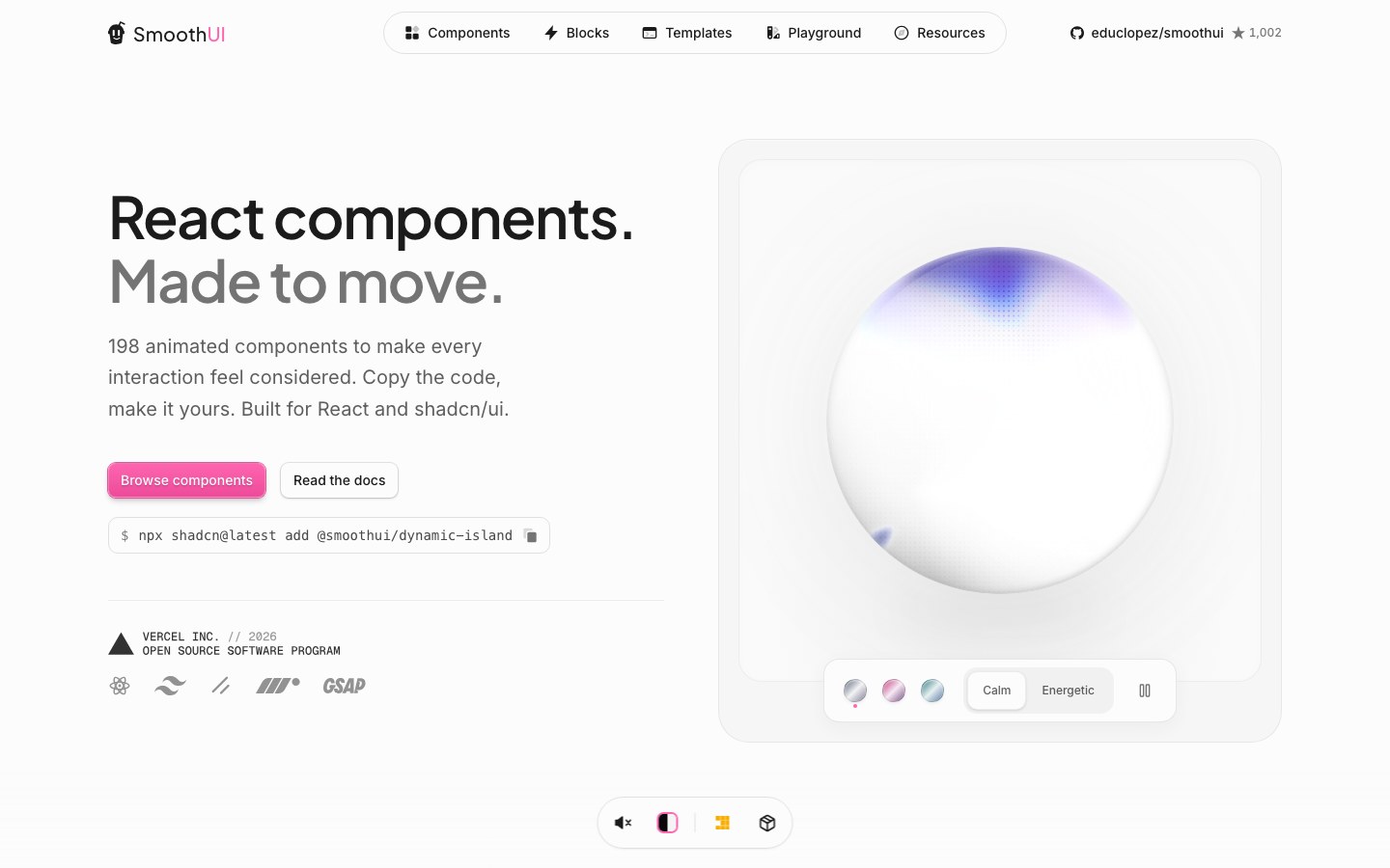
Animated React components with real craft in the motion — dynamic islands, number flips, card stacks.
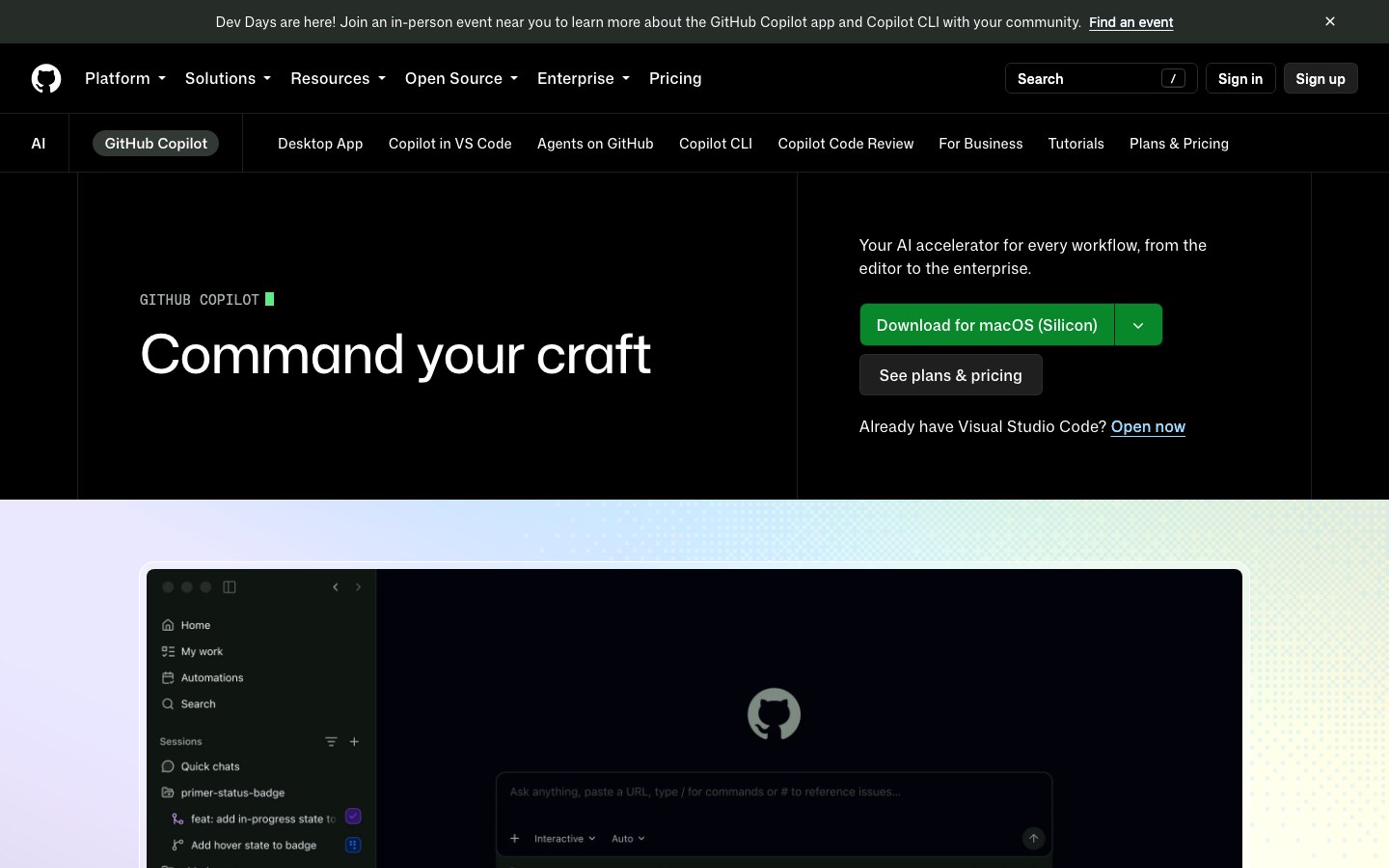
GitHub's design system for marketing pages — the building blocks behind github.com's product pages.
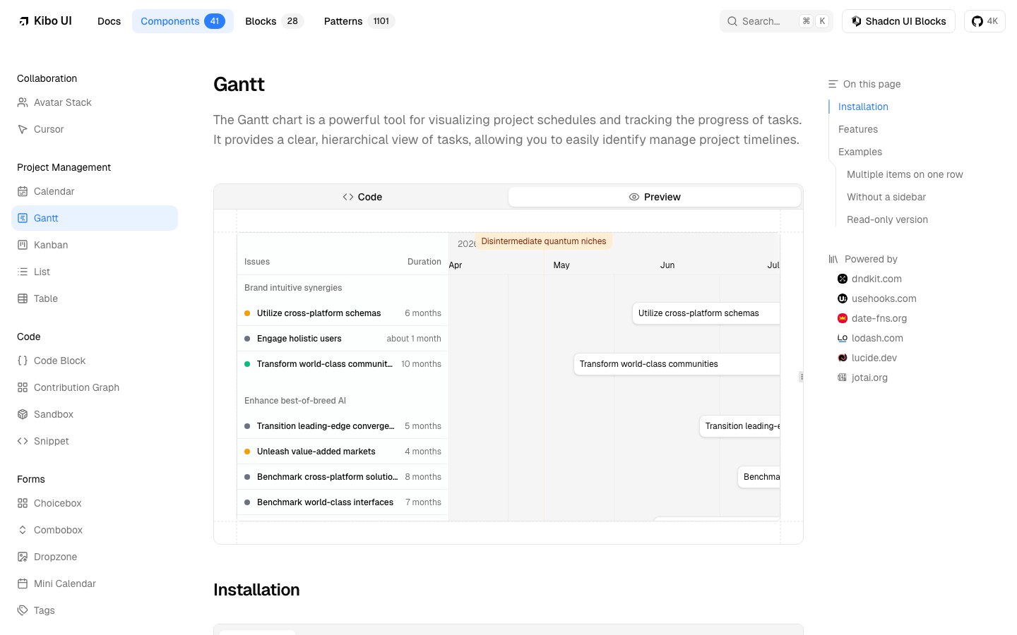
A high-quality shadcn/ui registry known for complex components — Gantt charts, kanban boards, calendars.
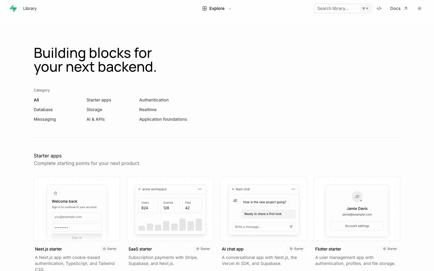
Supabase's own components and starter apps — auth, realtime cursors, avatars — installed via the shadcn CLI.
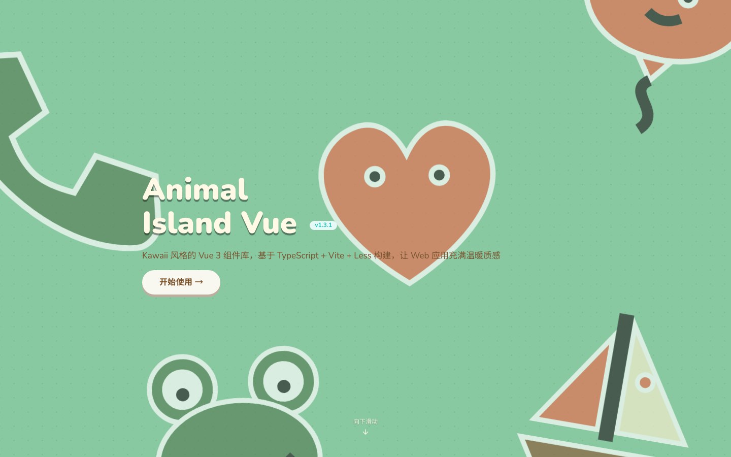
The Vue 3 edition of Animal Island UI — the same cozy, kawaii Animal Crossing look.
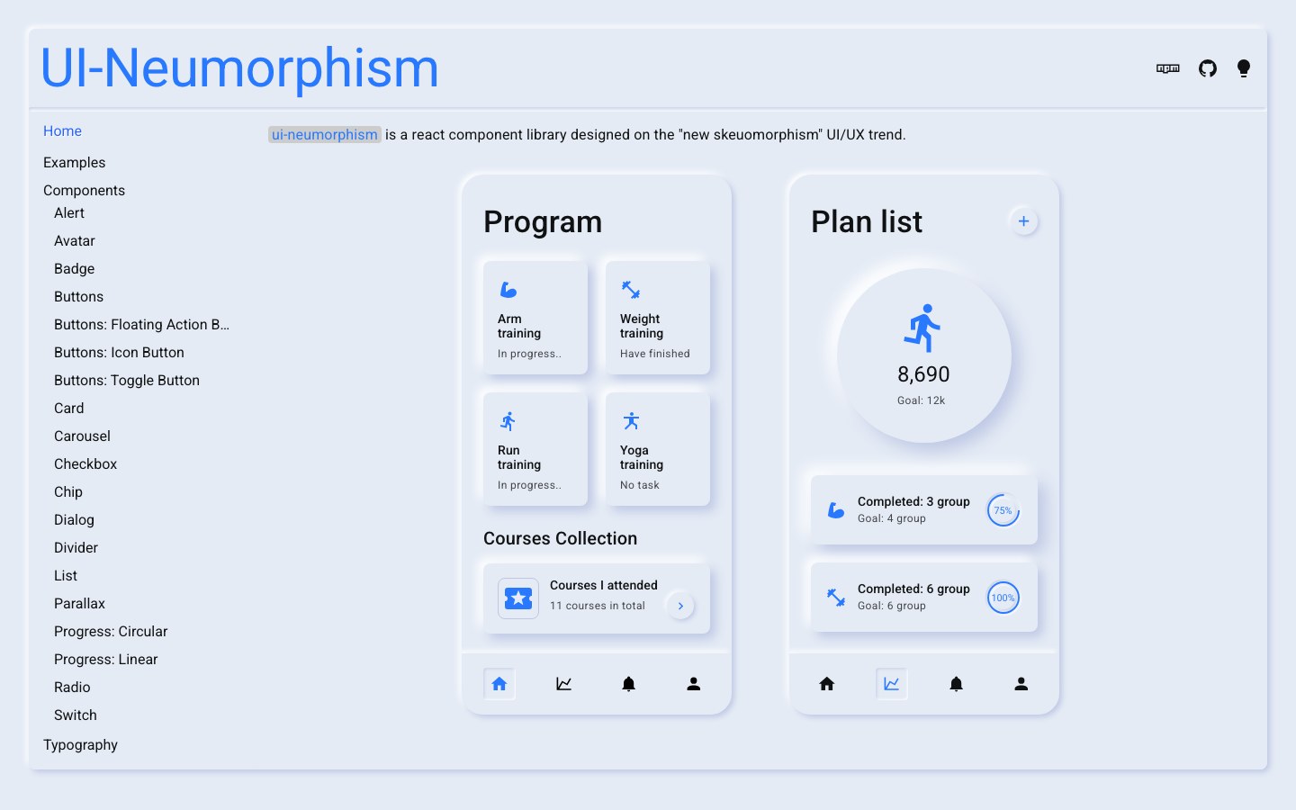
A React library for neumorphic 'soft UI' — raised and inset surfaces in a single tone.
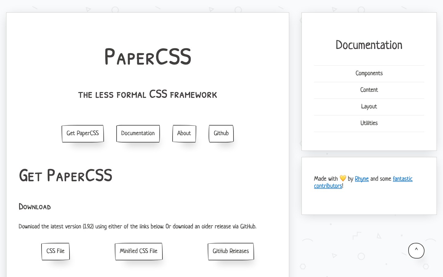
The less formal CSS framework — wobbly hand-drawn borders and a paper-like feel.
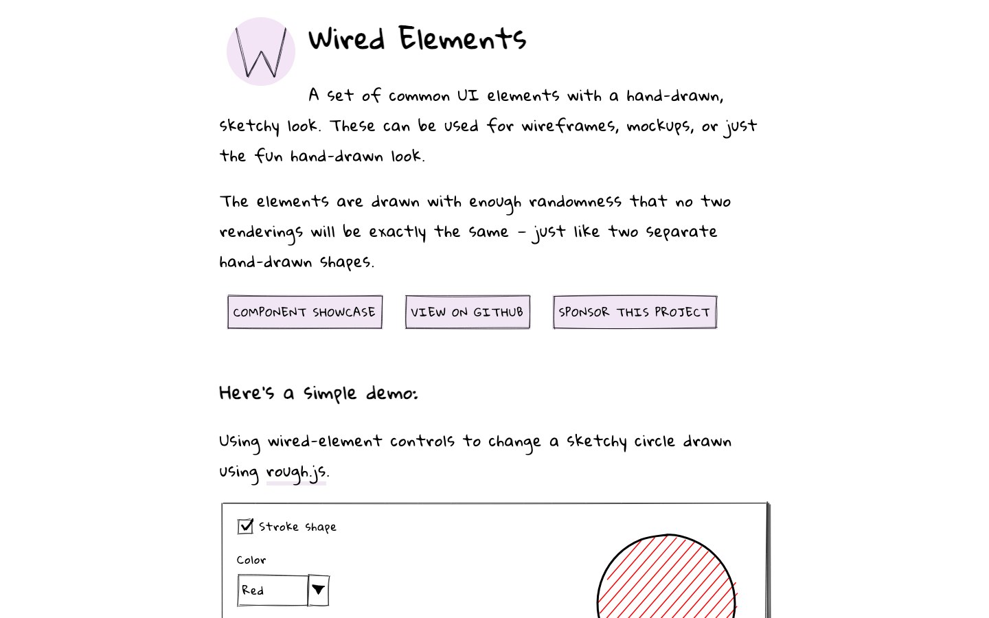
Hand-drawn, sketchy web components built on Rough.js — every render wobbles a little differently.
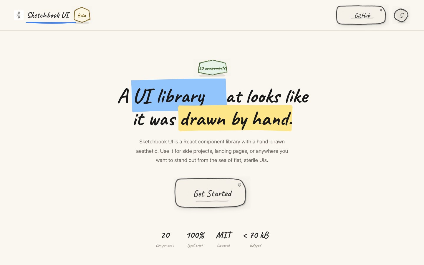
React components that look hand-drawn in a sketchbook — pencil outlines, marker highlights, handwritten type.
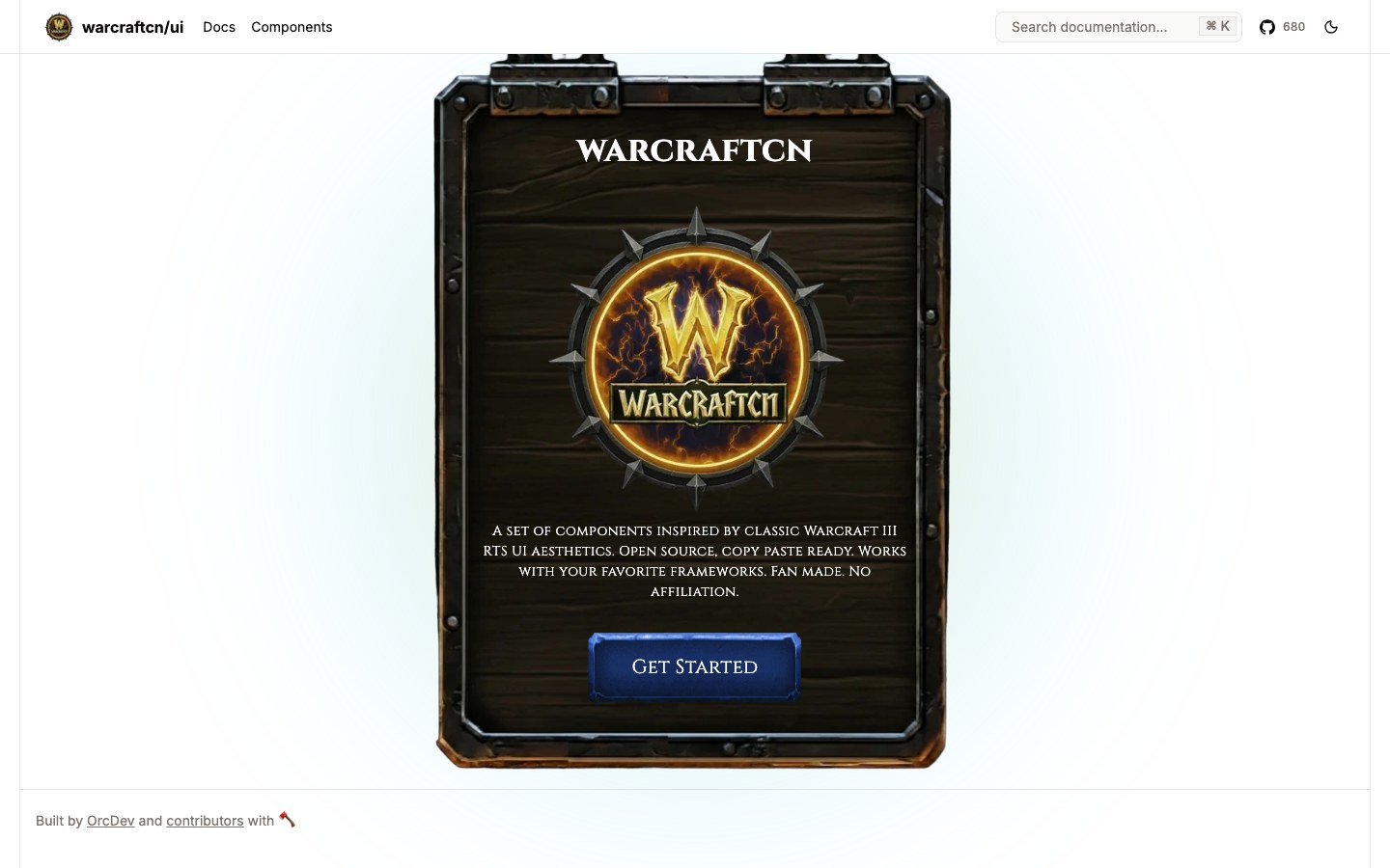
Components styled after classic Warcraft III — carved wood, metal frames, parchment — via the shadcn CLI.
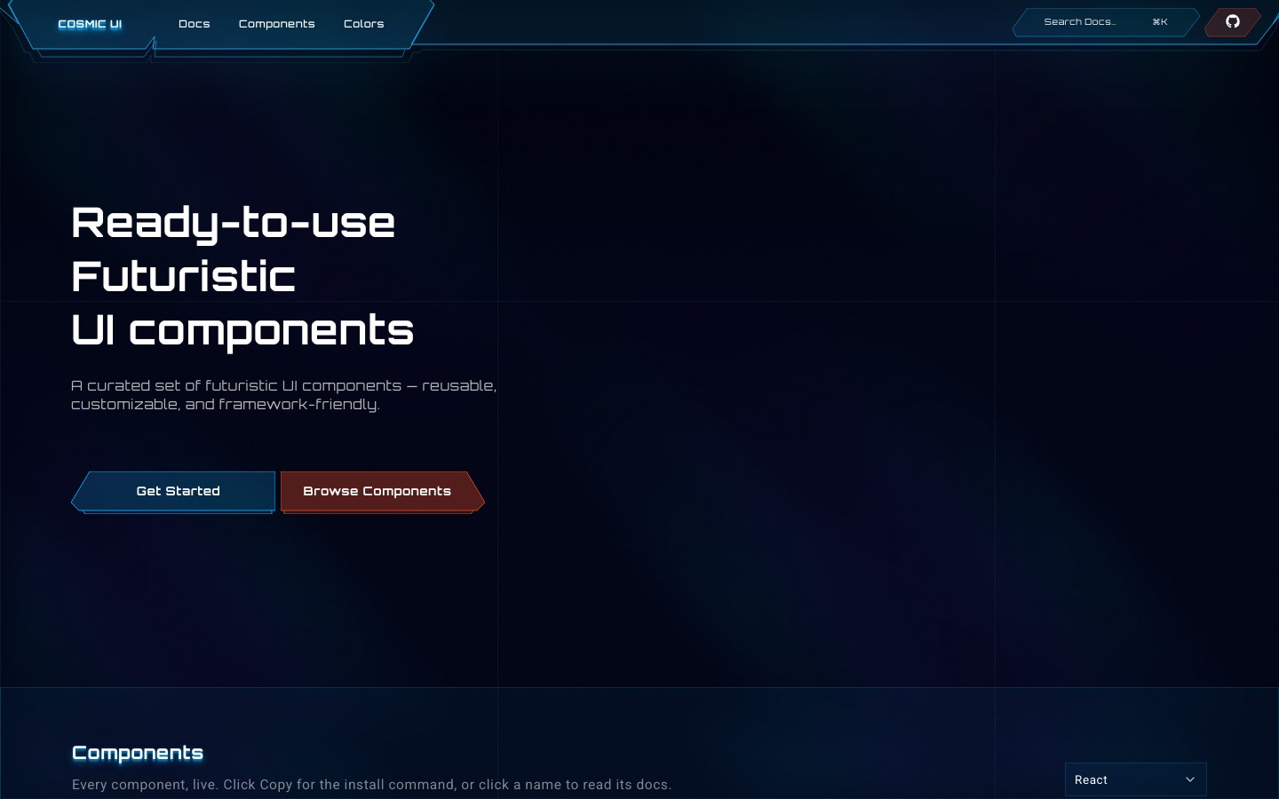
Sci-fi components with angled frames, neon outlines and starfield backgrounds, for React and Vue.
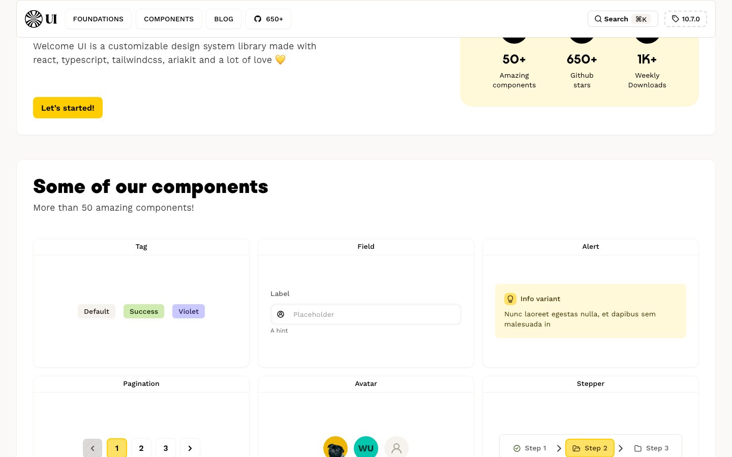
The design system of the job platform Welcome to the Jungle — friendly, bold, and very yellow.
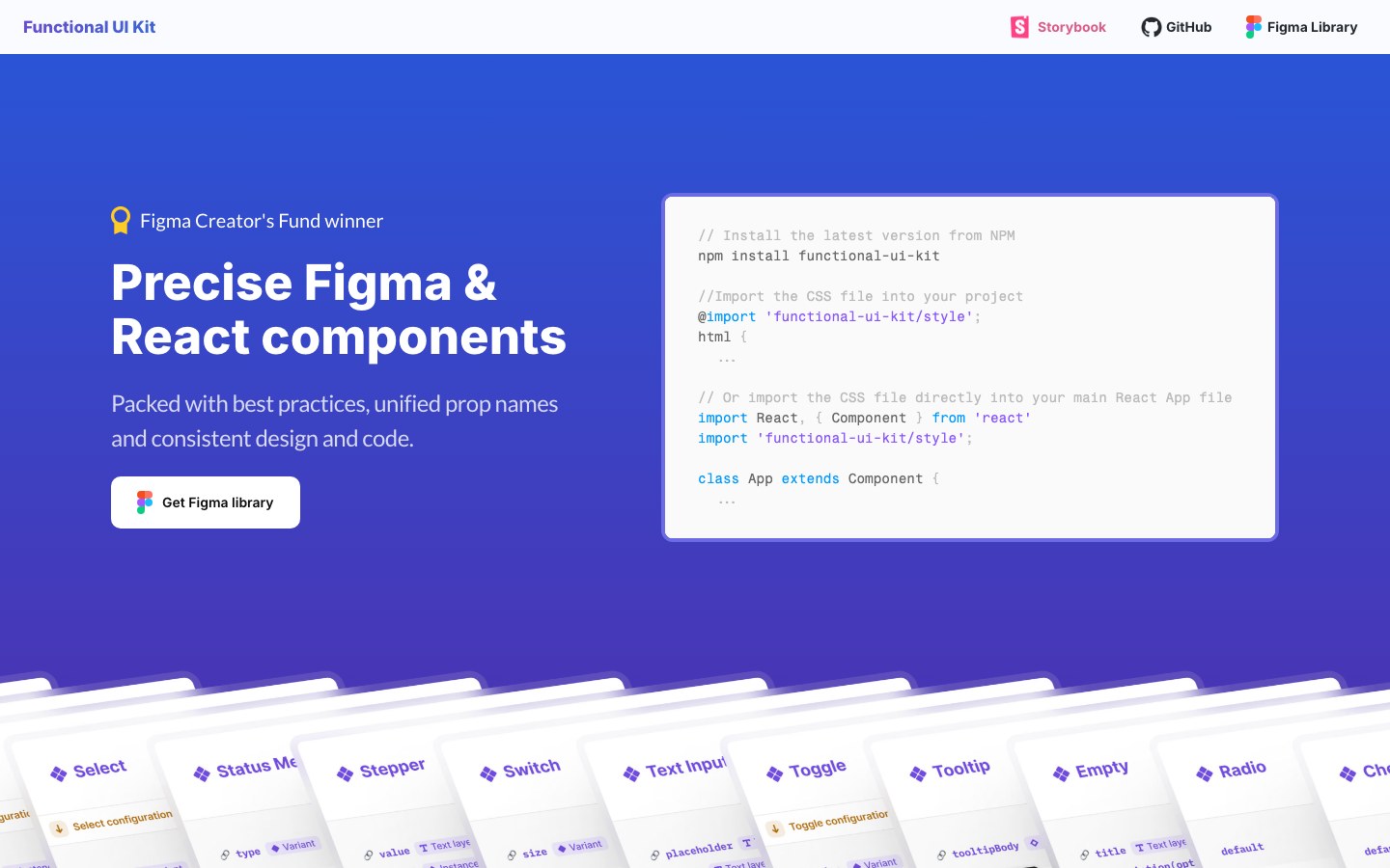
React components that mirror their Figma library one-to-one — same names, same props.
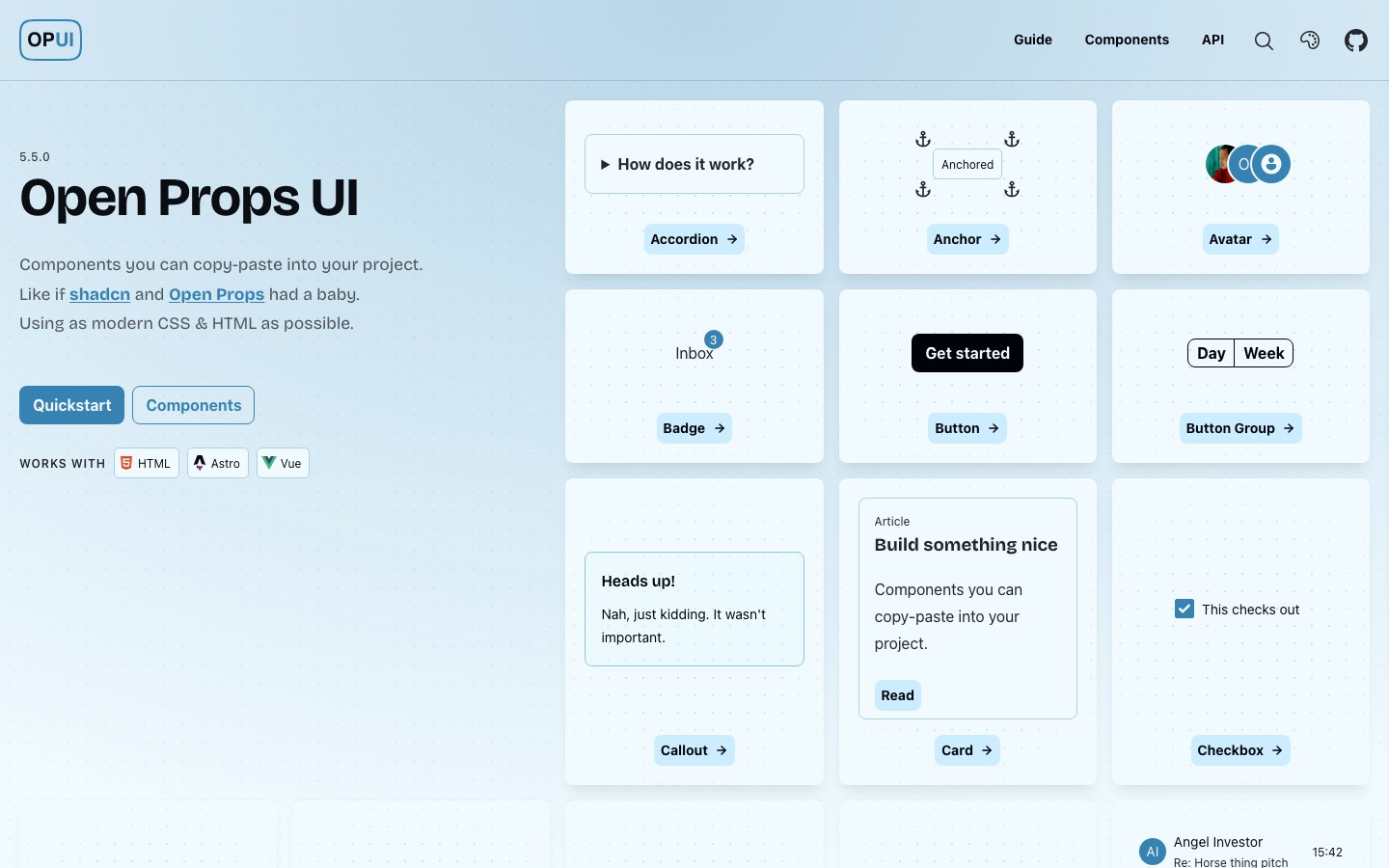
Pure-CSS components that lean on the newest HTML and CSS features — usable in any project.
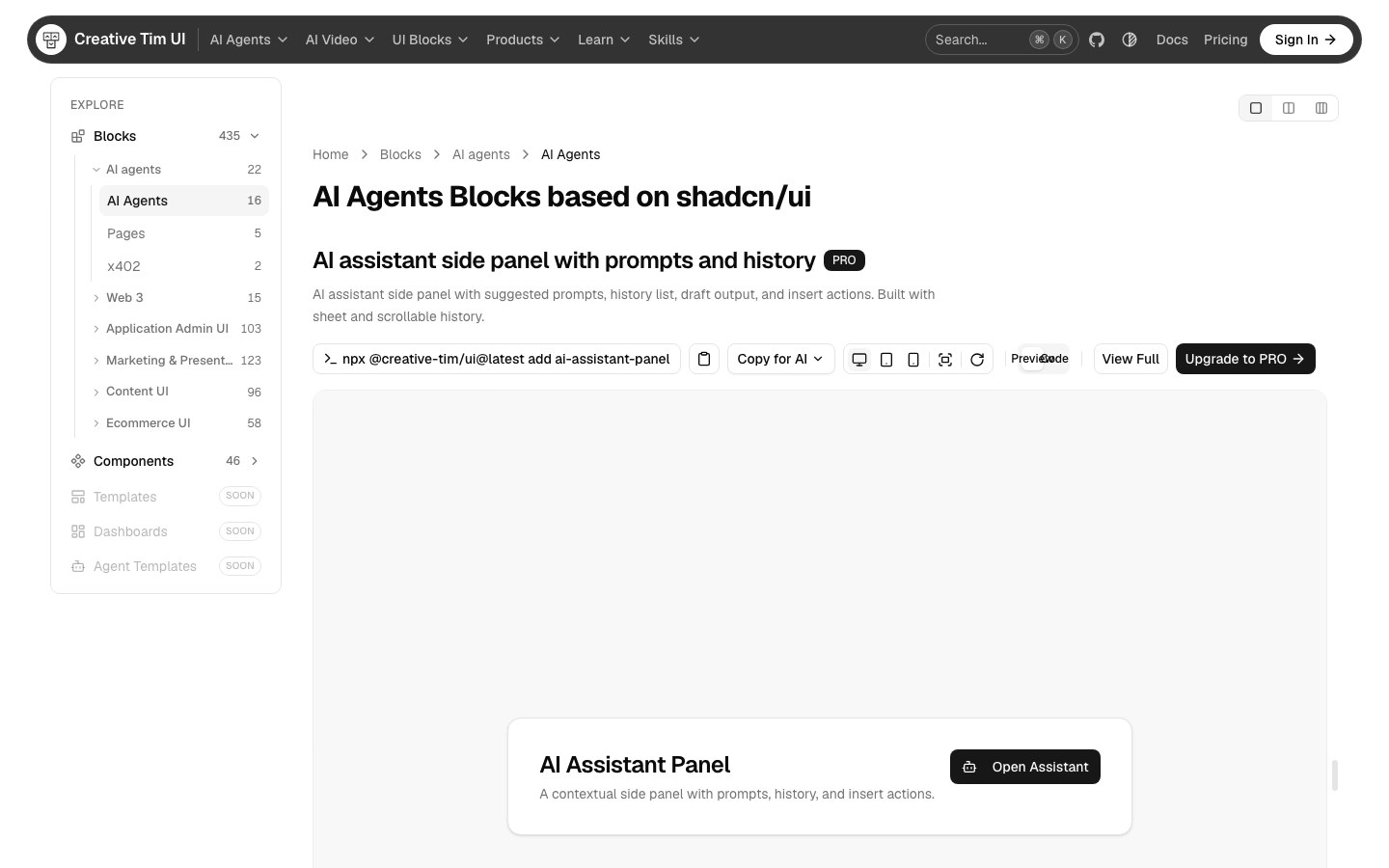
Hundreds of open-source shadcn/ui blocks for AI agents, admin panels, e-commerce and marketing.
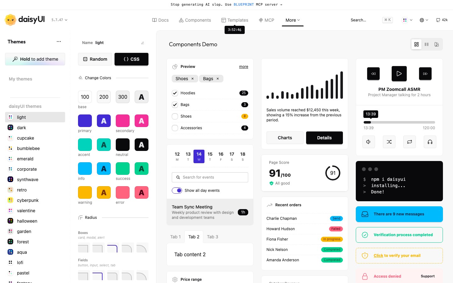
A Tailwind plugin that adds semantic component classes and dozens of ready-made themes.
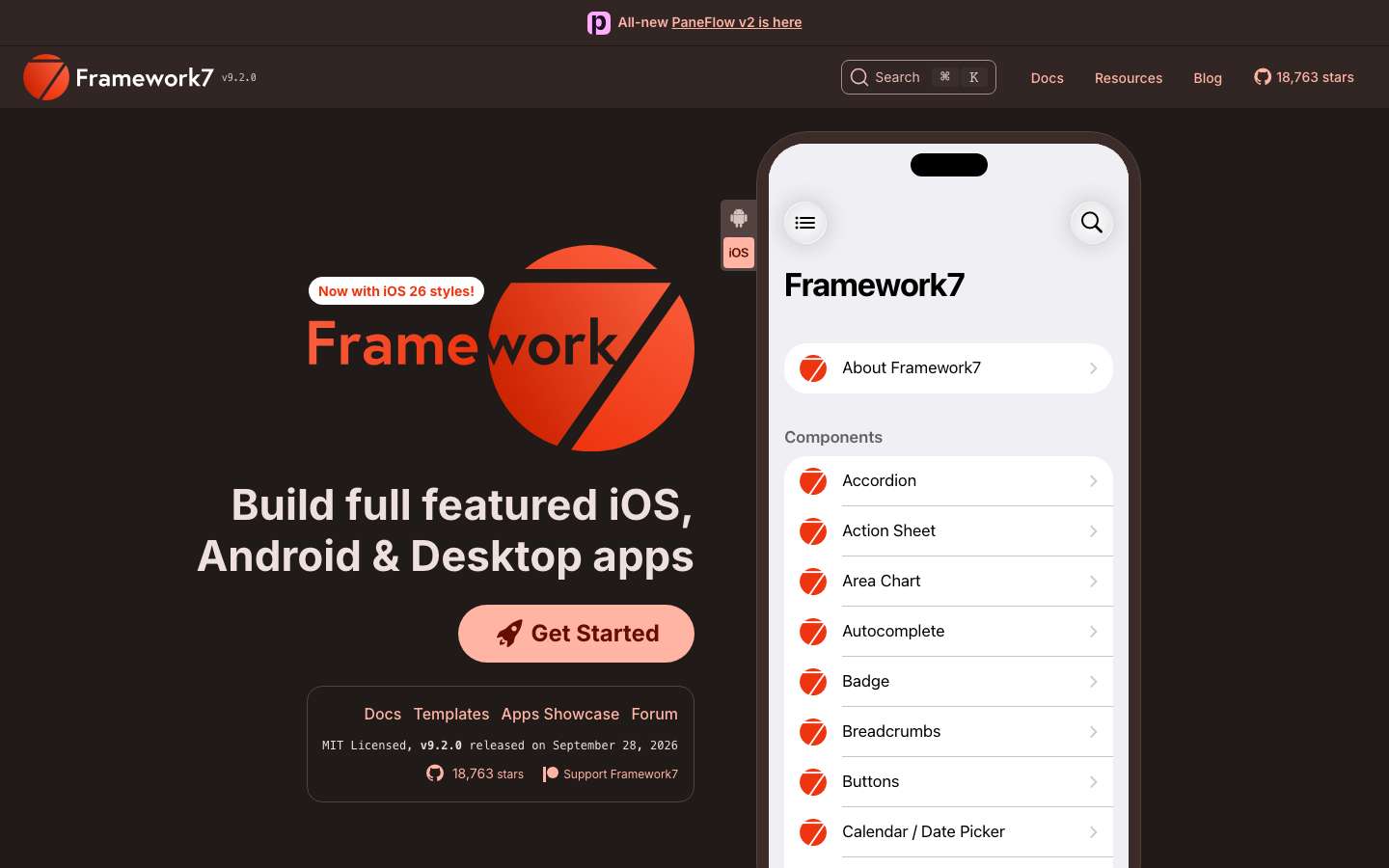
Build mobile web apps that look native on iOS and Android, with a huge kitchen-sink demo app.
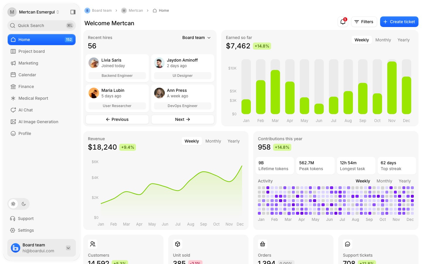
A dashboard-first React design system with a dozen full templates — finance, project boards, AI chat.
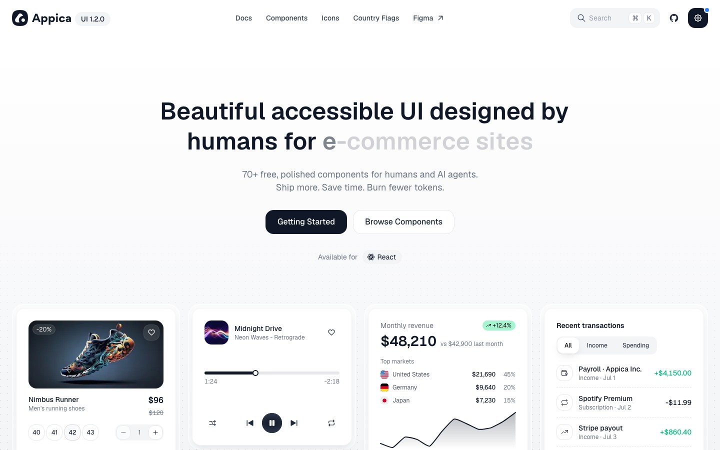
Refined components for e-commerce — product cards, media players, revenue charts and transaction lists.
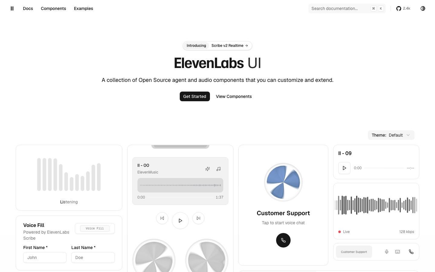
ElevenLabs' open components for voice and agent apps — orbs, waveforms and live transcripts.
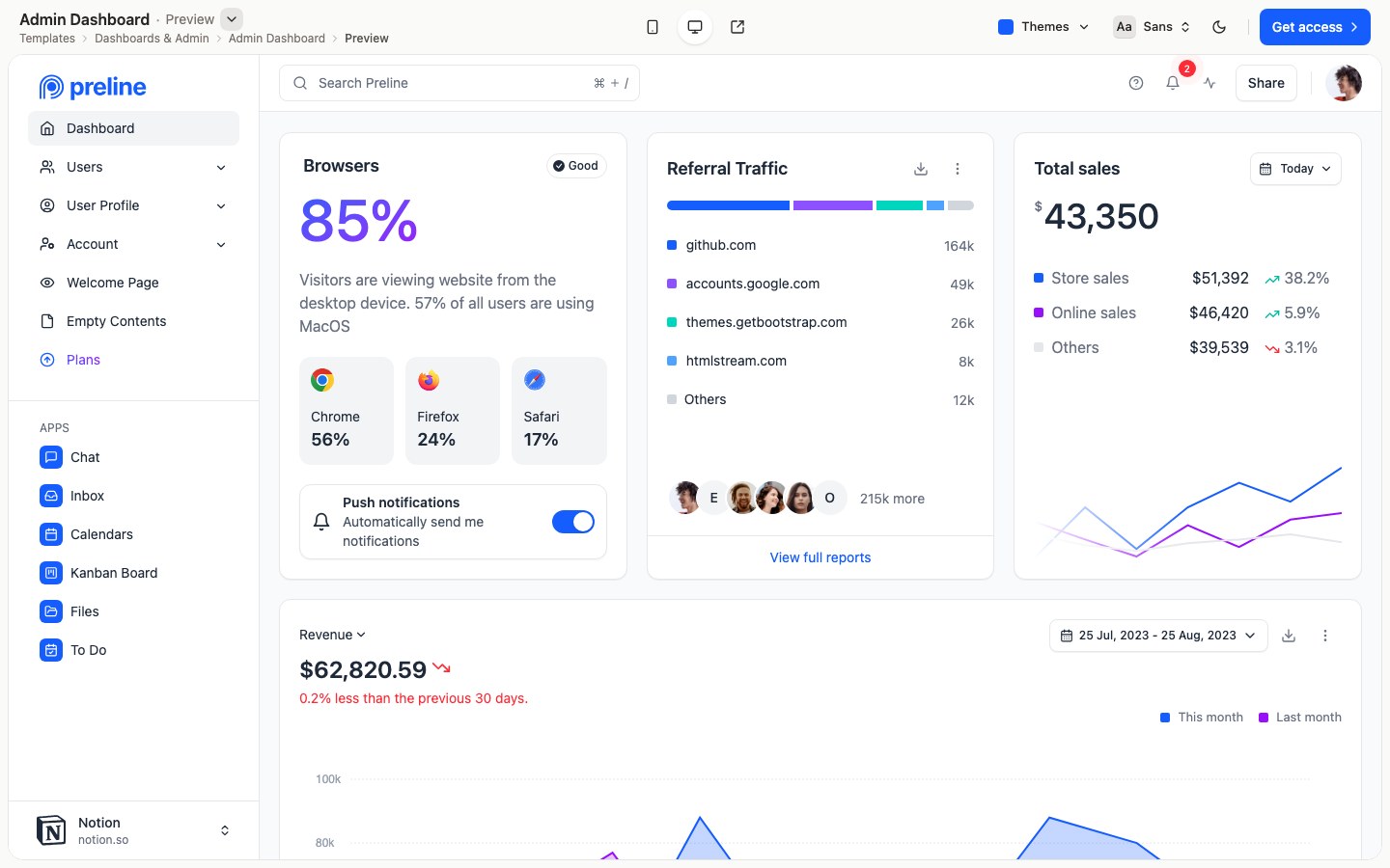
Tailwind components and polished full templates — dashboards, AI chat, SaaS sites — with dark mode built in.
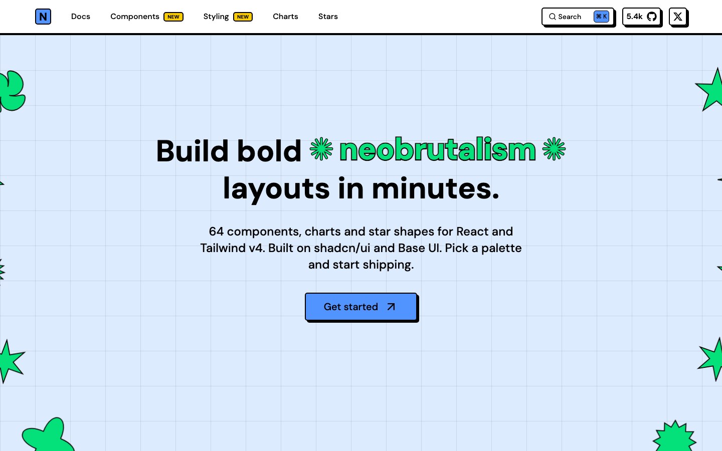
Bold neobrutalist components — thick borders, hard shadows, loud color — on top of shadcn/ui.
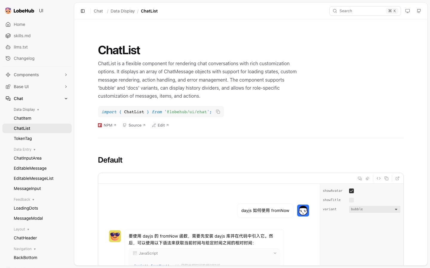
LobeHub's component library for AI products — chat lists, consoles and polished agent interfaces.
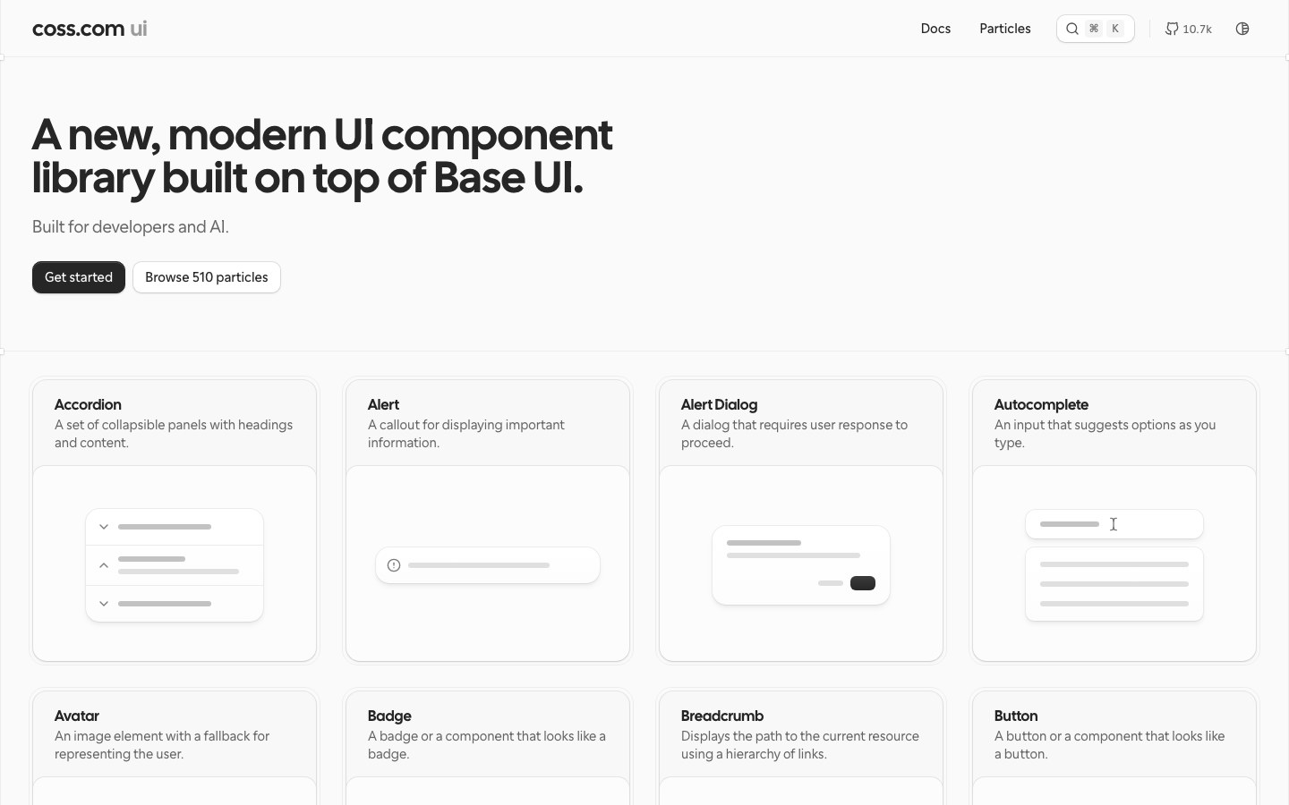
Cal.com's modern component library on Base UI, plus hundreds of ready-made component compositions.
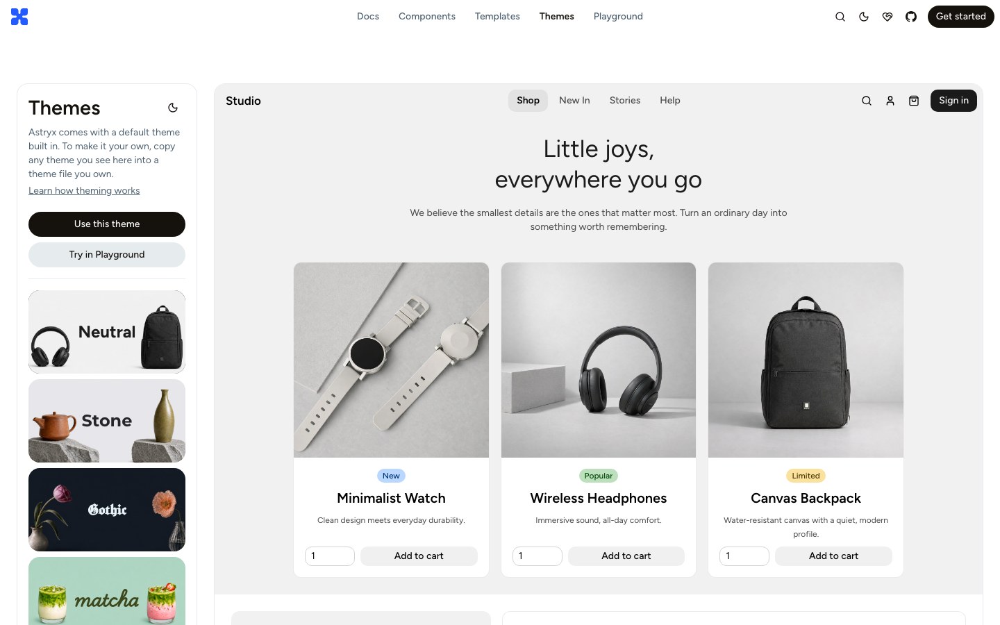
Meta's open design system on StyleX, with dozens of full-page templates and switchable themes.
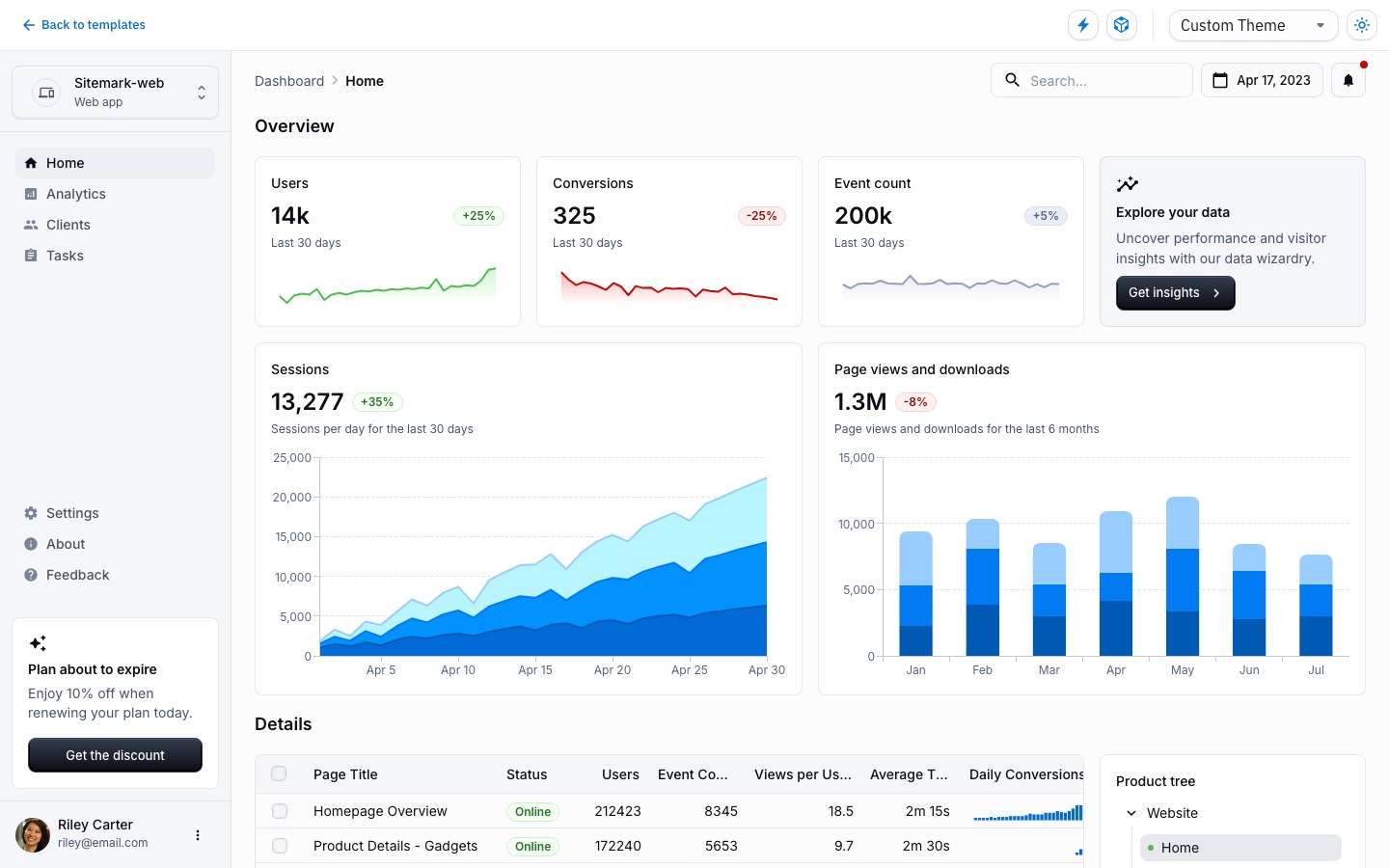
Google's Material Design in React, with free full-page templates for dashboards, checkout and marketing.
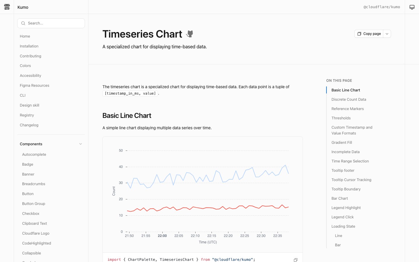
Cloudflare's own React component library — crisp, dense and built for dashboards.
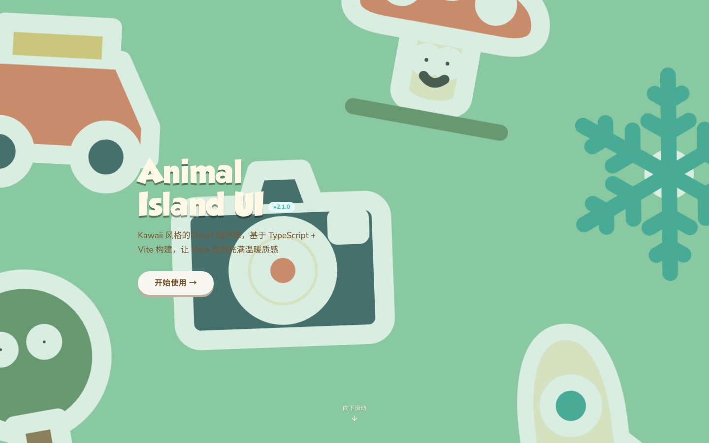
A kawaii React component library with the rounded, cozy look of Animal Crossing.
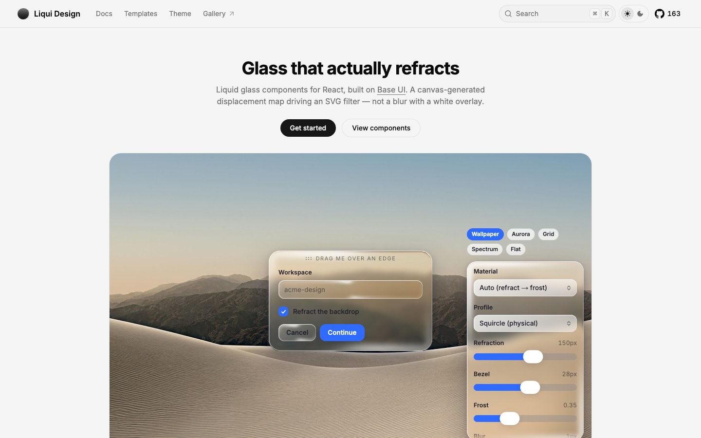
Liquid-glass React components that truly refract what's behind them, installed through the shadcn CLI.
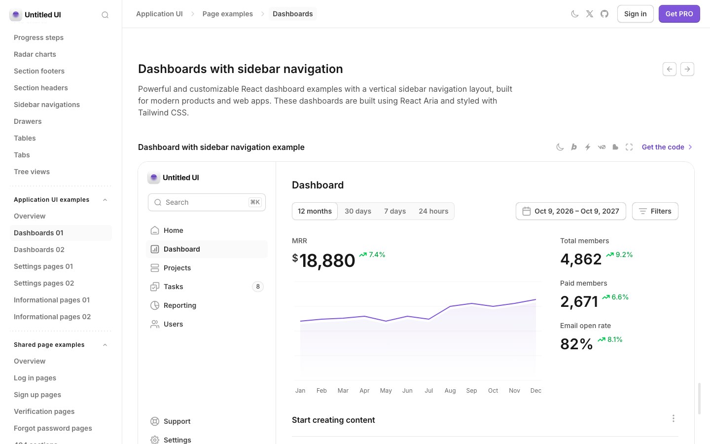
A large, carefully crafted React kit from the Untitled UI team — dashboards, settings and marketing pages included.
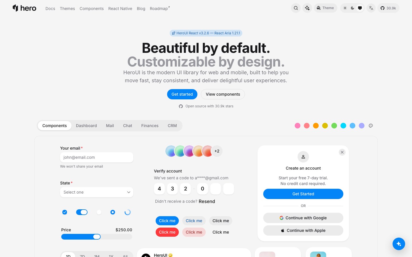
Polished React components on Tailwind and React Aria, with soft surfaces and a live theme builder.
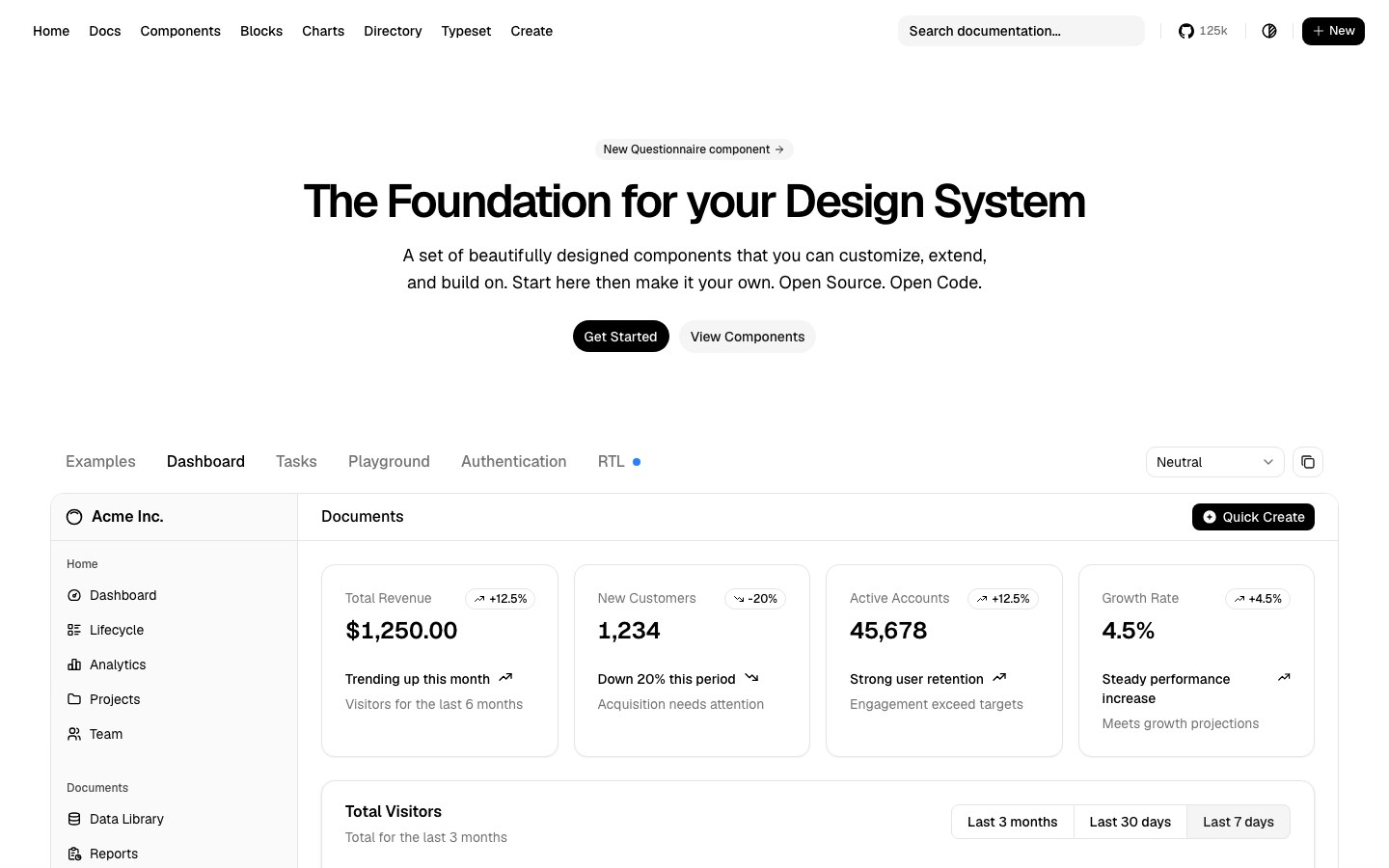
Copy-in React components you own outright — the default starting point for most modern Tailwind apps.