Design Systems
34 Kits · 34 FreeComplete systems with theming, tokens and dozens of components.
Most saved in Design Systems
All Design Systems kits
34 sites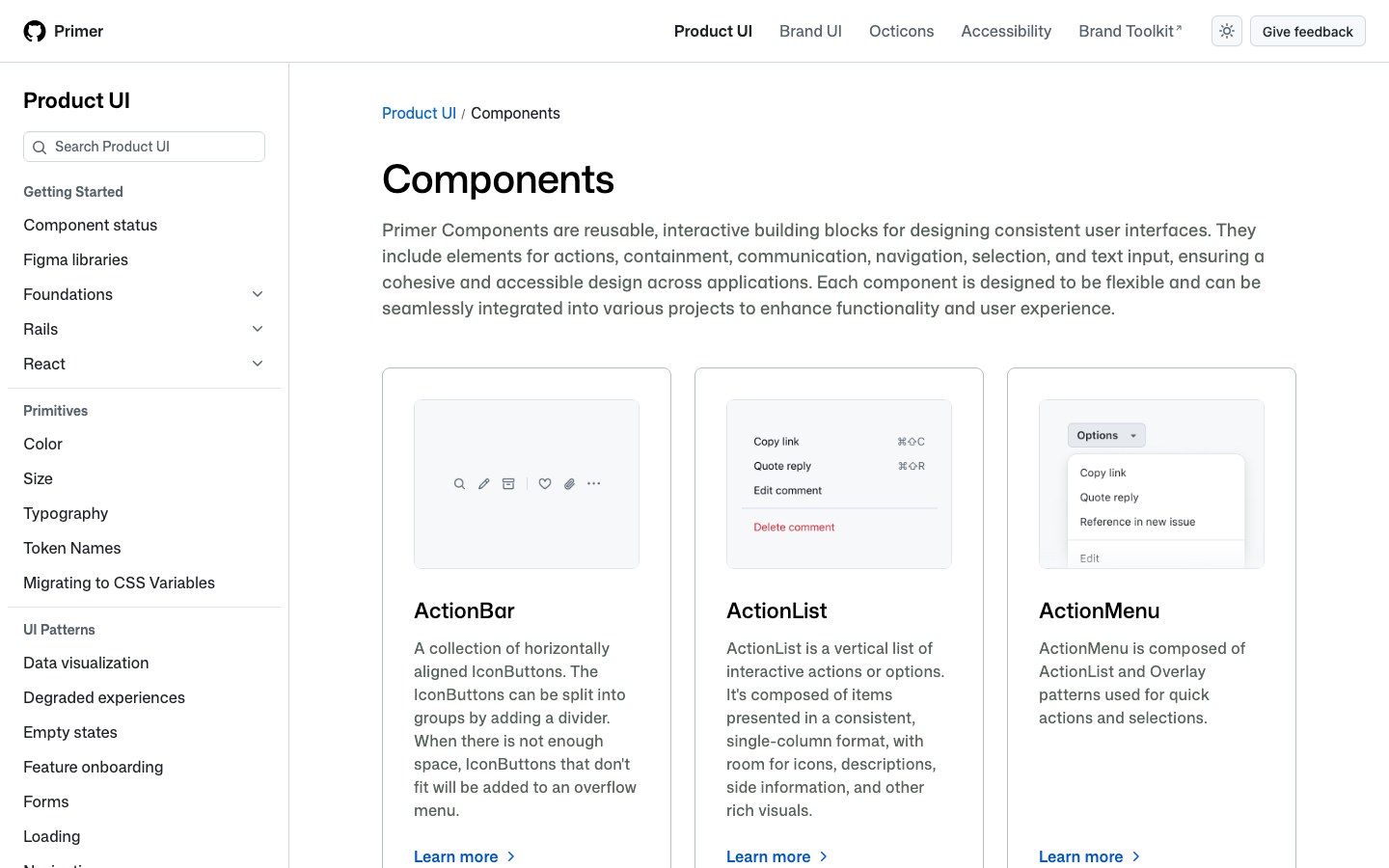
The components behind GitHub's own product pages, from issues to settings: clean, information-dense and built for developers.
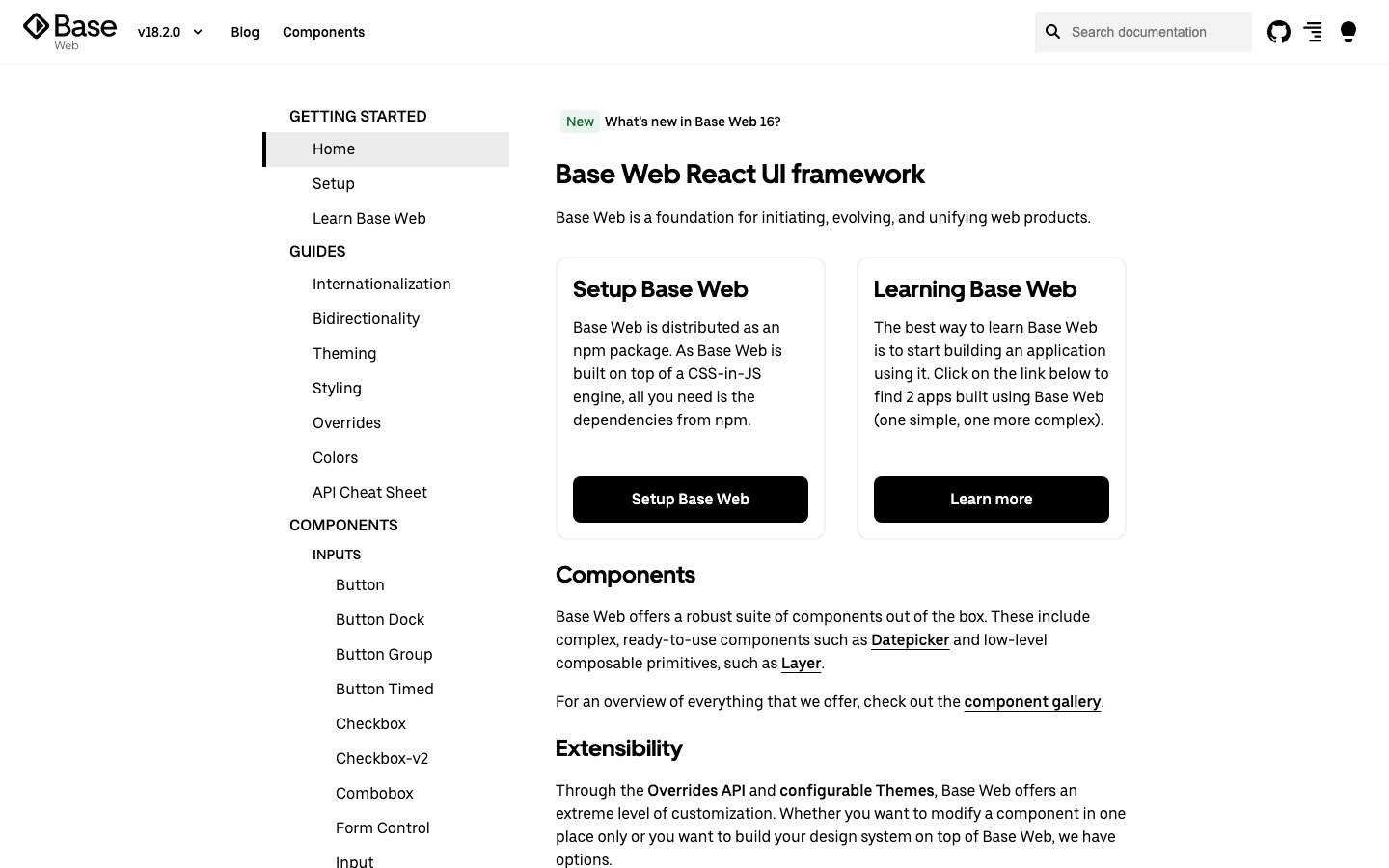
Uber's React design system: black and white, high contrast and plain shapes, the look of Uber's own web tools.
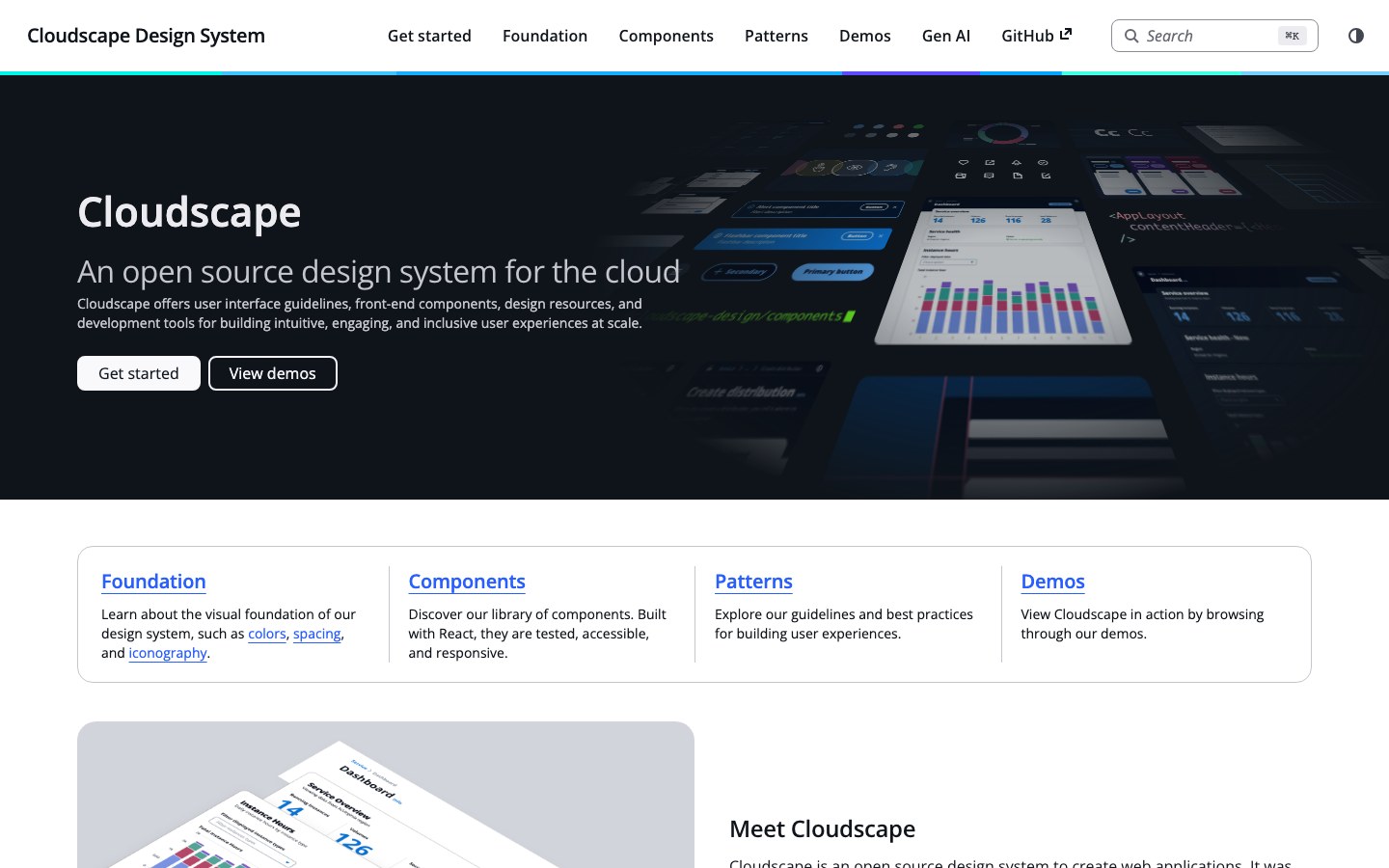
The design system behind the AWS console: data tables, forms and dashboards built for long working sessions.
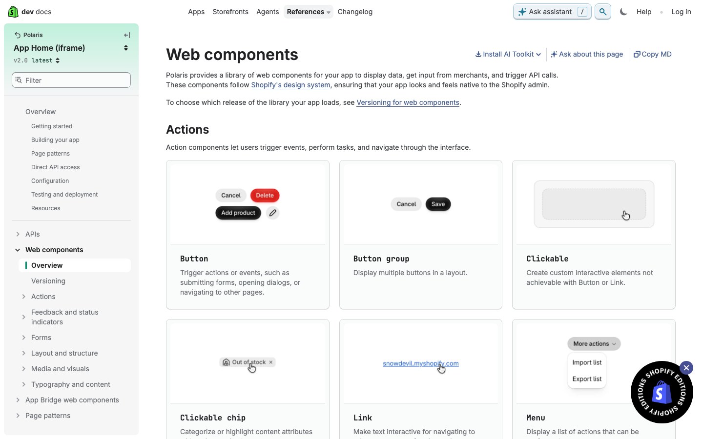
Shopify's admin design system, rebuilt in 2025 as web components: black pill buttons, gray canvas and calm white cards.
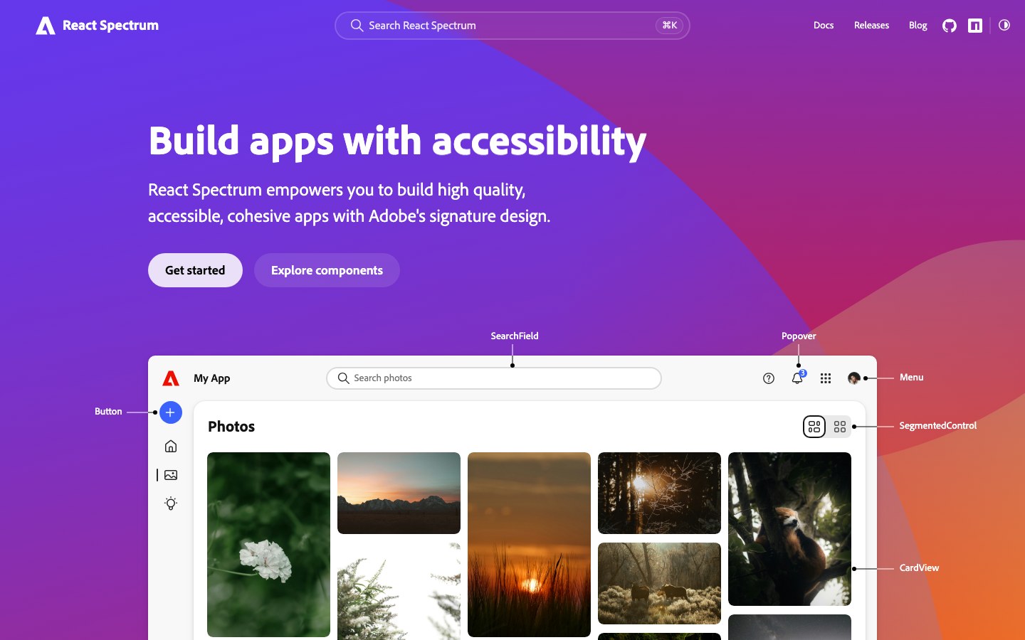
Adobe's new Spectrum 2, the look of today's Photoshop and Acrobat on the web: big rounded corners, bold type and a bright blue accent.
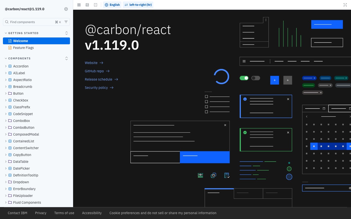
IBM's design system for its cloud and data products: square corners, IBM Plex type and a strict grid.
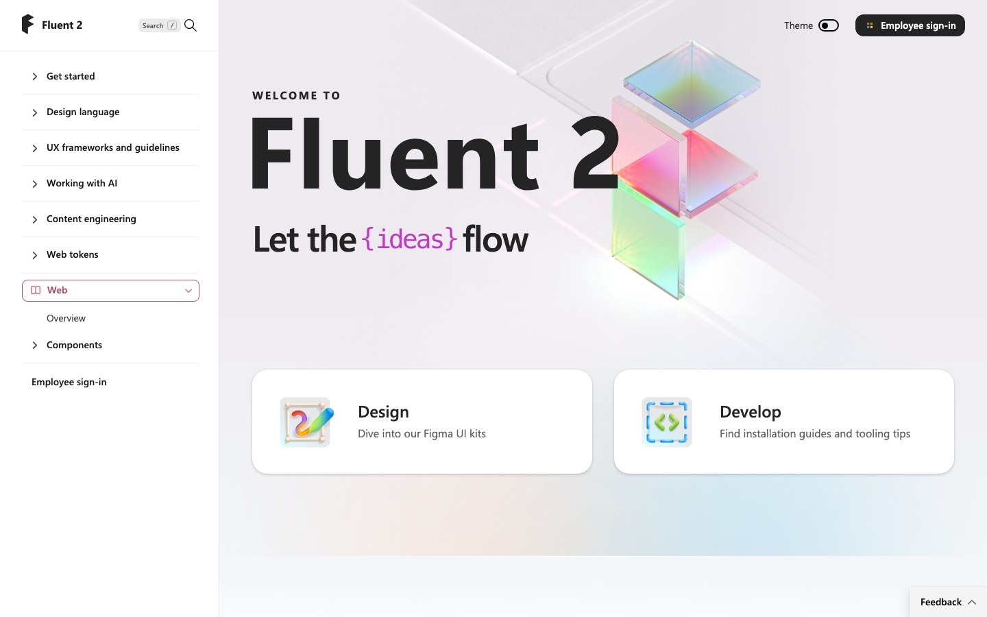
Microsoft's Fluent 2 for React, the system behind Teams and Office on the web: calm blue, small corners and dense, tidy layouts.
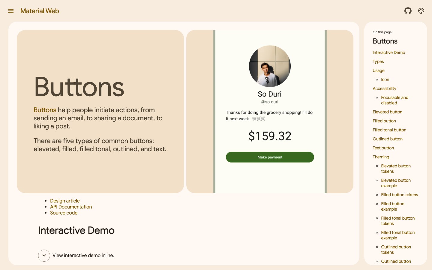
Google's Material 3 components as web components: rounded buttons, soft purple tones and works in any framework.
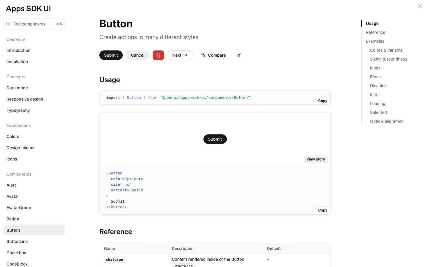
OpenAI's design system for apps inside ChatGPT: black pill buttons, lots of white space, Tailwind 4 tokens and Radix-based components.
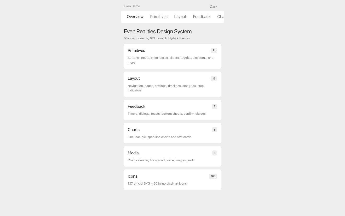
A design system for smart-glasses apps — dark screens, 55+ components and 191 pixel icons.
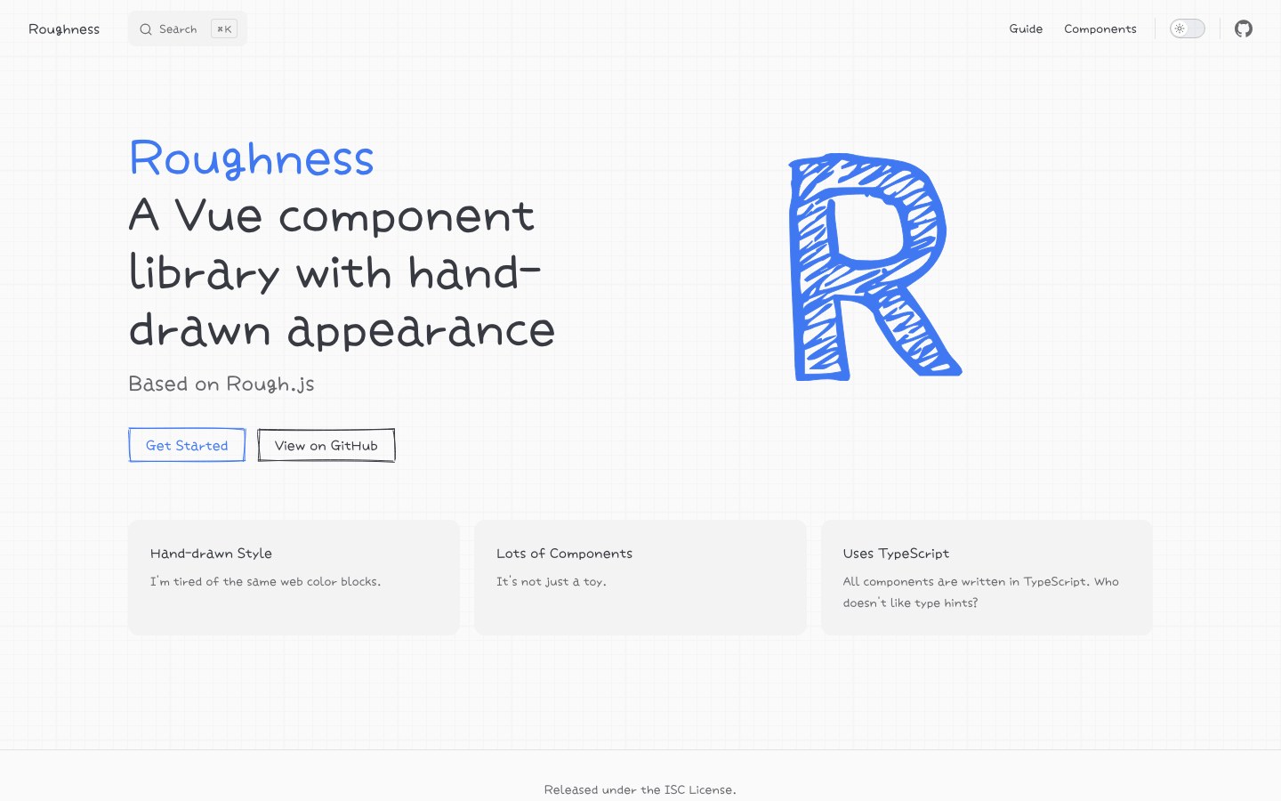
A hand-drawn Vue component library built on Rough.js — a rare full set in this style for Vue.
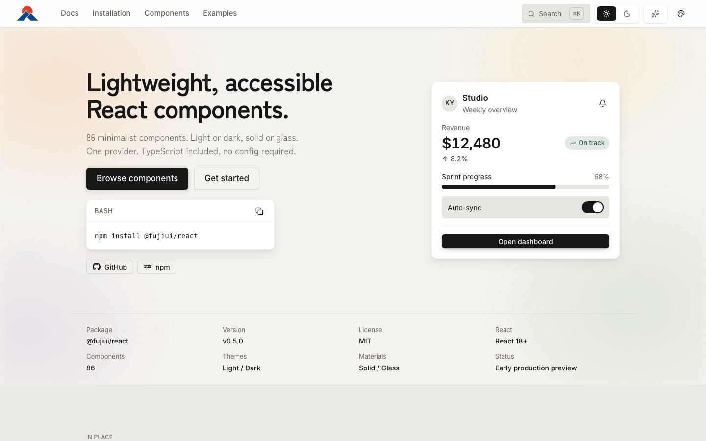
Restrained, accessible React components with an optional liquid-glass material switched by one provider.
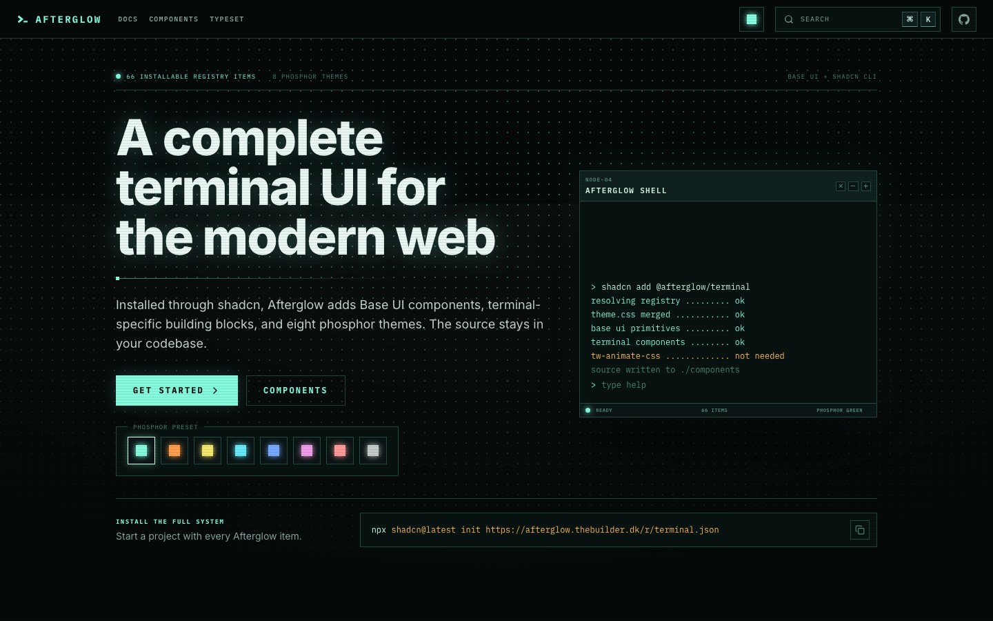
A terminal-style CRT UI kit with eight phosphor themes, installed through the shadcn registry.
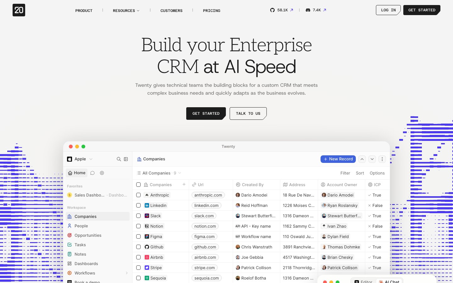
The UI package of Twenty, the open-source CRM — a Notion-like table-and-database interface.
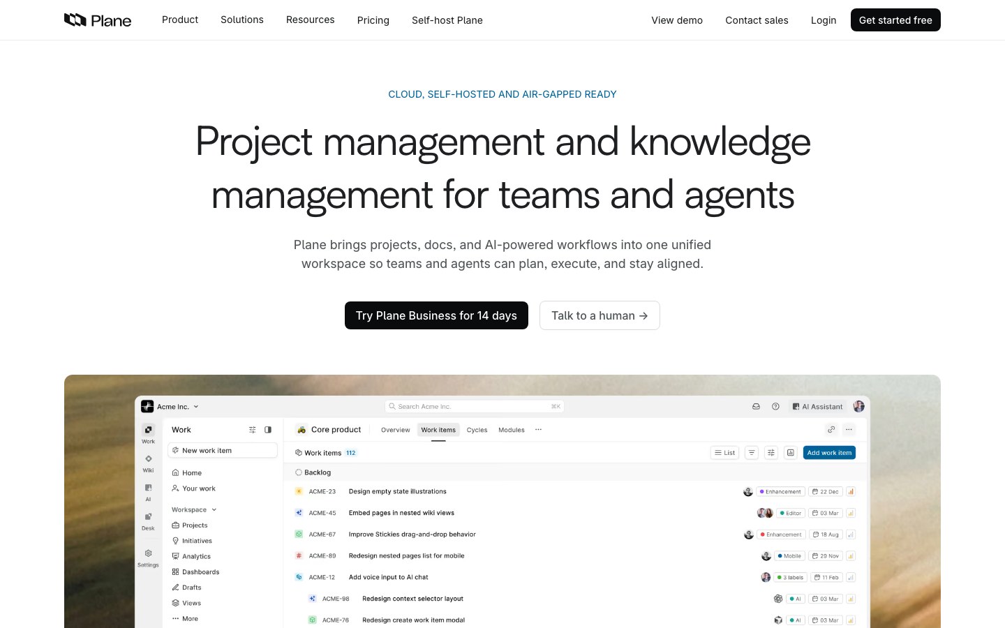
The UI package of Plane, the open-source alternative to Linear and Jira.
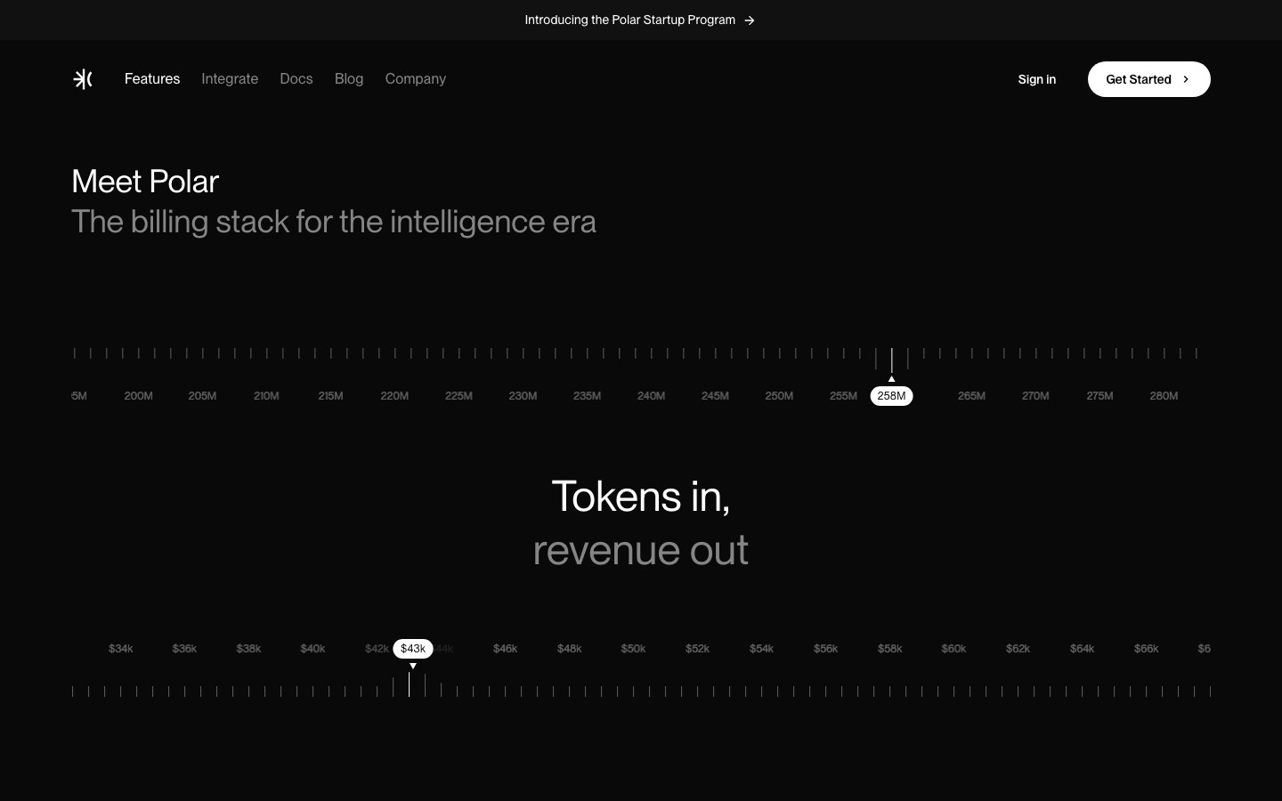
The component package of Polar, the open-source billing platform — dark and minimal.
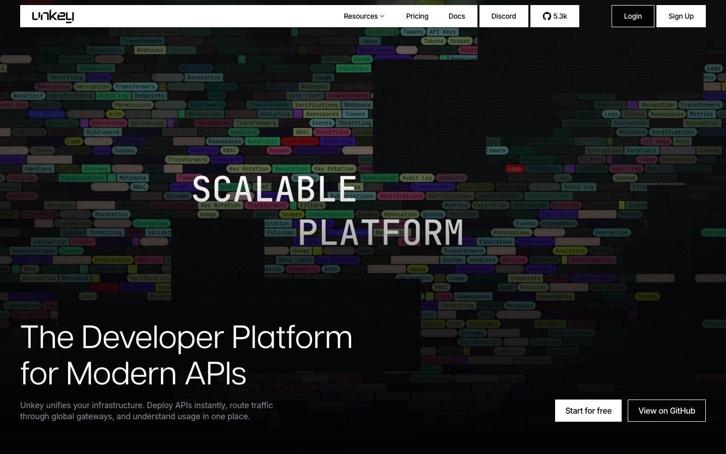
The design system of Unkey, the API platform — dark, dotted, unmistakably developer-tool.
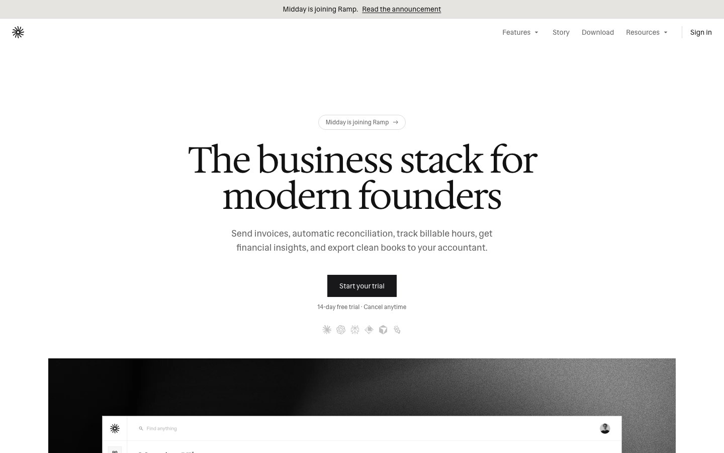
The UI package of Midday, the open-source business app — black and white, minimal, typographic.
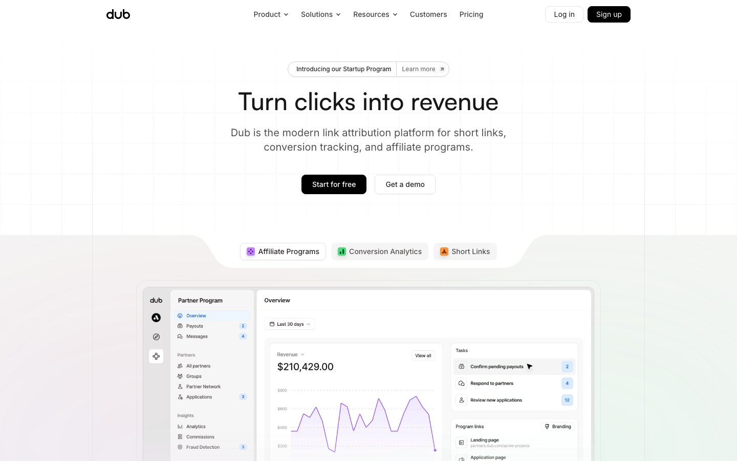
The component package behind Dub, the link attribution platform — clean, Linear-style SaaS interface.
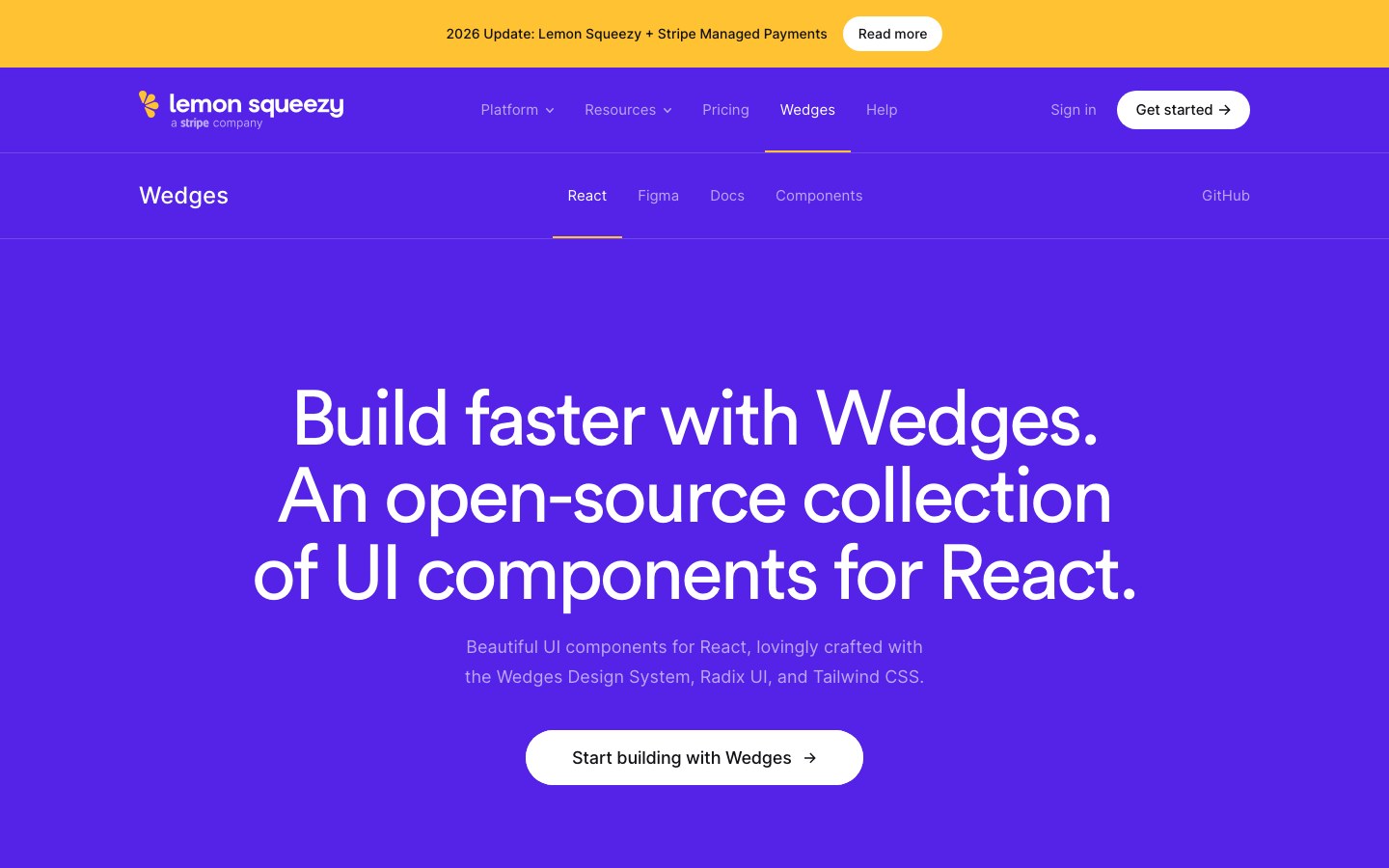
Lemon Squeezy's own React components, built on Radix and Tailwind with its playful purple brand.
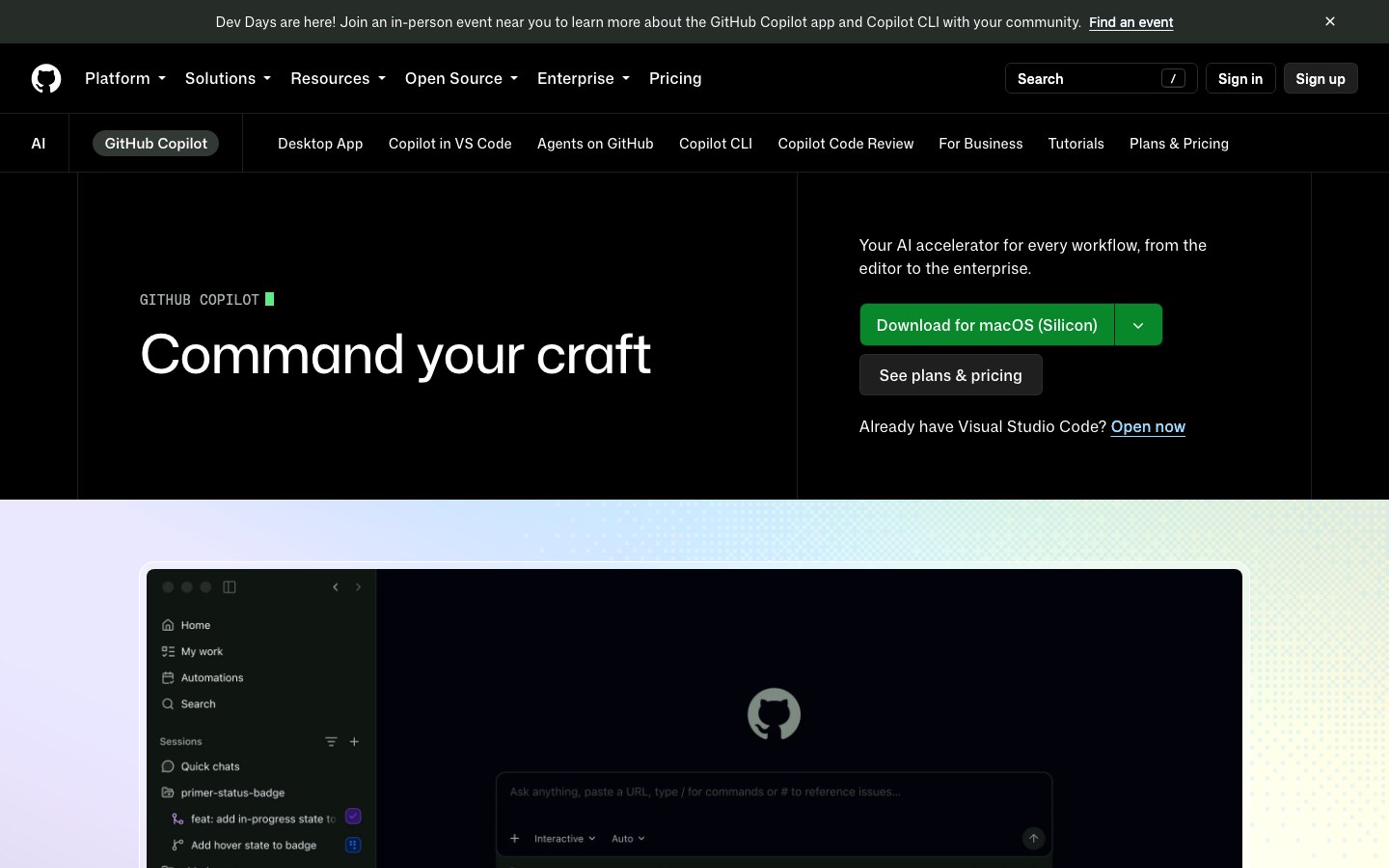
GitHub's design system for marketing pages — the building blocks behind github.com's product pages.
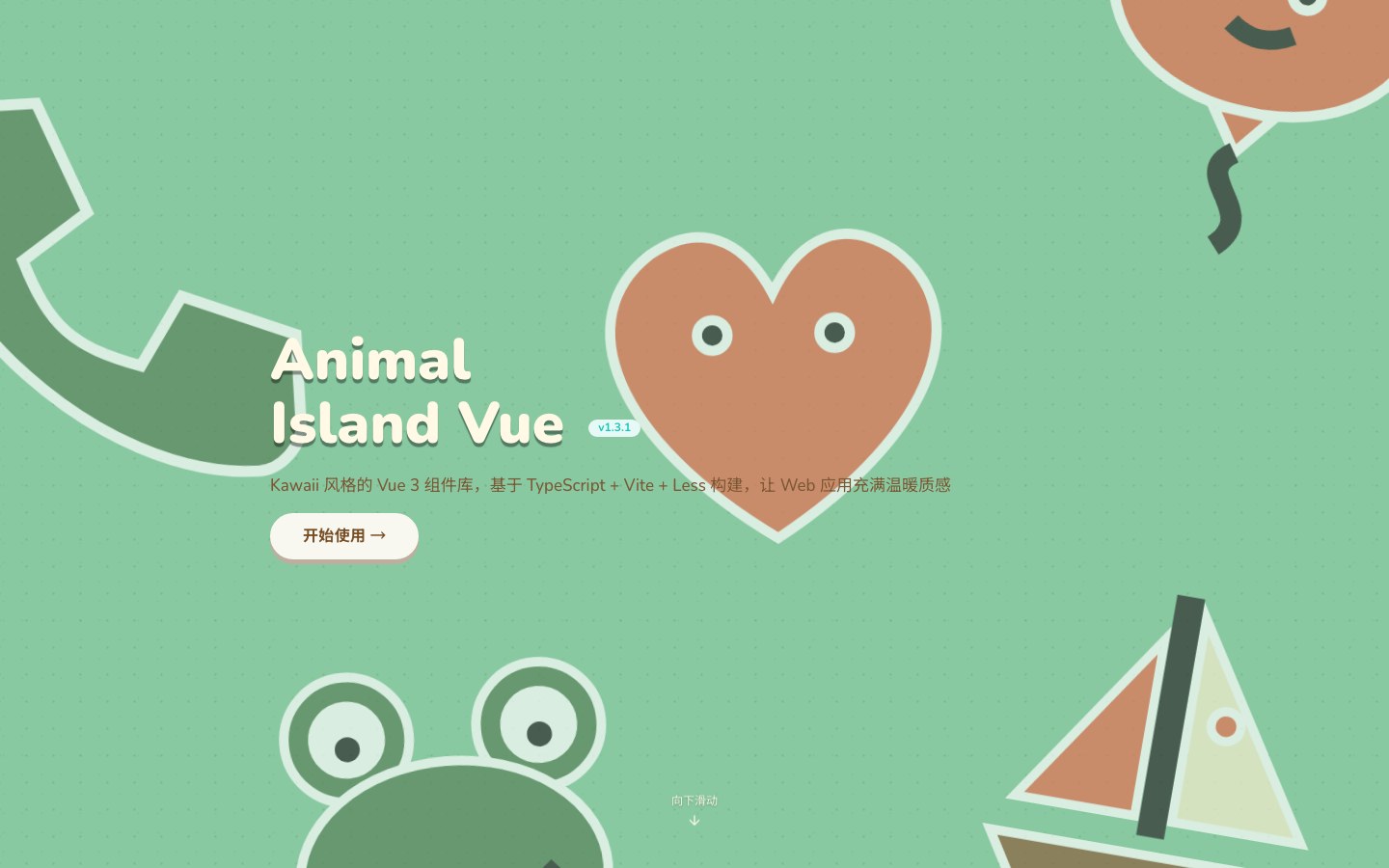
The Vue 3 edition of Animal Island UI — the same cozy, kawaii Animal Crossing look.
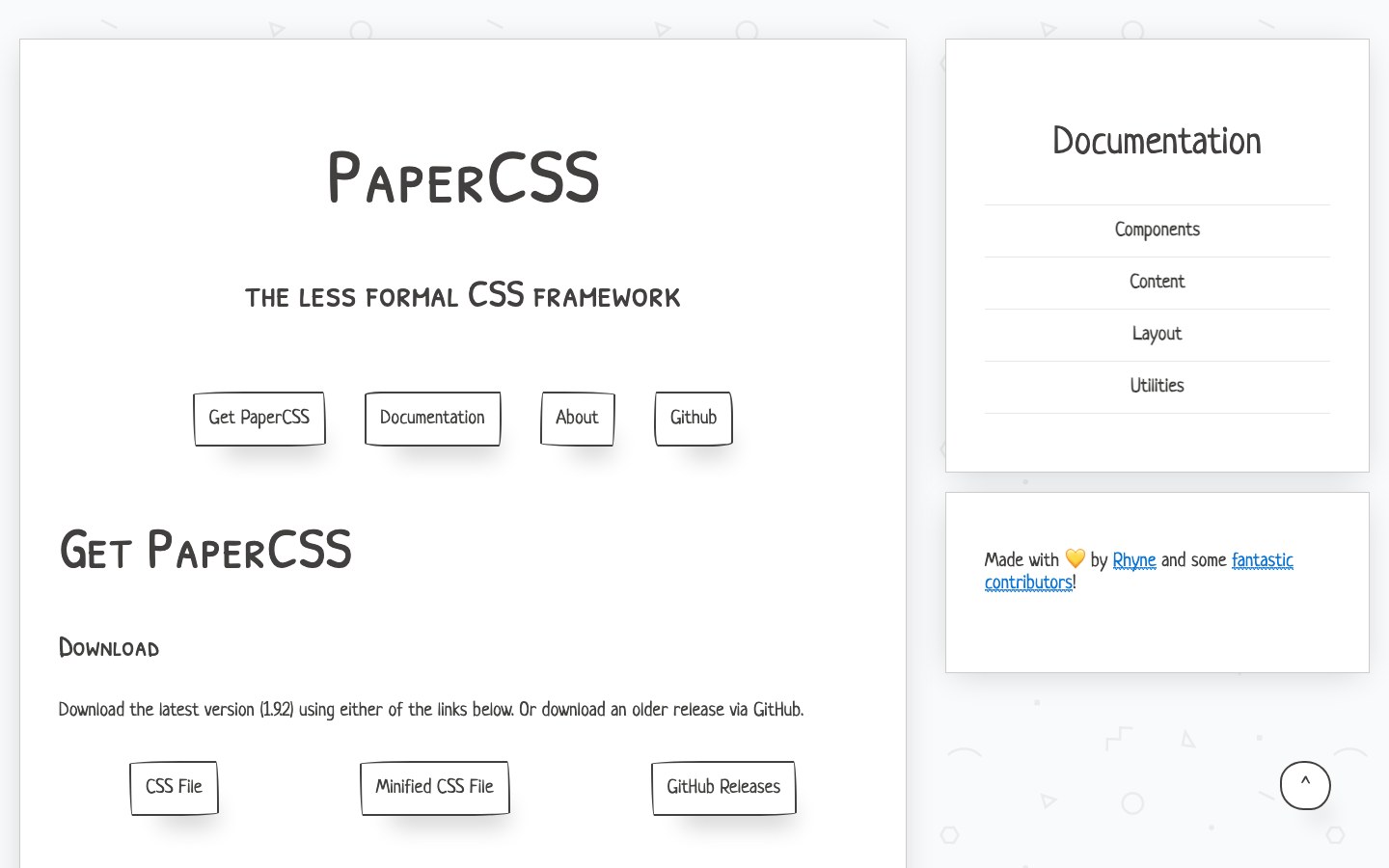
The less formal CSS framework — wobbly hand-drawn borders and a paper-like feel.
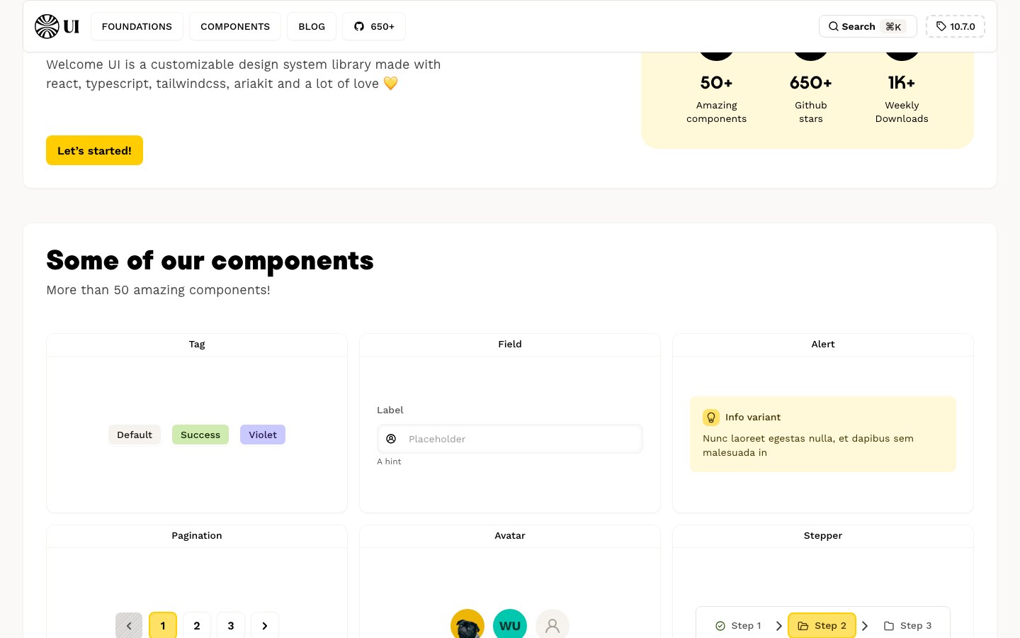
The design system of the job platform Welcome to the Jungle — friendly, bold, and very yellow.
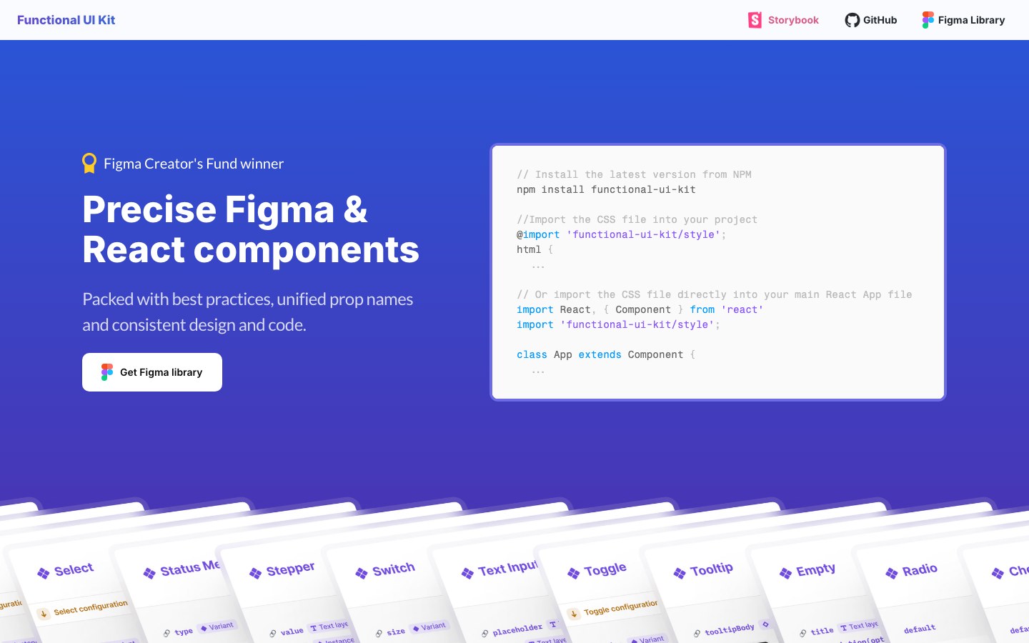
React components that mirror their Figma library one-to-one — same names, same props.
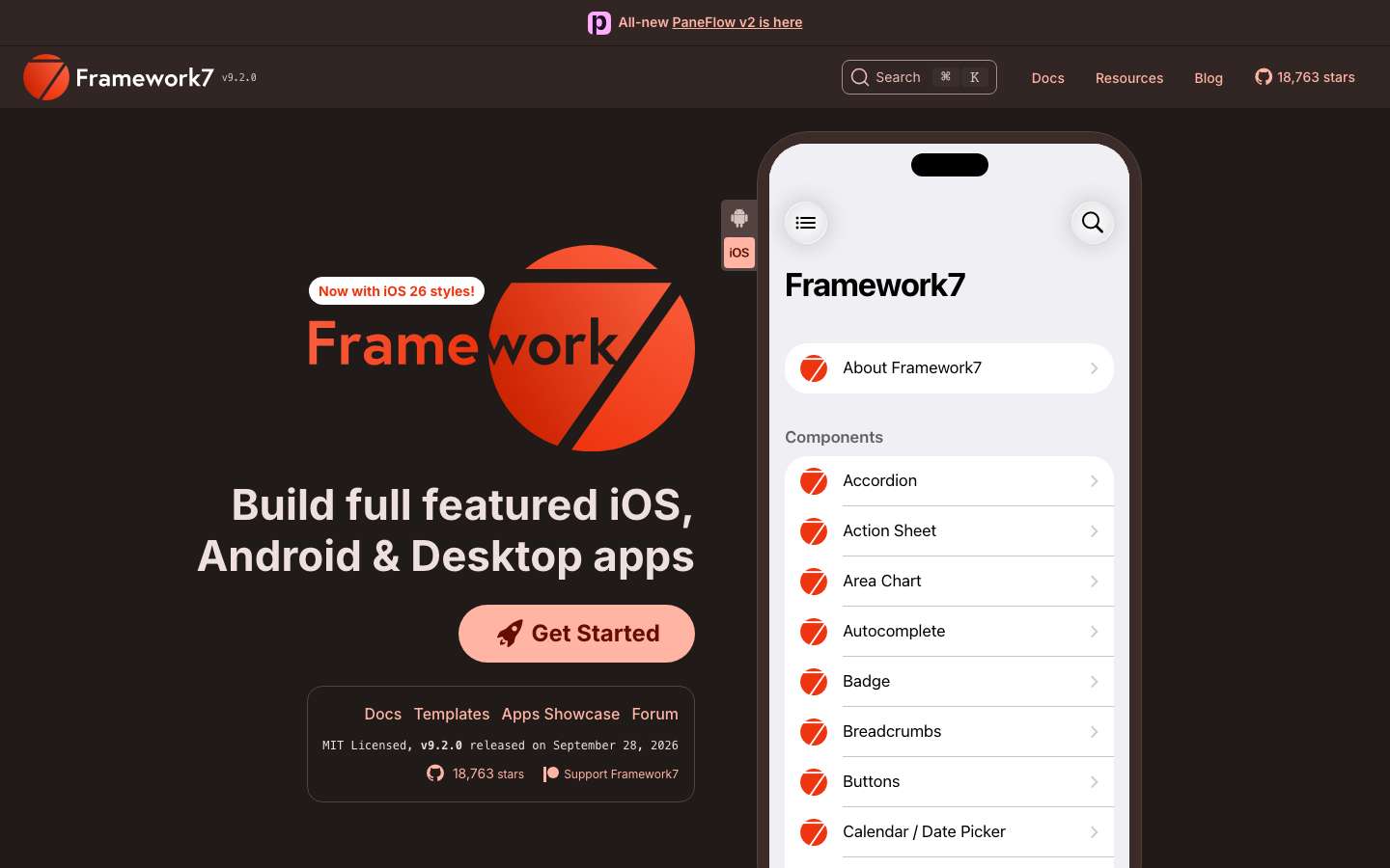
Build mobile web apps that look native on iOS and Android, with a huge kitchen-sink demo app.
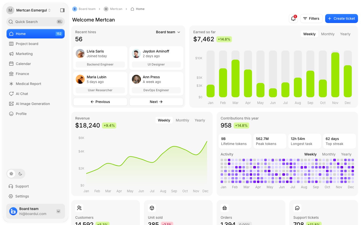
A dashboard-first React design system with a dozen full templates — finance, project boards, AI chat.
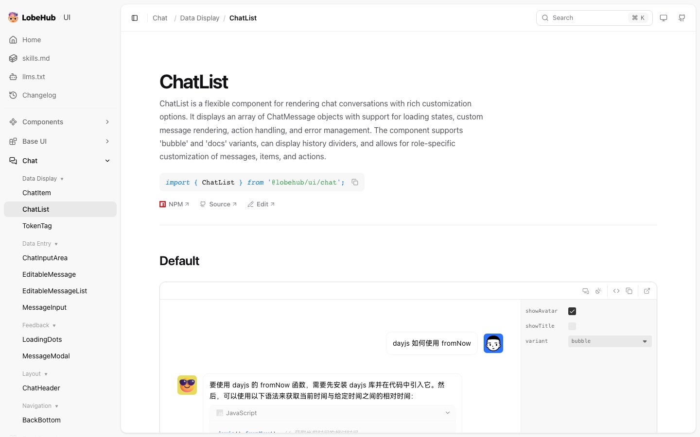
LobeHub's component library for AI products — chat lists, consoles and polished agent interfaces.
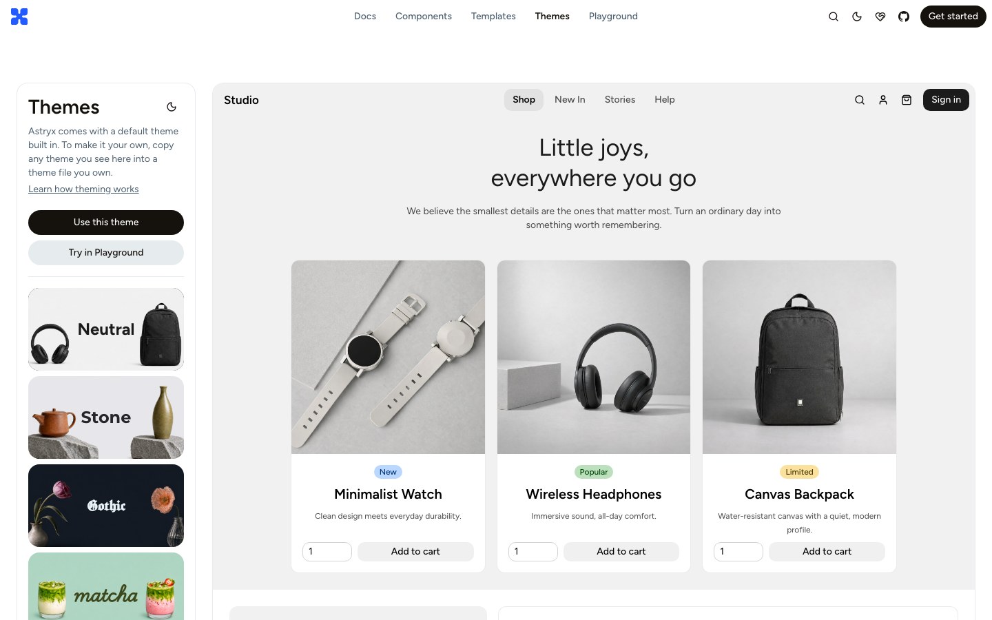
Meta's open design system on StyleX, with dozens of full-page templates and switchable themes.
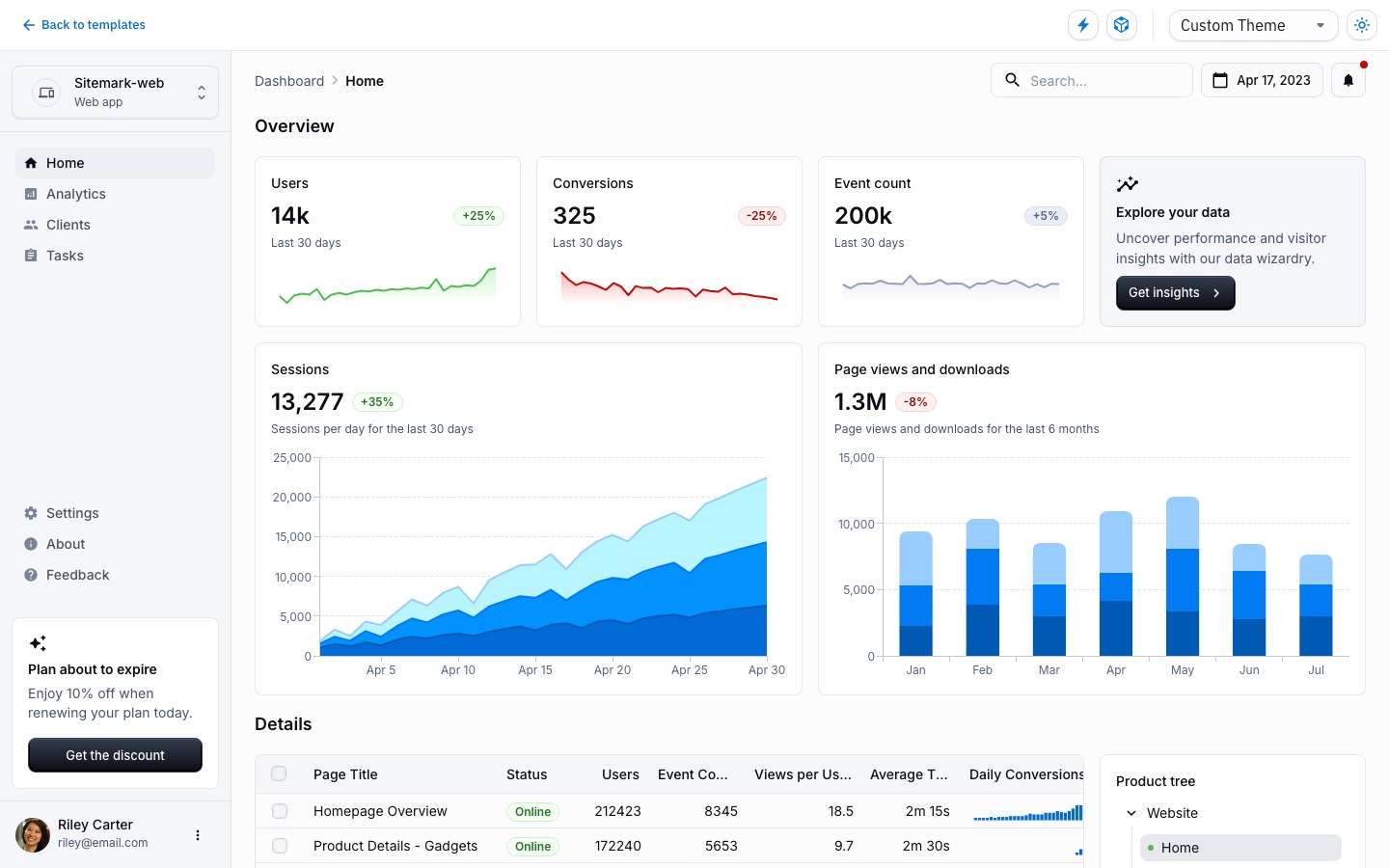
Google's Material Design in React, with free full-page templates for dashboards, checkout and marketing.
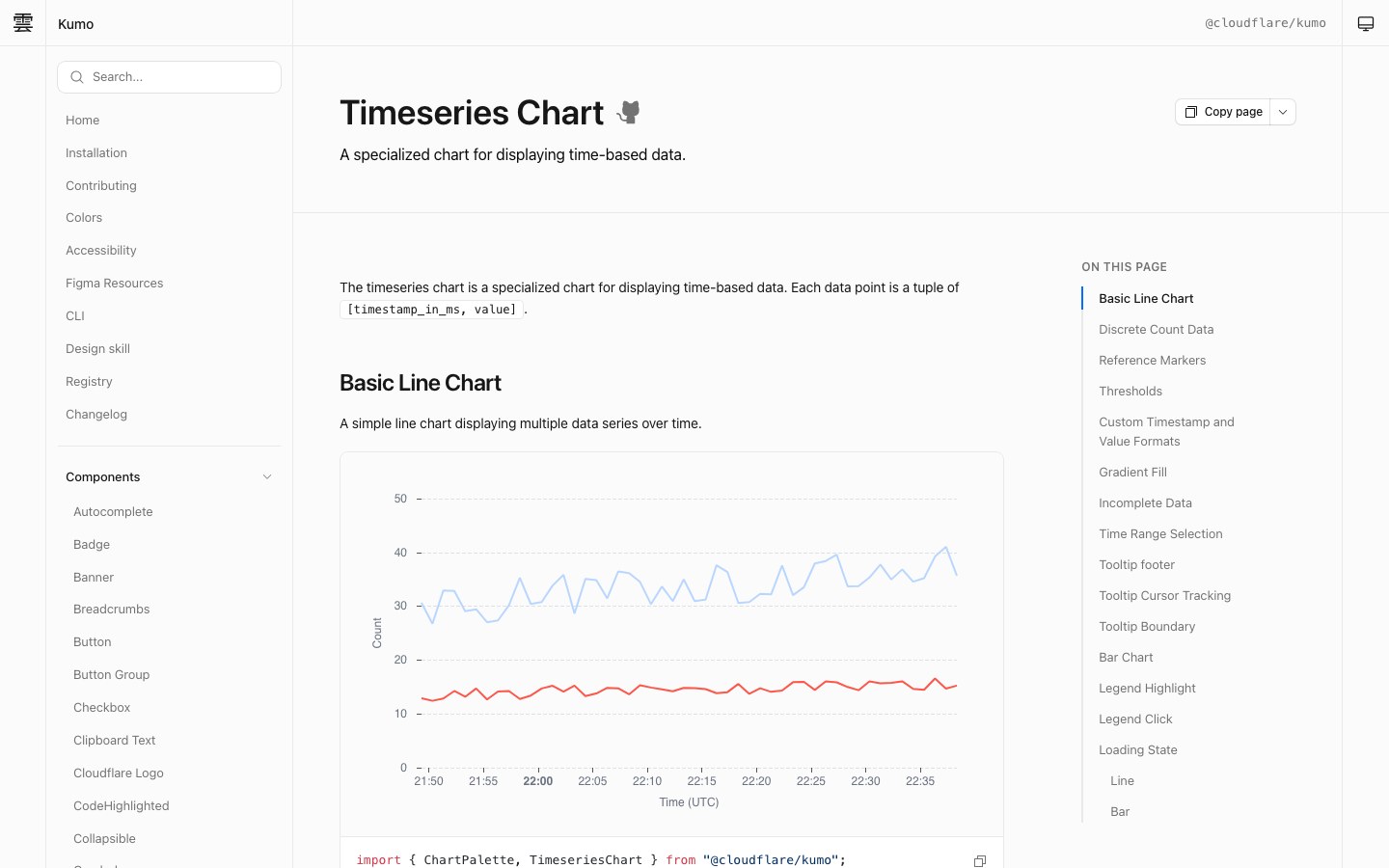
Cloudflare's own React component library — crisp, dense and built for dashboards.
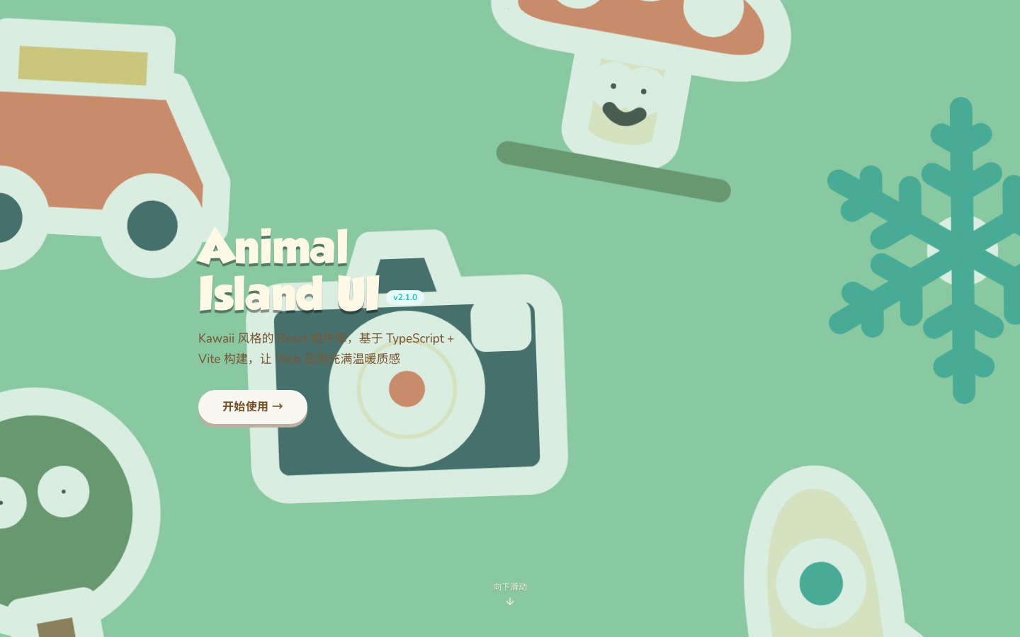
A kawaii React component library with the rounded, cozy look of Animal Crossing.
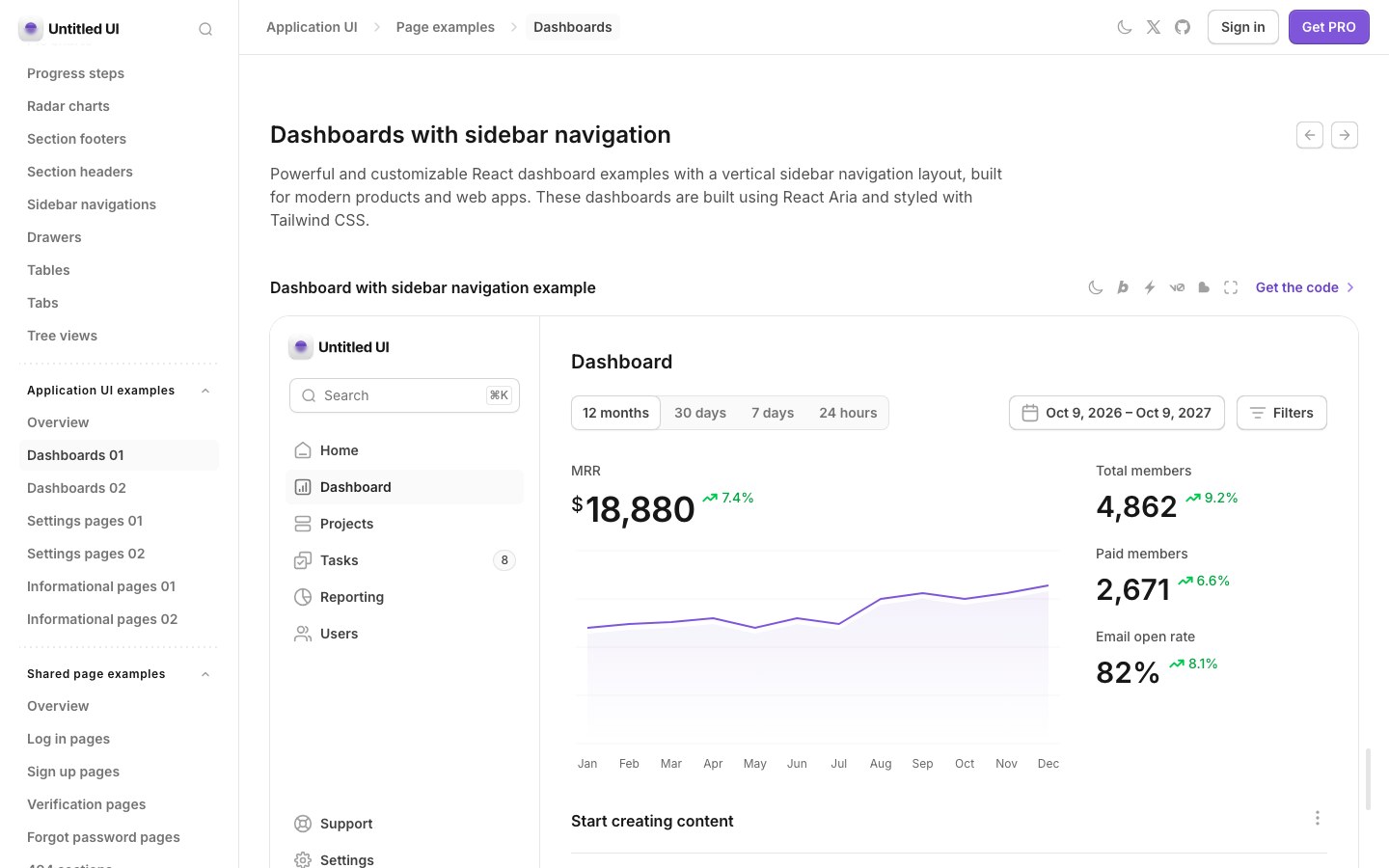
A large, carefully crafted React kit from the Untitled UI team — dashboards, settings and marketing pages included.
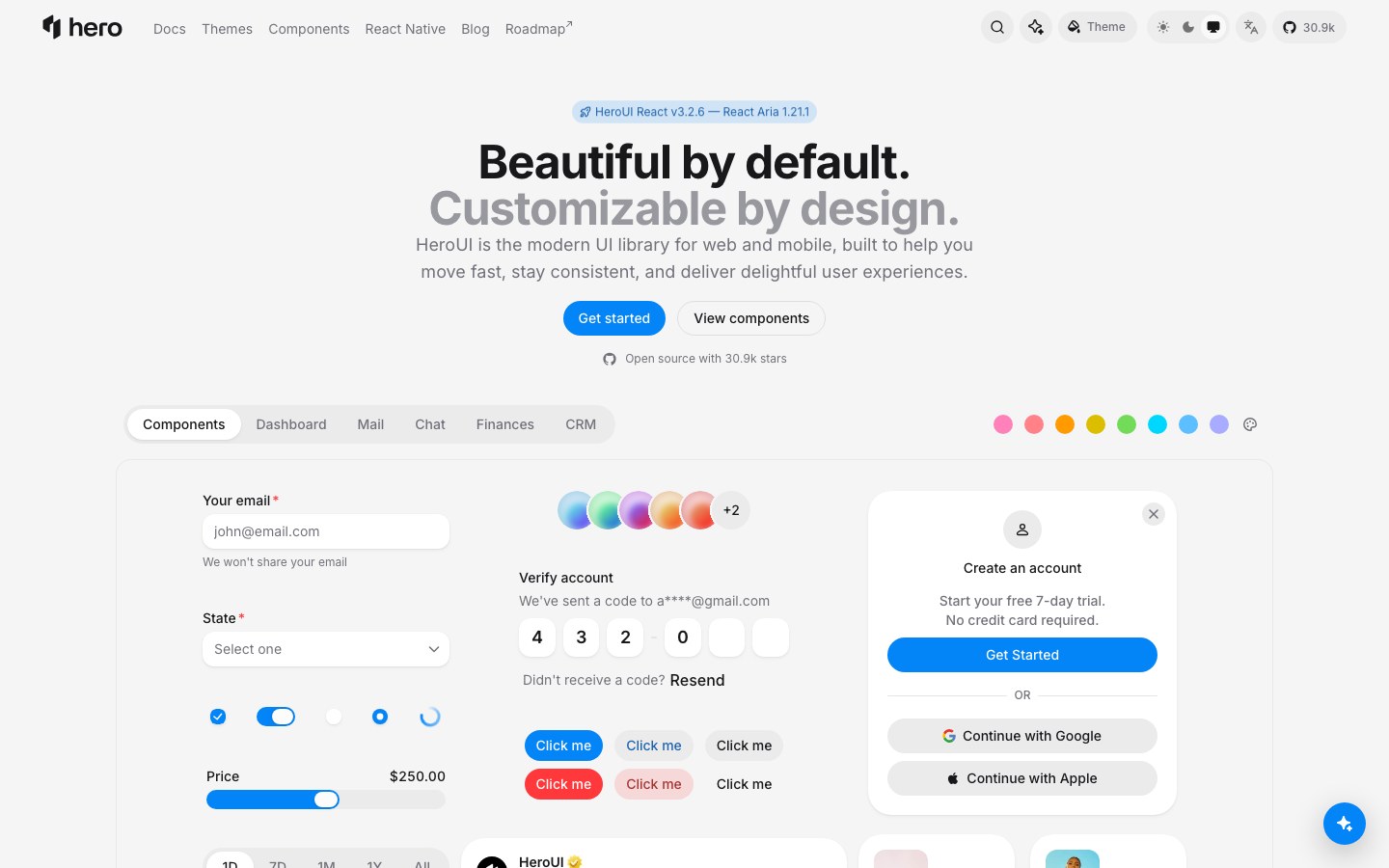
Polished React components on Tailwind and React Aria, with soft surfaces and a live theme builder.
A design system is more than a component set: it comes with tokens for color, type and spacing, theming, and rules for how parts fit together. Choose one when you want the whole product to feel consistent without designing every piece yourself.
- Products that need one consistent look
- Theming and dark mode
- Teams sharing one set of components